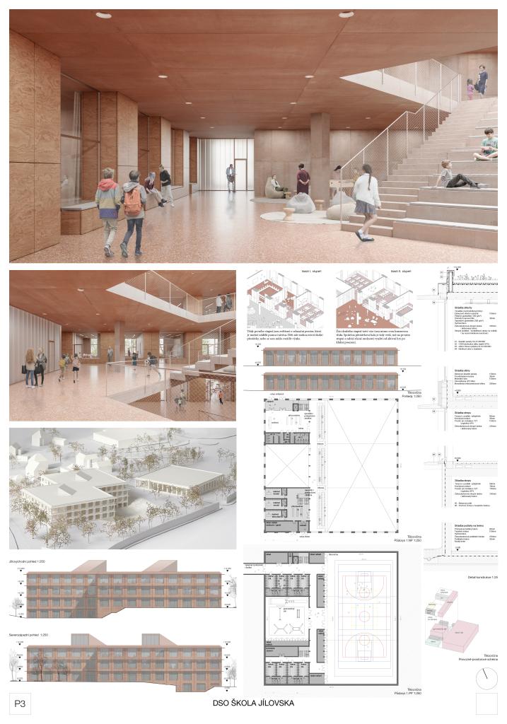
School of Jílovsko

1st prize
  • Author Studio Perspektiv
  • Team Ján Antal, Martin Stára, Martin Křivánek, Silvia Snopková, Ľuba Ondrejkovičová, Dominika Demlová
  • Prague
Annotation

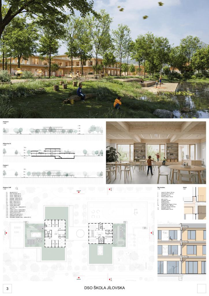
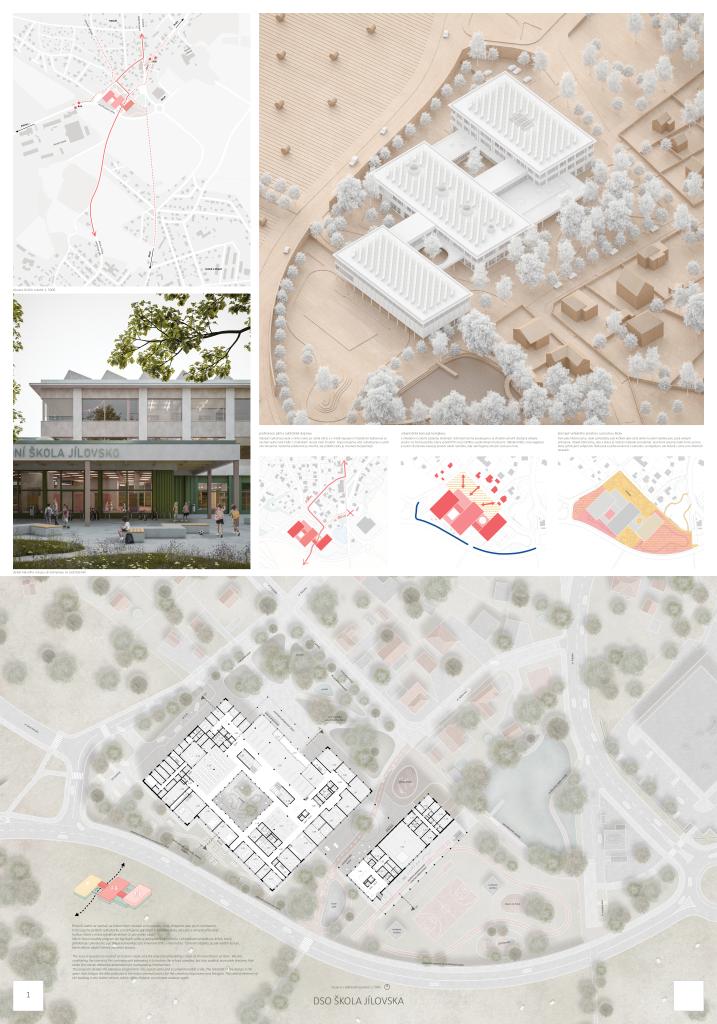
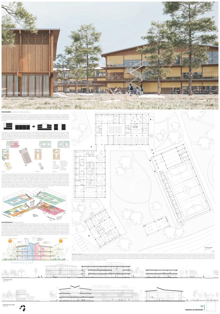
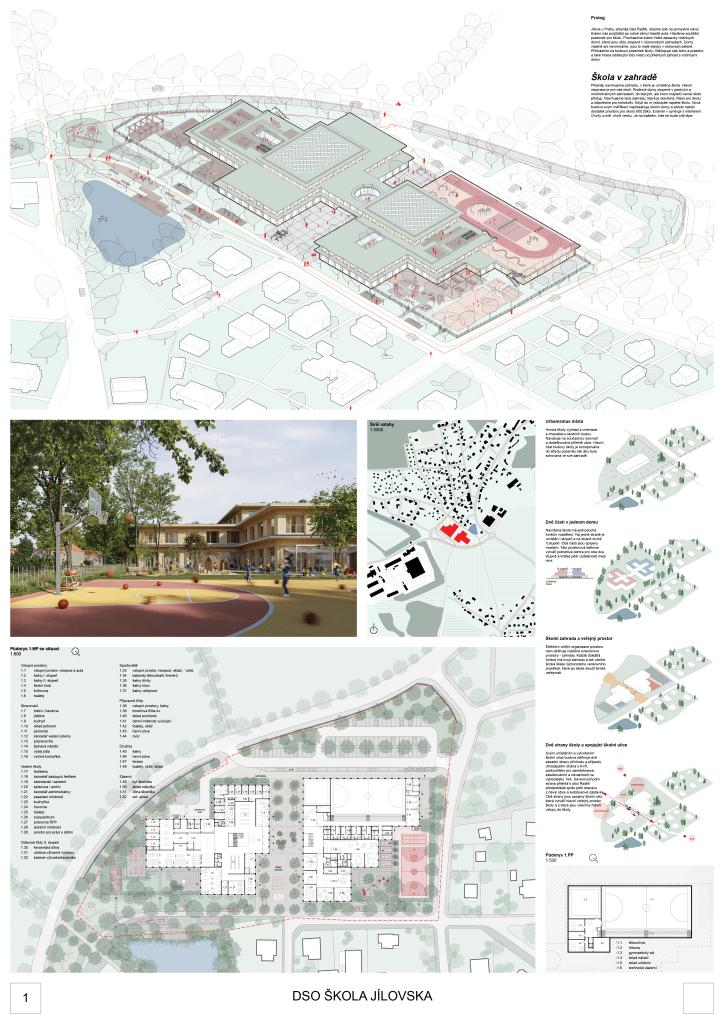
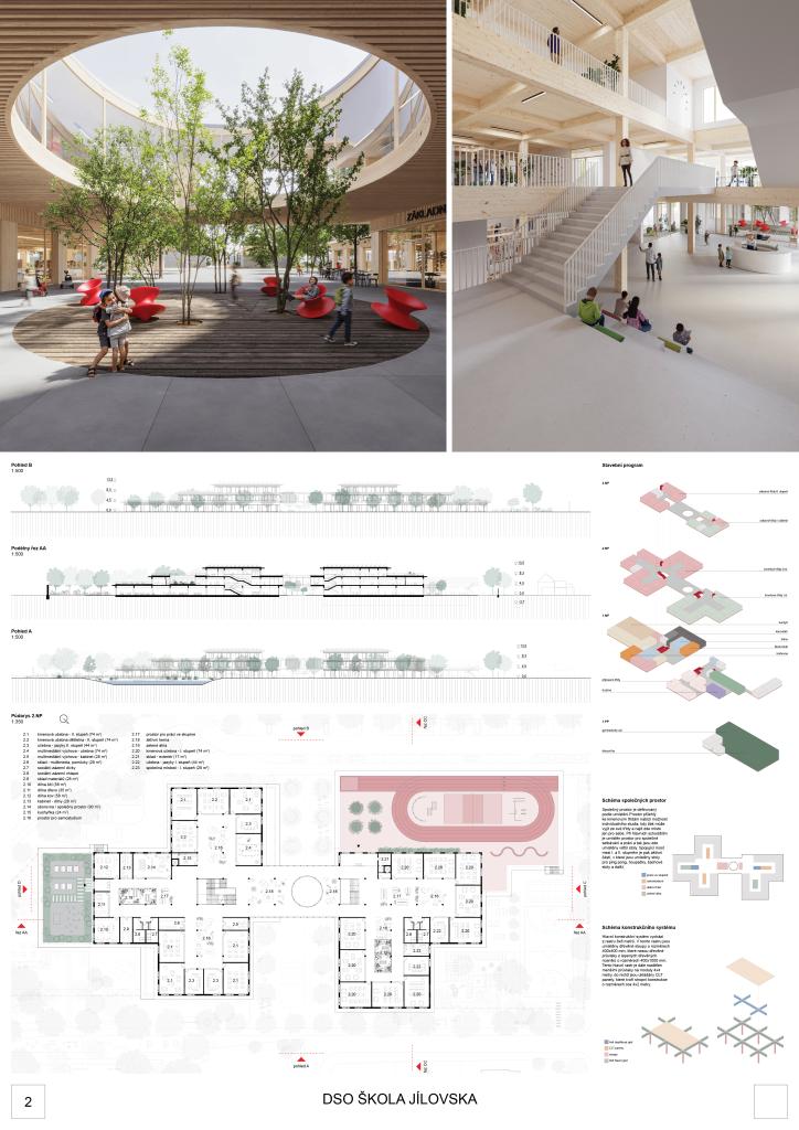
School in the garden. More precisely, we propose a garden where the school is located. The main inspiration for us is the surroundings. Family houses are drowned in colorful and multifaceted gardens, which nobody can access except the owners. So we propose an open garden. For school in the morning and for anyone in the afternoon. When you enter, you'll find the school. The new building doesn't exceed the scale of the surrounding houses and yet offers enough space for almost 600 pupils. The exterior is in synergy with the interior. Inside for a while, outside for a while. It's up to each individual where they feel more comfortable.

Jury Evaluation

The jury appreciates the overall urban layout of the building, which is based on a cross-shaped design that interacts with its surroundings and creates a variety of outdoor spaces. Despite the generous extension of the building over the entire site, the school integrates very harmoniously into its surroundings thanks to the setback in volume, the interplay of different heights, terraces and the overall low number of floors. The area adjacent to the by-pass road provides primarily for vehicular movement, while more intimate spaces are dedicated to schoolyards and outdoor sports facilities. The K+R area is effectively designed by being integrated at the entrance and parking. Unfortunately, the parking lot impacts the historic pathway, whose connection via the bypass would deserve more attention. The proposal has offered the best solution to the public space of the school, which also has the potential to become a new centre for the village and neighbourhood. This is due to the concentration of appropriate events in the proposed 'school square': it allows it to be lively throughout the day. The dual access to the school via the sheltered square, from both the street K rybníku and the parking lot to the southeast, maximally favours the social interaction of all visitors and is perceived very positively. The design of the façade, which protects the façade surfaces from direct sunlight while achieving a balanced combination of transparent and opaque parts along with horizontal and vertical elements, is also very positively evaluated. Thanks to the use of wood and distinctive overhangs, it creates a pleasingly subtle and well-proportioned image. The result is a simple and light aesthetic. The jury appreciates the imaginative integration of the pond into the school grounds and the way in which the school and public spaces are appropriately mixed and intertwined on its banks. This creates great potential for expanded use of the school cafeteria and adjacent garden area for community and social purposes. The layout of the individual operational units of the school is logical, the division of the building on the ground floor into two separate units, which are again combined into one organism on the first floor, contributes to easy orientation. The design thus makes full use of the tools of natural horizontal and vertical division. Indoor spaces such as the sports hall, assembly hall and canteen are logically distributed and have protected outdoor areas. Particularly impressive is the grouping of teaching spaces, which offer a wide range of additional learning opportunities in the circulation areas. Common areas and workshops are concentrated on the ground floor, with appropriate links to a well considered parterre drawn into the heart of the school site, and combined with a cleverly chosen interface between sheltered and public outdoor space. This allows for naturally time-segregated use of public spaces and facilities by the school and community. The use of the main entrance hall as a school assembly hall is considered by the jury to be feasible, but the specific uses of this space require careful attention in the design. Learning spaces structured into larger clusters minimise single purpose corridors and allow for the effective use of circulation spaces for alternative learning. A generous communal space in the connecting bridge at the first floor level appropriately complements the clustered spaces of 1st and 2nd grade level and serves for communication and meeting. The jury positively evaluates the separate clusters of subject-specific classrooms set in the 3rd floor roofscape of each level. On the other hand, the location of the running track on the roof of the sports hall in direct connection with the classrooms of 1st grade level, which in turn lack direct contact with the outdoor garden, raises doubts. Overall, the jury assessed the proposal as an excellent contribution to the brief.
Previous Next
2nd prize
  • Author Apropos Architects
  • Team Michal Gabaš, Laura Lukáčová, Miroslav Slezák, Tomáš Beránek, Eva Gabaš Rosenová
  • Chrudim
Annotation

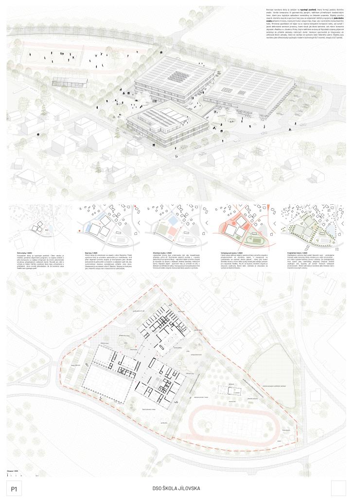
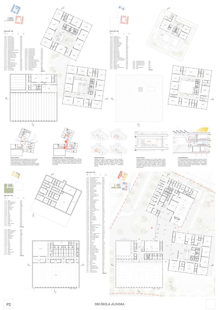
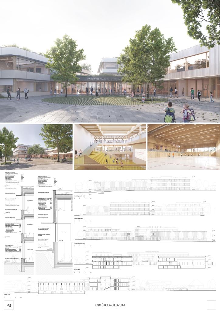
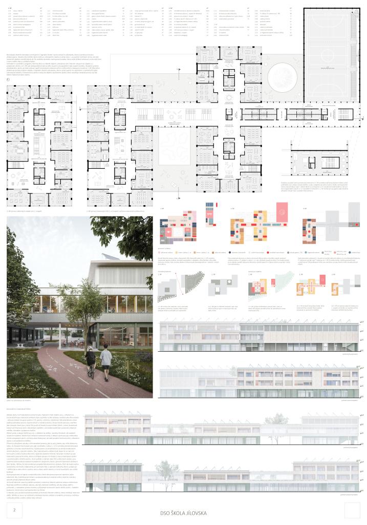
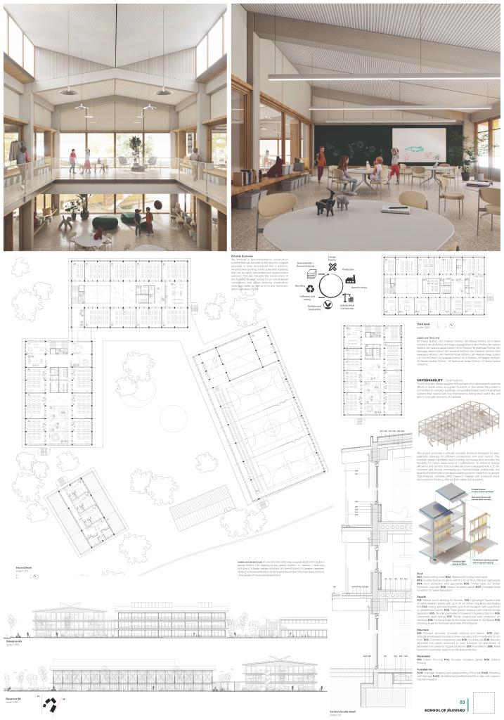
The concept of the designed school is based on the typology of pavilions, which, in ensemble, form the shape of the school grounds. We propose a composition of three geometrically clear, scale-appropriate quadratic masses logically distributed on the designed plot. The buildings of the first grade, the second grade, and the sports hall are connected in their mutual center of gravity into a unified volume by a ground floor mass that serves as an entrance hall, foyer, and central communication hub. The mass arrangement not only aims at the most compact composition of the whole but also creates clearly defined outdoor spaces that serve both the school itself and the local community of residents in Radlik and Jílové u Prahy. The scale of the two- to three-story volumes blends nicely into the adjacent development of houses. The outdoor sports field is integrated into the generous school garden, which is located in the eastern part of the area. The buildings are designed as timber buildings using modern technology of GLT beams, columns, and CLT panels.

Jury Evaluation

The jury appreciates the interplay of the three rotated volumes responding to the geometry of the site by aligning the individual blocks with the site boundaries. This compact layout allows for a large area to be created for park and sports facilities that can connect to the existing pond. A not very favourable interaction, however, is created with the adjacent low-rise residential development on the street K Rybníku. The outdoor circulation areas are well organised. Parking and Kiss and Ride spaces are appropriately located near the main entrance, while maintaining a clear separation. The design of the facades is considered by the jury to be very convincing and appealing. The glazed parts are protected from direct sunlight by horizontal shading blades, which reflects the sustainable approach to the project. The design has credibly addressed the irregular open spaces surrounding the school: ranging from an enclosed school garden for school breaks to an open public space, appropriate to the rural setting of the site. This pleasingly bold concept of the school's public plaza has the potential to act as a natural filter between the public and school spaces based on natural time-based separation. Given the lack of other protected outdoor spaces, this solution will be difficult to sustain in practice. Overall, the jury appreciates the emphasis on community and public use opportunities in the design of the outdoor areas of the school grounds, and the possibilities for separate community use of both the cafeteria and the sports hall. Unfortunately, a comparable potential for the outdoor sports facilities is limited by the lack of easy access to social facilities. The distribution of individual functions within the building is logical. The articulated floor plan allows for separate access to many parts of the building suitable for community use. The placement of the 1st grade level on the upper floors is surprising but understandable given the desire to minimize the footprint and makes sense when combined with the connection to the roof terrace and community room. The jury considers the independently operated pre-school classroom unit on the ground floor of the 1st grade level block to be a very successful solution, as well as the cleverly designed entrance area of the 2nd grade level serving as an assembly hall. The single-storey entrance area, designed as a communication hub is functional despite its slight spatial indifference and reliably guides users to the various operational parts of the building. The connection to the school plaza, which serves as the main outdoor space of the school, could be more generous. The jury appreciates the economical yet generous spatial design of the school's teaching areas. Especially in the 1st grade level, the central hall can serve well for alternative teaching despite the large number of connected classrooms, while in the case of the second level the spaces will serve more as equally necessary chill-out zones.

Previous Next
3rd prize
  • Author BY architects
  • Team Markéta Zdebská, Marek Žáček, Tomáš Vojtíšek, Max Mohl, Miroslav Faist, Alexandra Andreea Bajan, Laure Philippe, Josef Filip (traffic)
  • Prague
Annotation

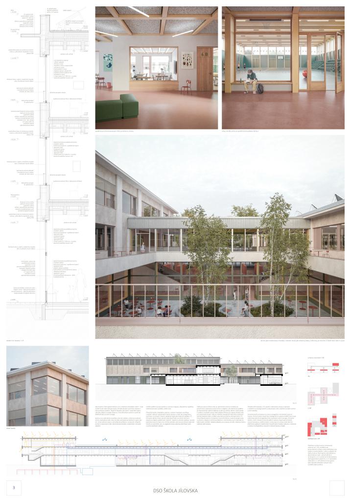
The area in question is located on historic roads, and the new school building is seen as an enrichment of them. We are confirming the course of the cycleway and extending it to include the school complex and publicly accessible features that make the site an attractive destination for surrounding communities. The proposal divides the extensive program into logical units and a comprehensible scale. The leitmotif of the design is the spine that bridges the bike path and is the main communication for the common classrooms and the gym. The central element of the building is the indoor atrium, which offers children an intimate outdoor space.

Jury Evaluation

The jury positively evaluates the urban design of the school, which features three main blocks unified by a central spine. However, the overall composition is not quite clear and it is difficult to read the original intention. The outdoor spaces are very pleasant, well proportioned and the buildings are well integrated into the environment. The jury appreciates the effective concept of car and pedestrian circulation designed as a foreground to the school entrance, although its area looks oversized, compromising the areas for the school garden and playground. The attempt to differentiate the expression of the facades through a playful combination of several types of materials does not look very harmonious. The effort to bring life to the school site by incorporating amenities along the footpath in the form of a skate park, playground and sports hall entrance appears very successful. The easy public access to the sports hall and outdoor sports facilities is much appreciated. At the same time, the school canteen, given its integration in the layout, is unlikely to have such potential. From an operational point of view, the design is very well thought out and responsible, with no essential units missing. It consistently and successfully avoids the intersection of individual school activities. The location of the communal and public facilities on the ground floor, which despite its size is clearly arranged and generously proportioned, is key. The open, free-flowing space around the inner atrium is generous and serves as a changing room, dining room, library and circulation area. Particular attention needs to be paid to acoustic comfort and daylighting. The location of the central changing areas in a prominent position at the entrance to the building is seen by the jury as a solution that guarantees their sophisticated, thoughtful and safe design. The jury appreciates the clustering of the teaching spaces on the 2nd and 3rd floors. However, the design of the clusters is inconsistent and only some of the 2nd grade level clusters fulfil their function perfectly. On the 1st grade level, this arrangement serves mainly to divide the continuous space into smaller units. The operational connection of the teaching space to the otherwise operationally completely separate sports hall within the circulation spine on the 2nd floor is one of the strengths of the design.

Previous Next
honorable mention
  • Author MACH
  • Team Marc Subirana Ribera, Laia Gelonch Llongarriu, cooperation Victoria Cirillo, Magdalena Mannise
  • Barcelona, Spain
Annotation

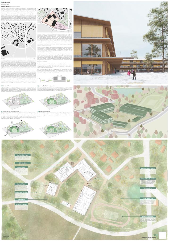
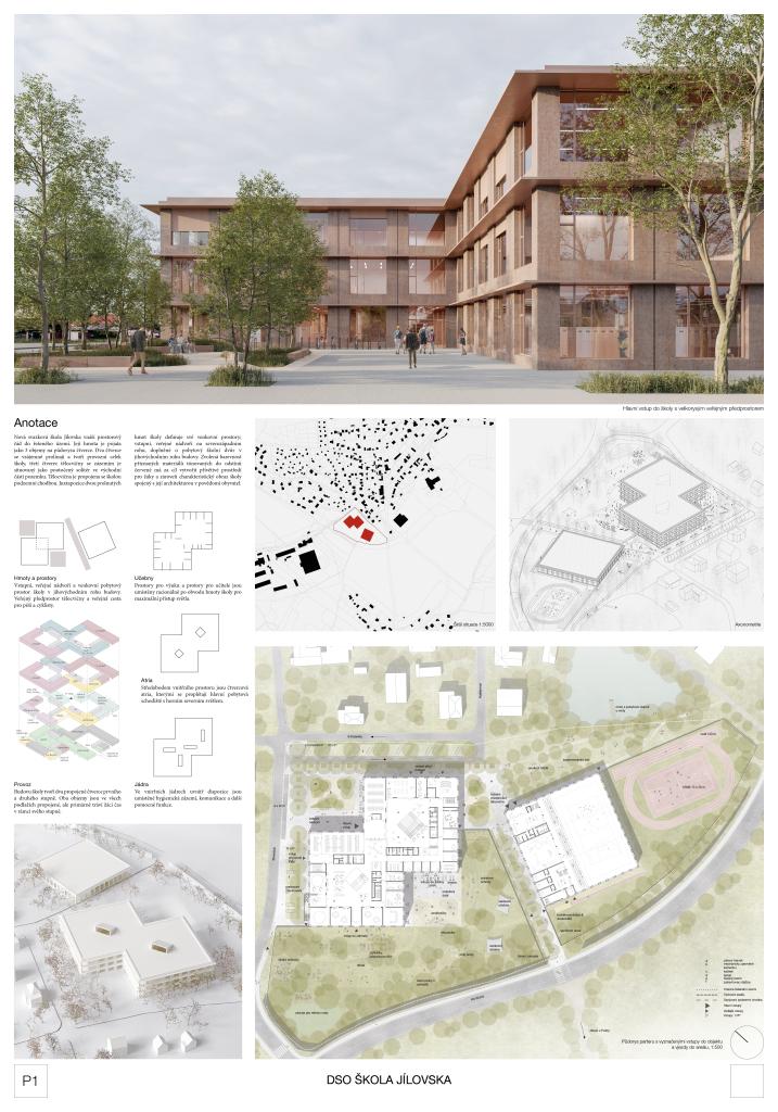
The architectural proposal for a school in the Jilovska region adopts a vernacular approach, blending harmoniously into the surrounding landscape and urban-rural context. The design seeks to create a seamless integration between the building and its natural and built environment, fostering a sense of calm, well-being, and belonging. In addition to this contextual sensitivity, the project explores avant-garde strategies in school design, emphasizing community, social interaction, and collaborative learning. Open, flexible, and hierarchically organized common spaces form the core of the design, encouraging students to gather, share experiences, and build meaningful relationships. Combining a deep respect for the local context with innovative educational spaces, the project aspires to offer a nurturing and inspiring environment that promotes personal and collective growth.

Jury Evaluation

The consistent pavilion design of the campus represents a unique approach in the context of the competition. It emphasizes the outdoor spaces - both school and public - and their mutual symbiosis and connection with the urban structure of the village. It creates different sized outdoor spaces with different functions, including a sports area in the south, a generous schoolyard set between the buildings, and entrance spaces at the sides. The exceptional massing of the individual pavilions arranged around the generous schoolyard, their articulation and architectural expression with the use of pitched roofs and timber facades naturally integrate the school buildings and the whole site into the fabric of the village. The parking and Kiss and Ride areas are efficiently designed, located close to the main roads and well connected to the entrances. Even from the rather schematic design of the outdoor spaces, their potential and preferred natural character is evident. The symbiosis of the school with nature is supported by the lack of 'warm' connections between the individual pavilions, which in this case is not to be considered a design flaw. Thanks to the pavilion design, the operational layout of the site is logical and clear, allowing for a variety of uses of its individual parts. The jury appreciates the effort to achieve the most economical spatial solution, which is also functional in the educational parts of the building. In the common areas of the school, however, this effort is compensated by an excessive combination of functions, and the circulation corridors are undersized. Some important operational units of the main building, especially of a technical nature, are unfortunately completely missing and their completion would require a fundamental modification of the design, for example by adding an entire technical floor. The surprising structural solution with a concrete structure and wooden facade provides a subtle and original architectural expression, but at the cost of a high degree of glazing and a very high maintenance requirement. The graphic design is of an extremely high standard.

Previous Next
honorable mention
  • Author Malý Chmel
  • Team Zdeněk Chmel, Miroslav Malý, Gabriela Sládečková, Miroslav Chmel, Martin Ciglbauer, Jitka Vančurová, ZAN studio – vizualization, Landa Ruhmkorf – consultation of landscape solutions
  • České Budějovice
Annotation

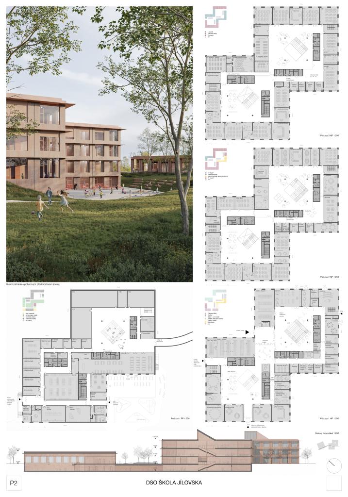
The new Jílovská school brings spatial order to the area. Its mass is conceived as 3 volumes on a square plan. Two of the squares intersect in plan and form the operational unit of the school, while the third square of the gym with facilities is situated as a rotated solitaire in the eastern part of the site. The gym is connected to the school by a corridor. The juxtaposition of the two interlocking masses of the school defines its outdoor spaces; an entrance, formal, public courtyard at the northwest corner, complemented by a residential schoolyard at the southeast corner of the building. The chosen colour scheme of admitted materials, tinted in shades of red, aims to create a welcoming environment for pupils as well as a unique image of the school in the minds of residents.

Jury Evaluation

The urban design concept of the school is remarkable for its compact solution, which minimizes the floor area and preserves a generous outdoor space for sports and leisure activities. However, the scale of the higher volumes and the design of the facades is not entirely appropriate in the context of the surrounding environment. The primary school is arranged in two interlocking cubes, with the sports hall located in a separate partially sunken building on the other side of the historic pedestrian path. This operational scheme is clear and functional. It allows easy use of the sports facilities by the wider community without interfering with the running of the school. Pupil access to the sports hall is somewhat unconvincingly managed via an underground corridor. The proposed landscaping between the sports hall and the pond unifies the area and integrates the site naturally into the existing fabric of Radlik. The parking areas are appropriately sized, only their location parallel to the street K Rybníku raises concerns due to the traffic generated by the school traffic. The outdoor spaces adjoin the indoor operations in a logical and natural manner. Both the public spaces and the sheltered school corners are generous in scale, blending together without major operational conflicts, resulting in an overly welcoming campus. At the same time, it holds great potential for community use. The jury appreciates the successful effort to strike a delicate balance between the ample amount of protected outdoor space and the openness of the site to the wider community. The chosen layout principle of separating 1st and 2nd grade level has great potential but remains largely unexploited. The size of the common atria is at the limit of the possibility of creating a pleasant environment. The place where the two cubes are joining is completely omitted, and would deserve a more thorough examination and presentation of a clear view of how this space should look and function. In the presented floor plans, it becomes an confusing node, the importance of which is furthermore undermined by the quite insensitive insertion of a toilet block for employees. The architectural expression of the building and its graphic design is considered by the jury to be very successful. The jury also appreciates the verification of the project through the creation of a physical model.

Previous Next