-
Author
zetzetzet
Mikuláš Macháček - Country Česko
- City Praha
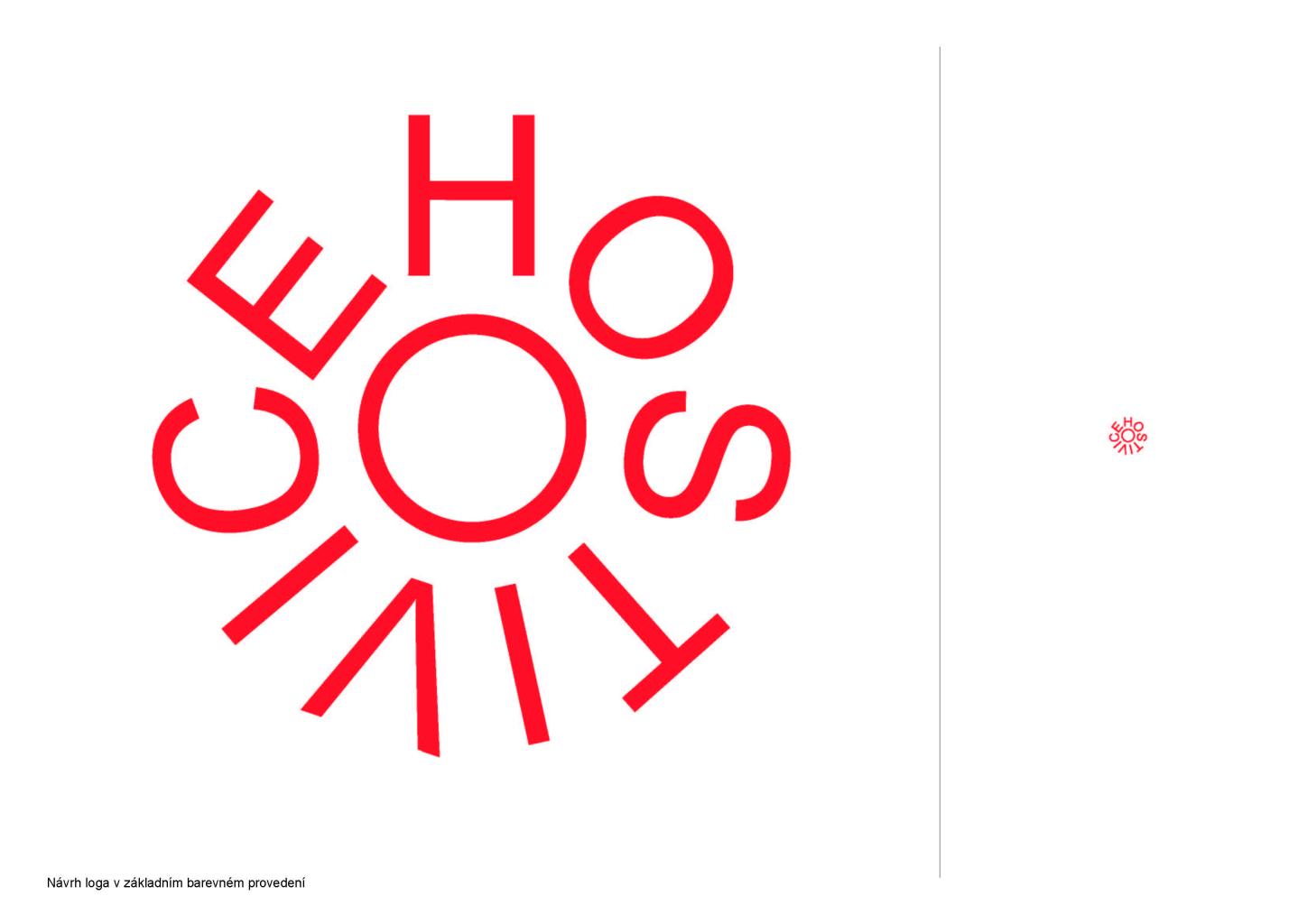
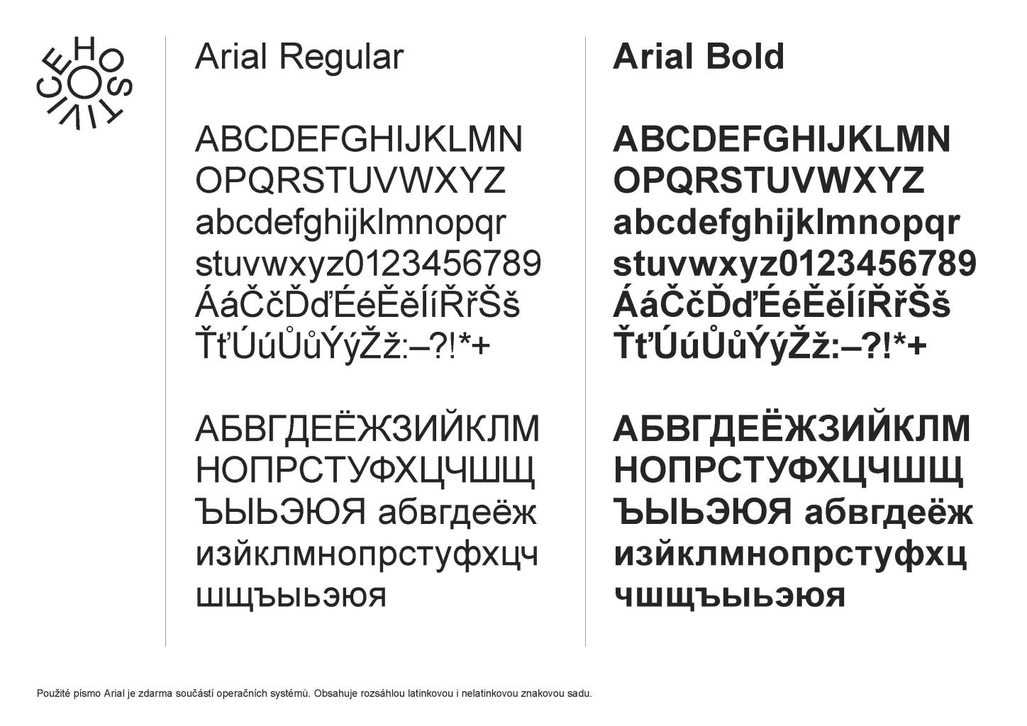
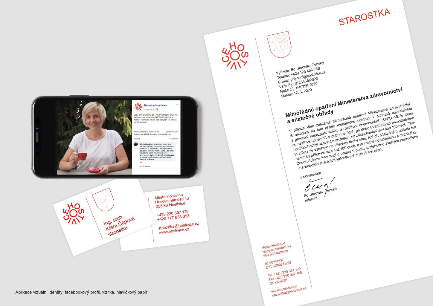
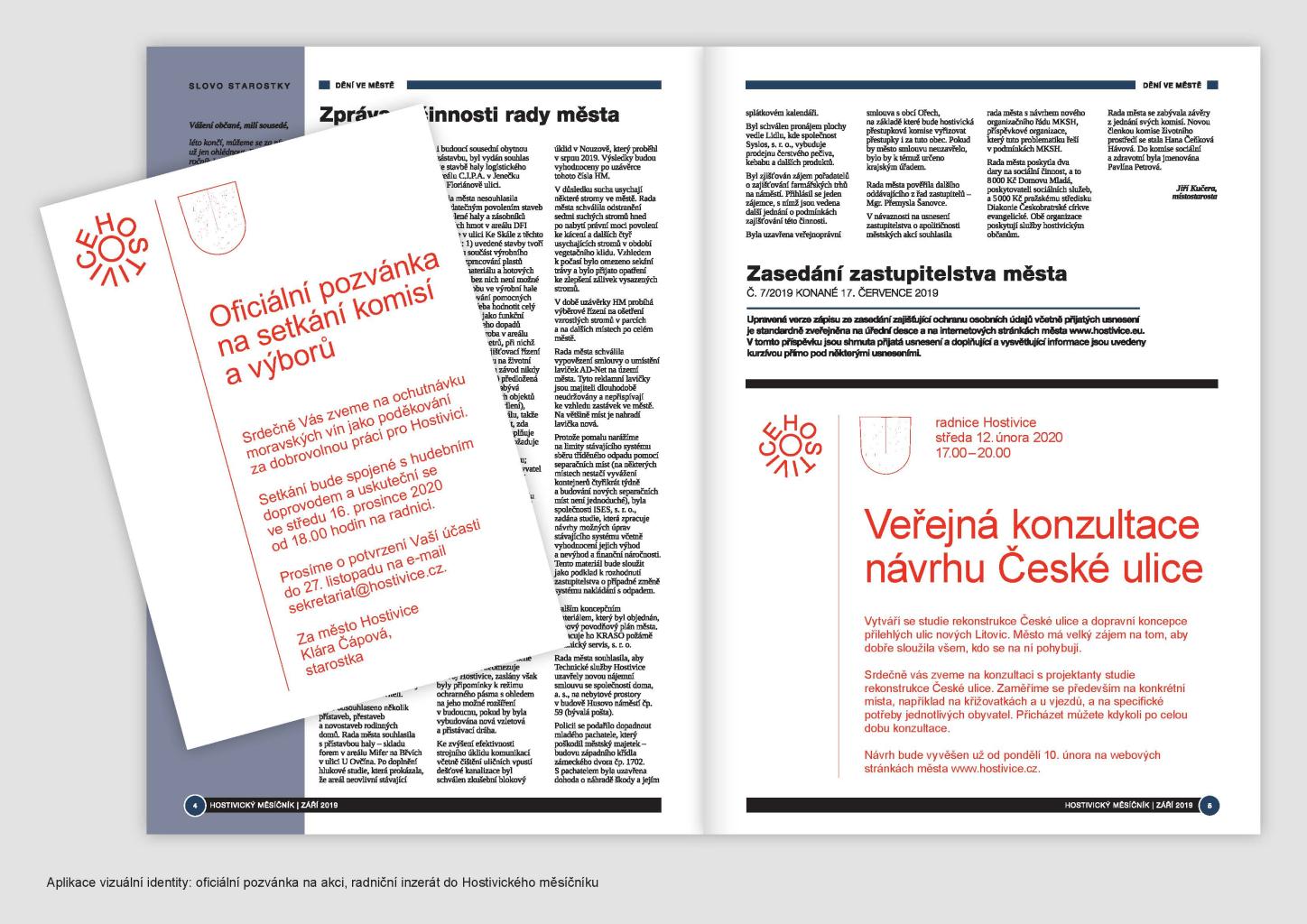
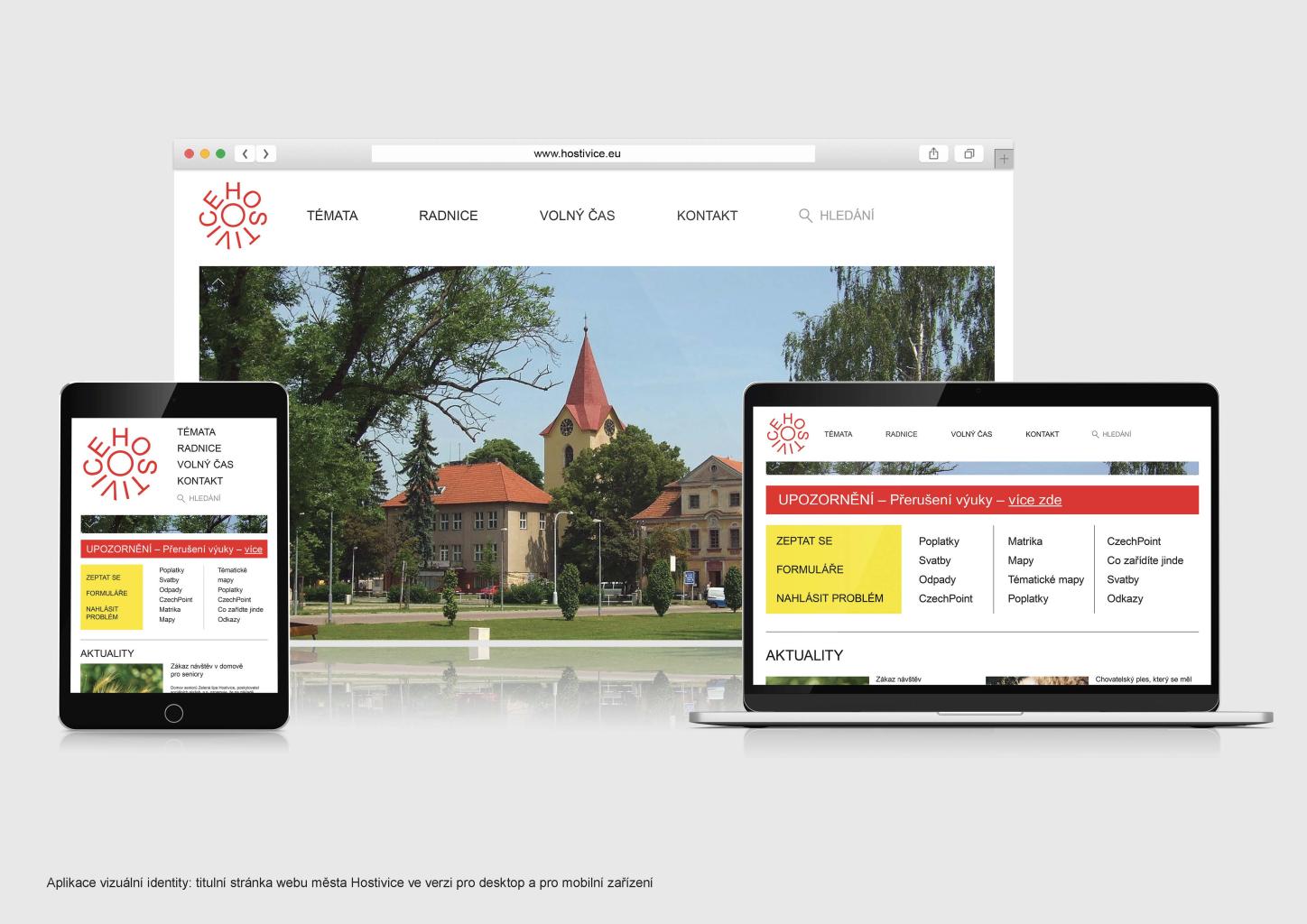
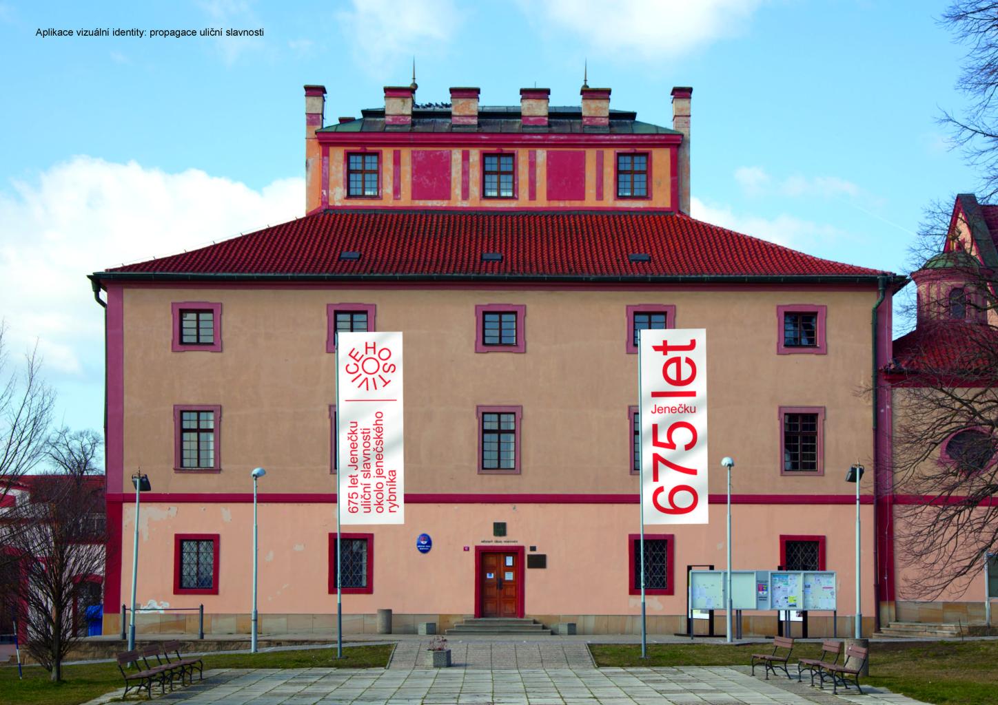
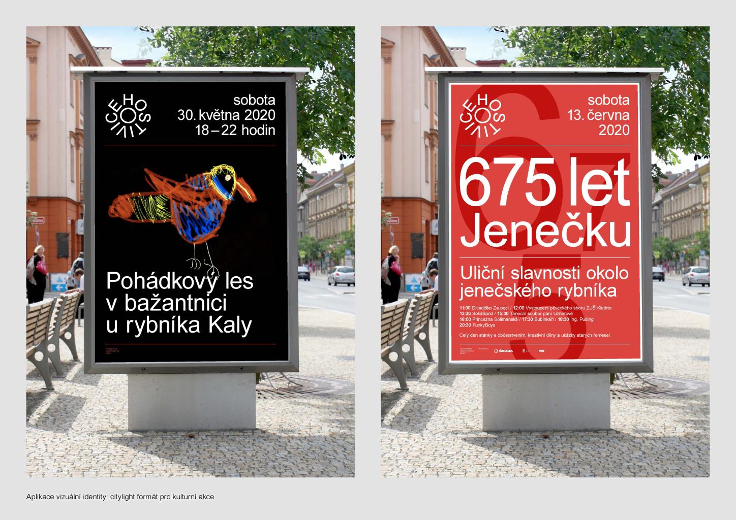
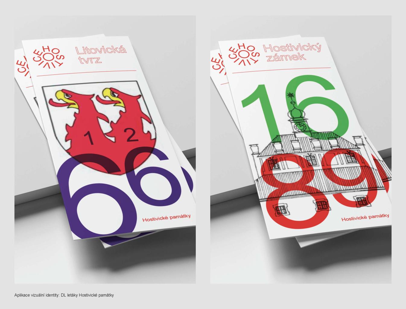
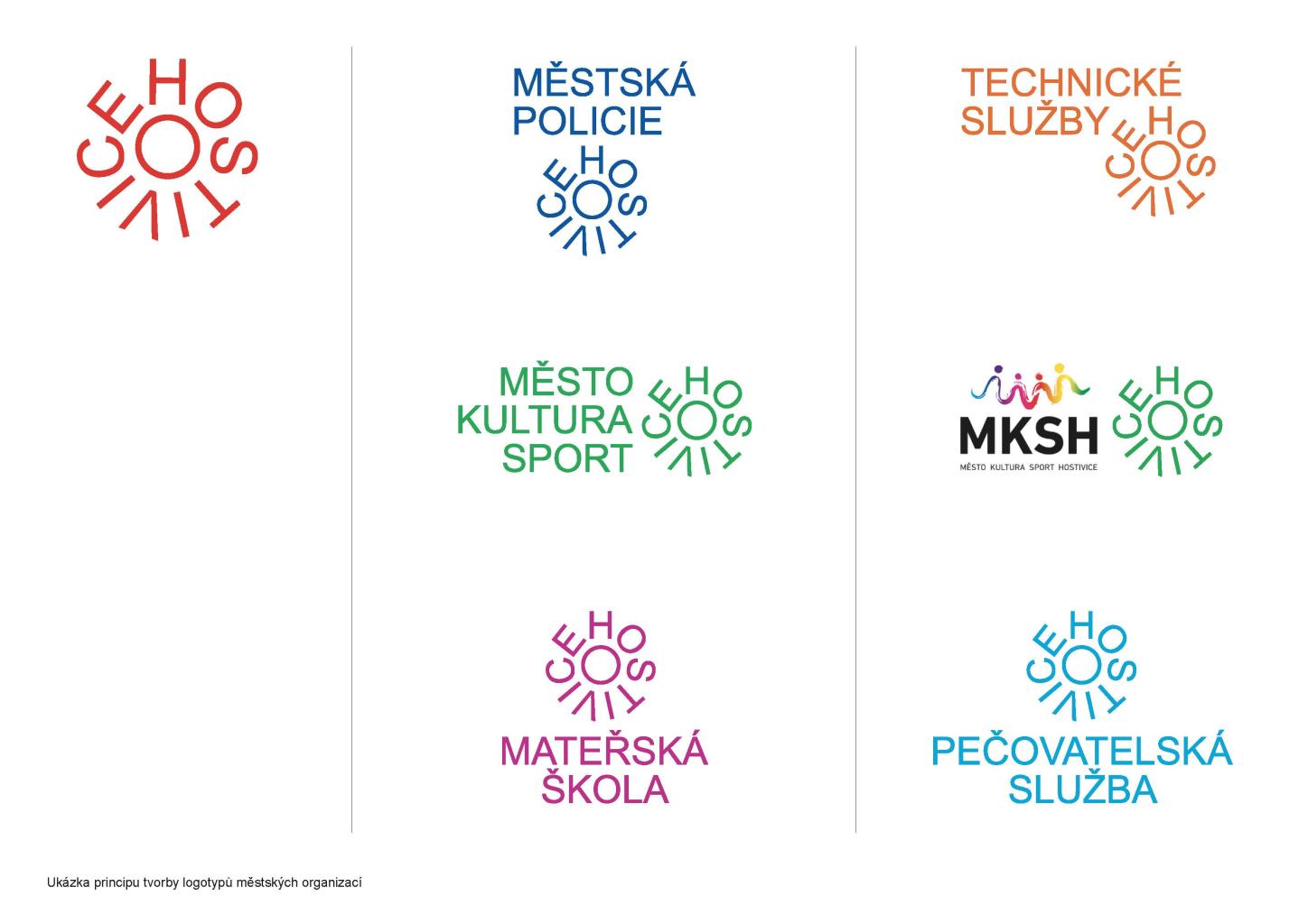
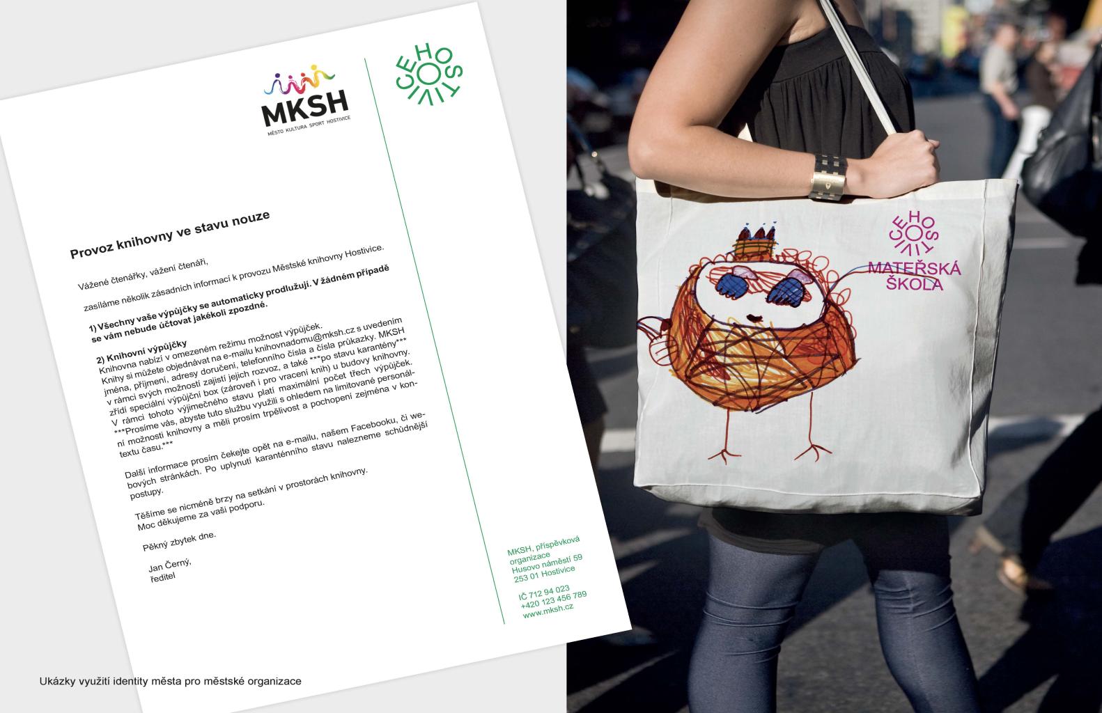
Logo design - transforms the historical attributes of the city into a contemporary typographic symbol - is inspired by the circle symbol as the cornerstone of classical iconography - follows the seal signs and stamps of the original municipalities - is inspired by a gear that refers to industrial production and the modern development of the city - is based on the color of the red field in the town emblem belonging to Hostivice Visual identity - creates a hierarchy in the use of the logo and the coat of arms - deliberately uses the most common Arial system font for which it seeks a new dimension - introduces a simple principle of creating logotypes of city organizations - integrates elements of the city's existing identity - symbolizes and communicates openness by its variability
The Commission values the originality of the solution, based on the local identity that the proposal develops. The proposal is not based on differences, but on a connection. In its application, it works fine and is not based on any complicated aesthetic principle. Despite the distinctive appearance of the new symbol, the jury appreciates the non-violent typographic connection of the proposed symbol with the city organizations (Kindergarten, Municipal Police, etc.). Among other things, the new city symbol elegantly works with commonly available Arial fonts. The new symbol works well with the city emblem. Thanks to its great usability, the new city symbol has the chance to create an original city communication code that citizens will accept. Overall, the design of the identity of Hostivice looks dignified, harmonious, and does not lose its own dynamics.
