Visual identity of the Terezín Memorial

1st Prize
  • Author 20YY Designers
  • Prague
Annotation

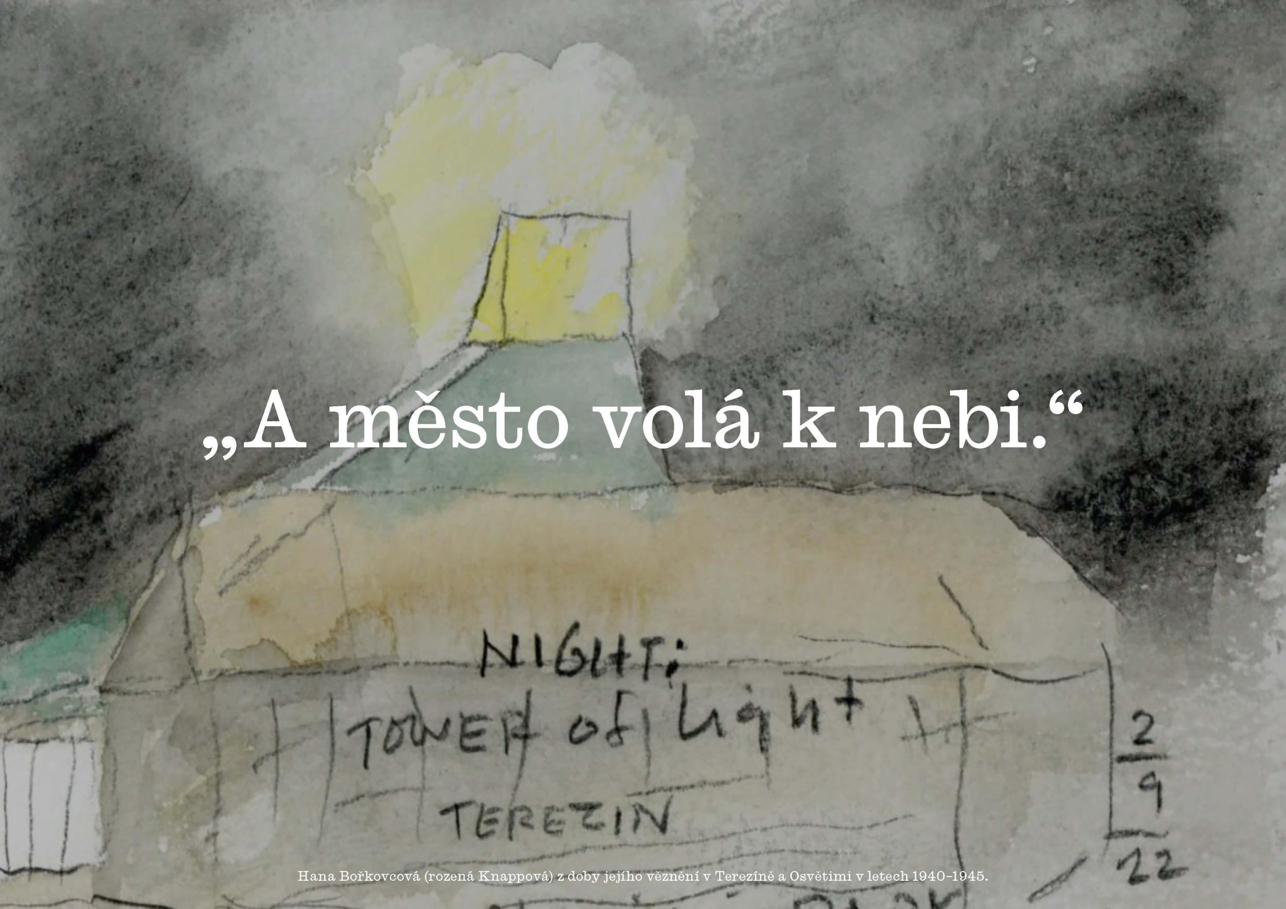
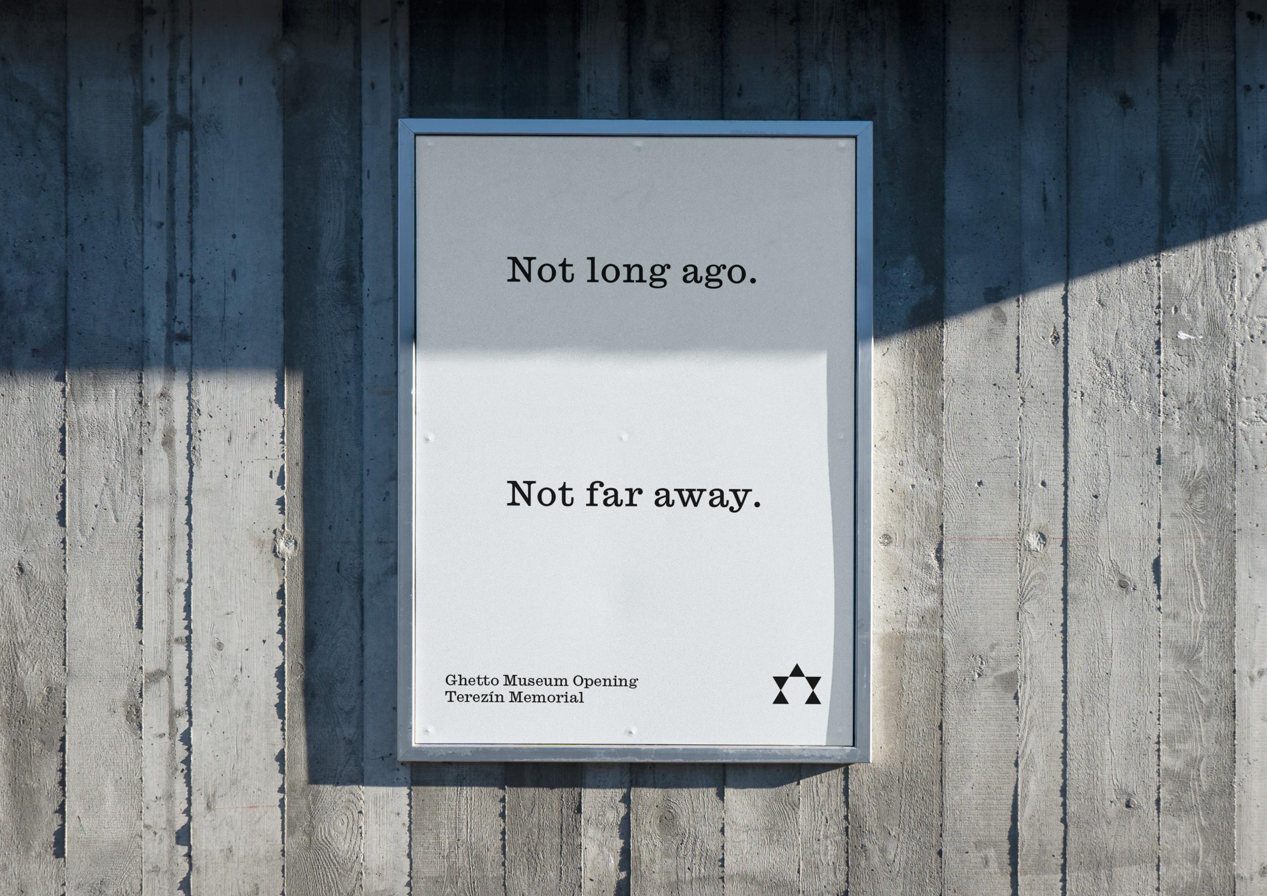
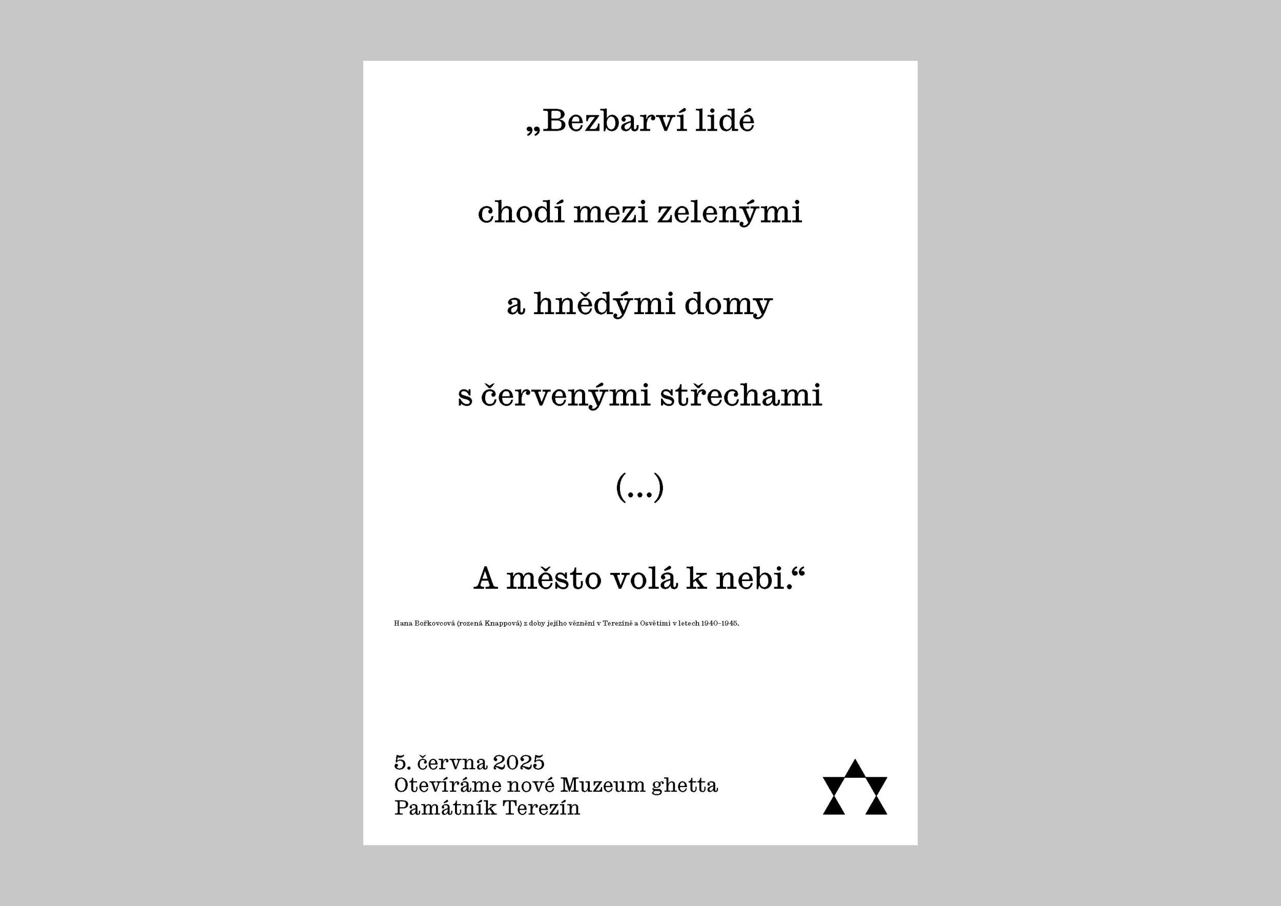
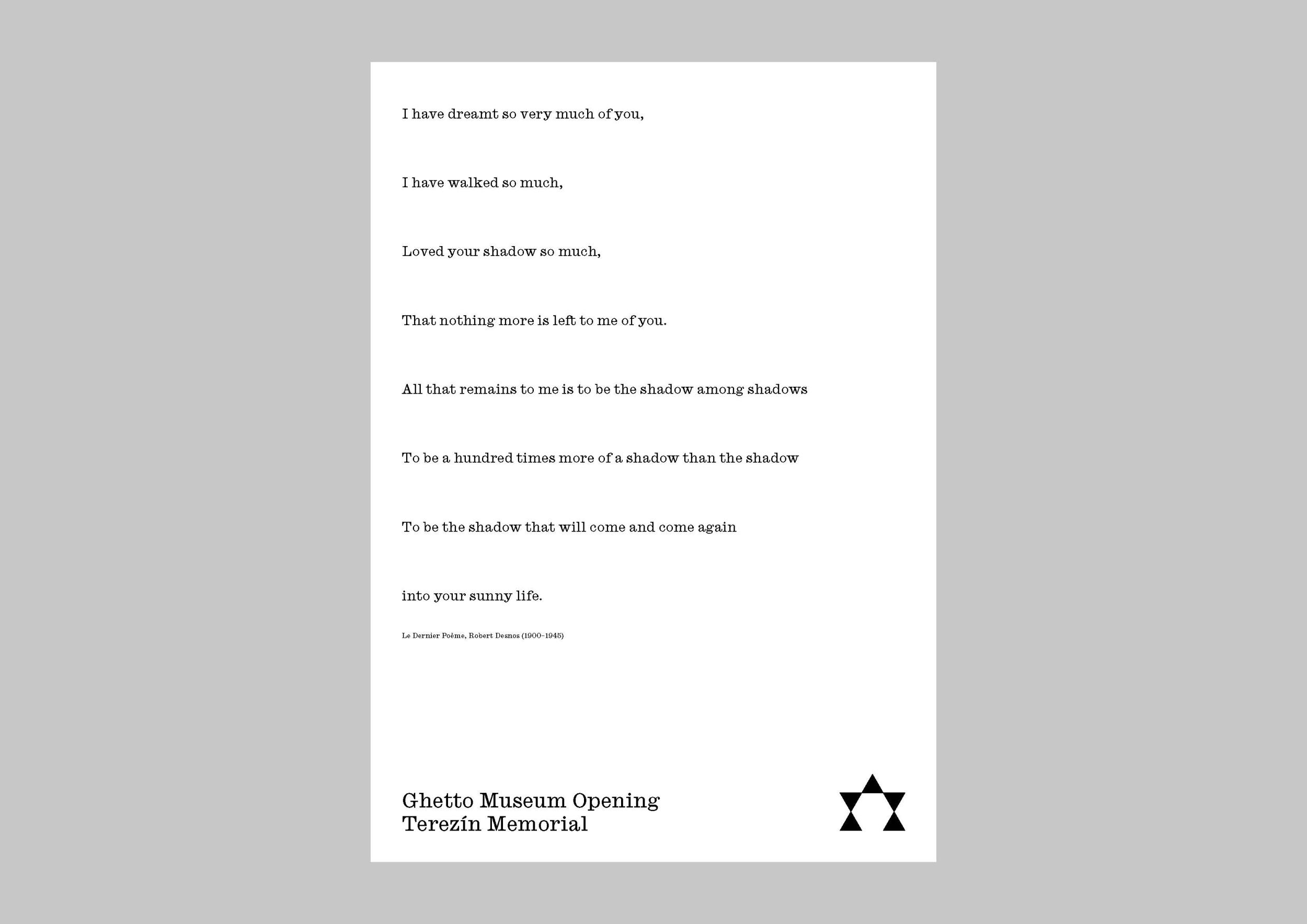
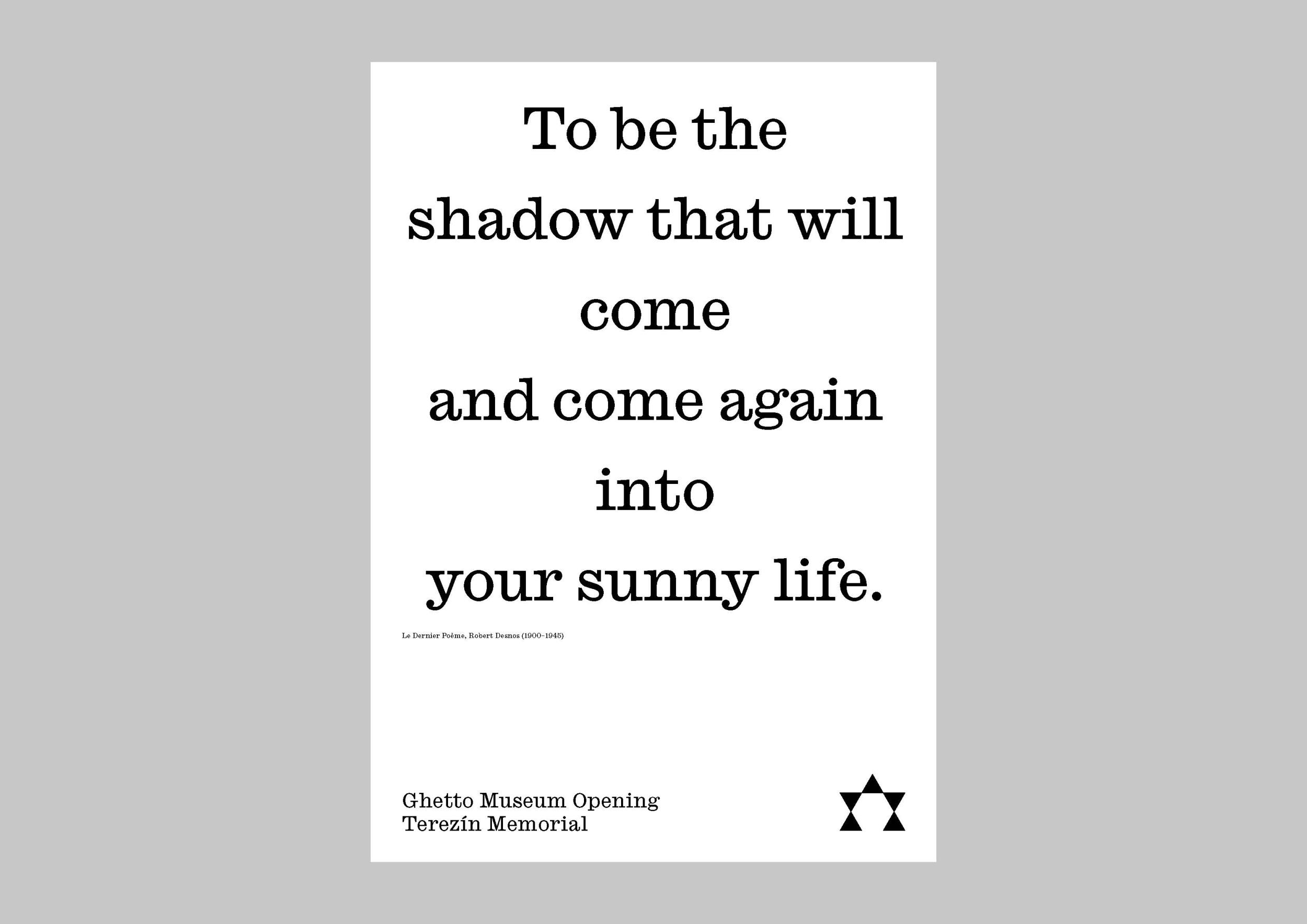
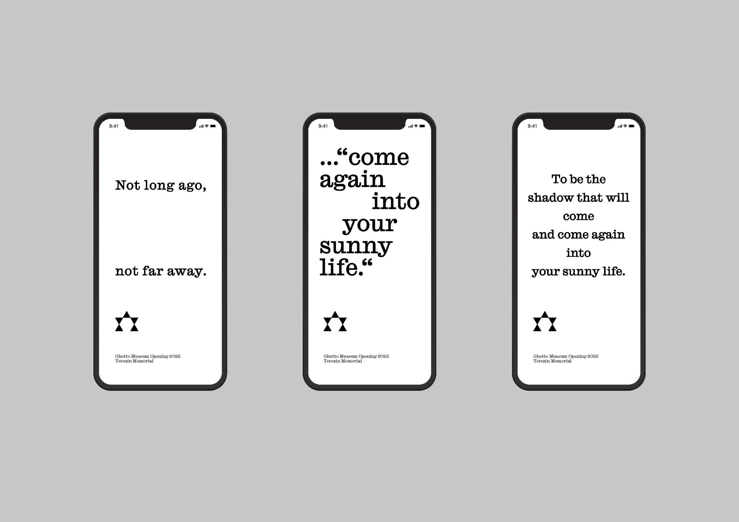
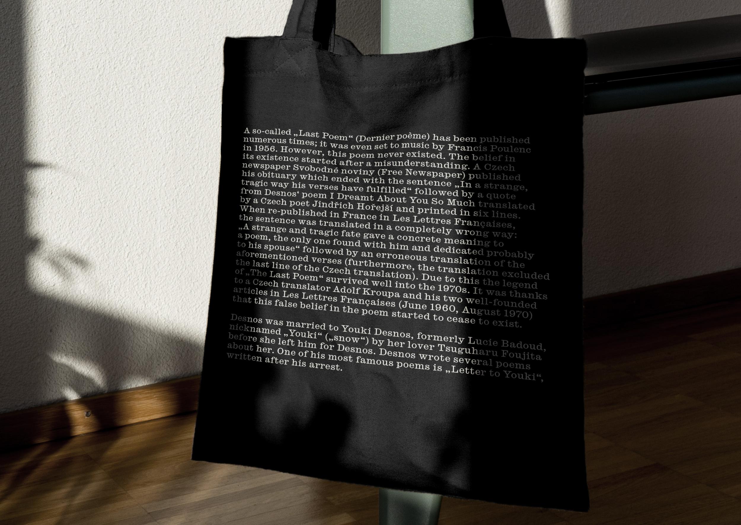
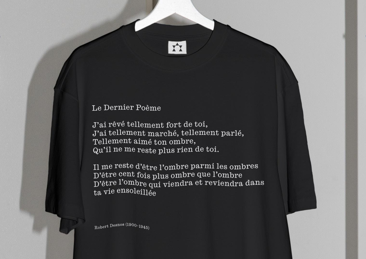
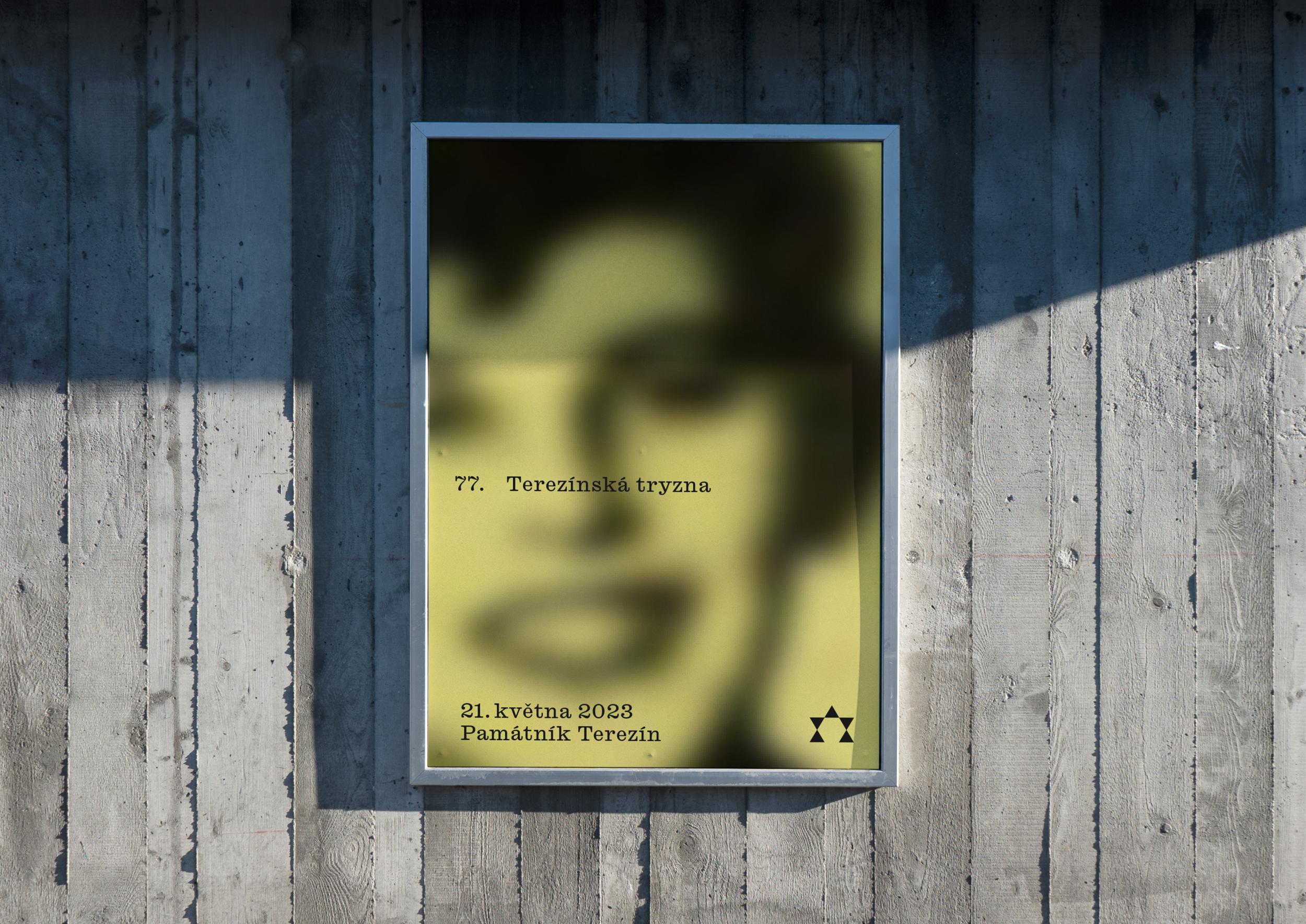
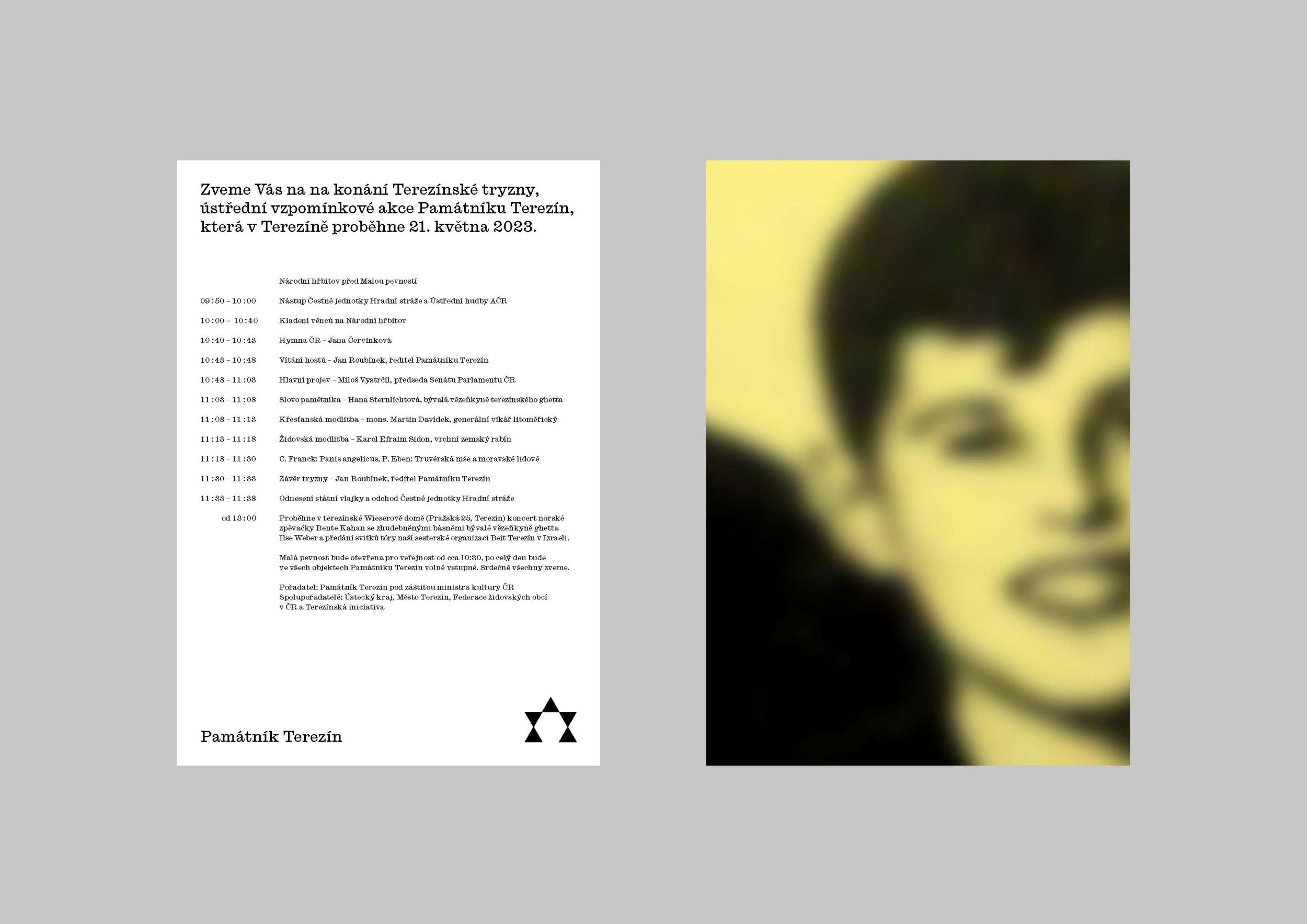
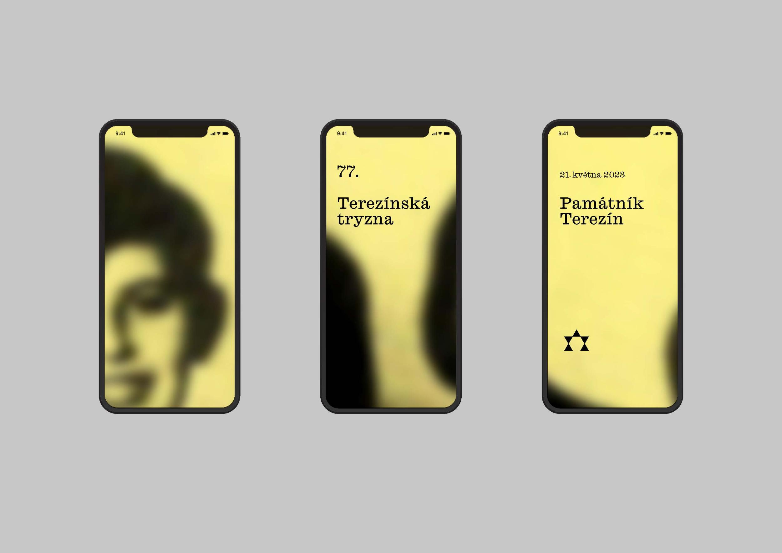
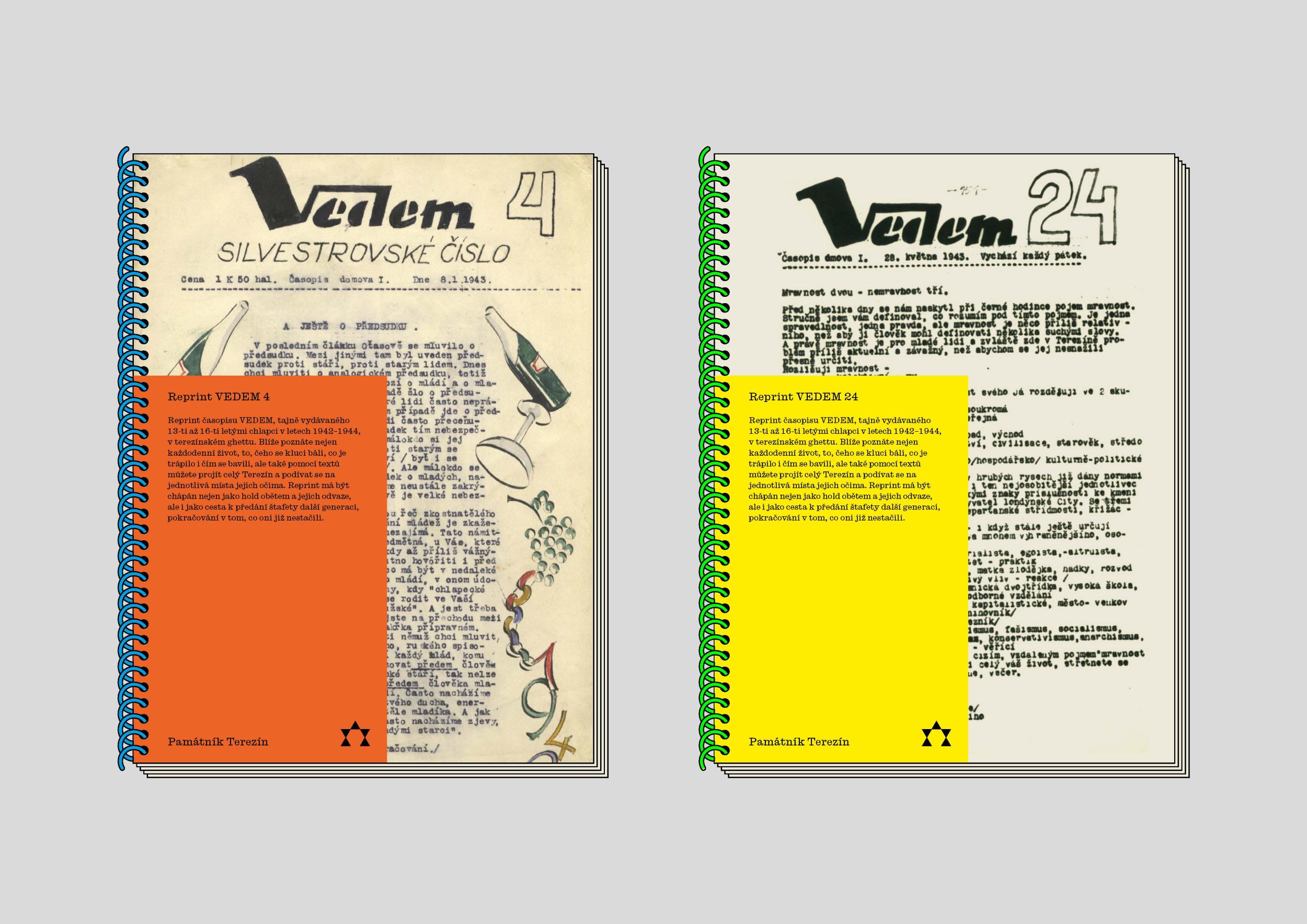
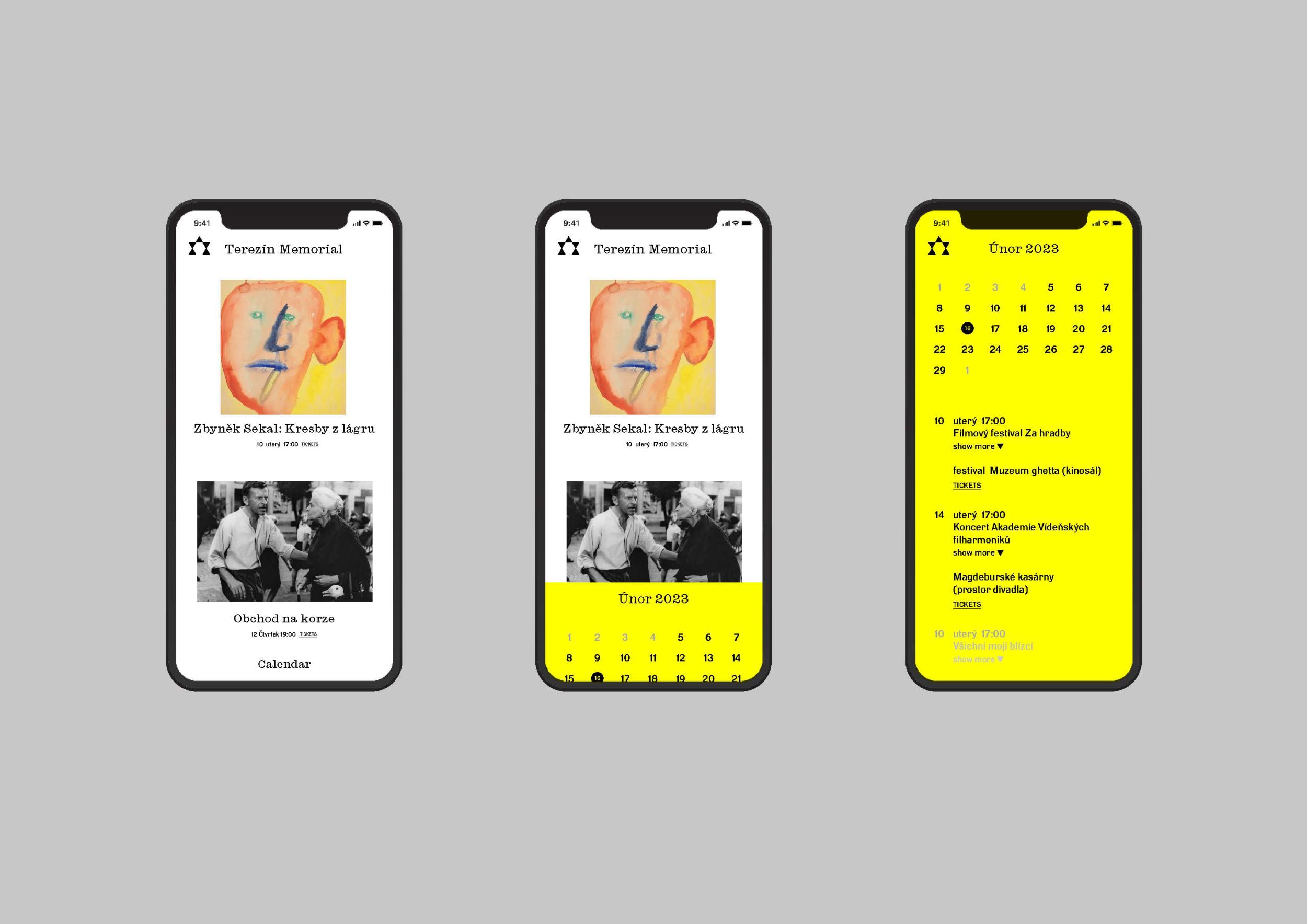
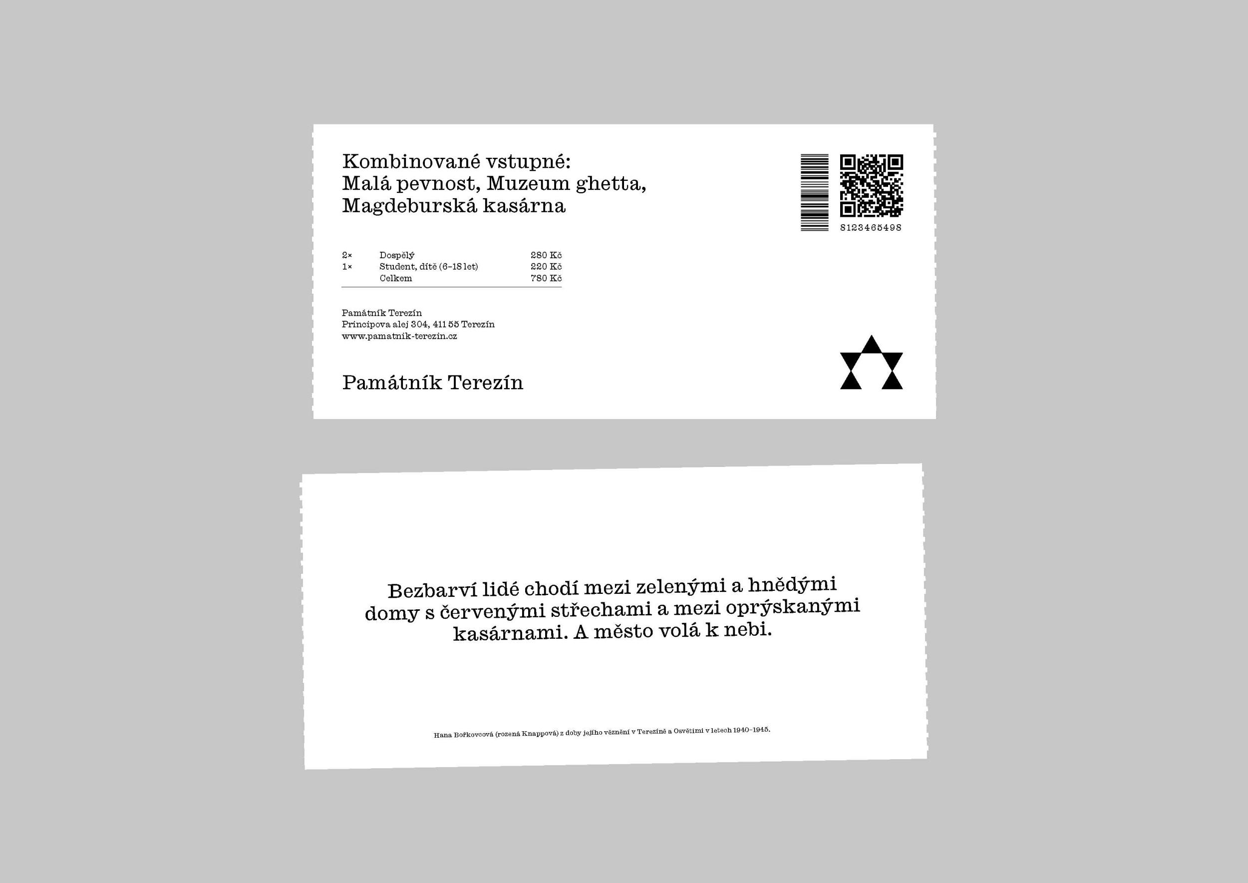
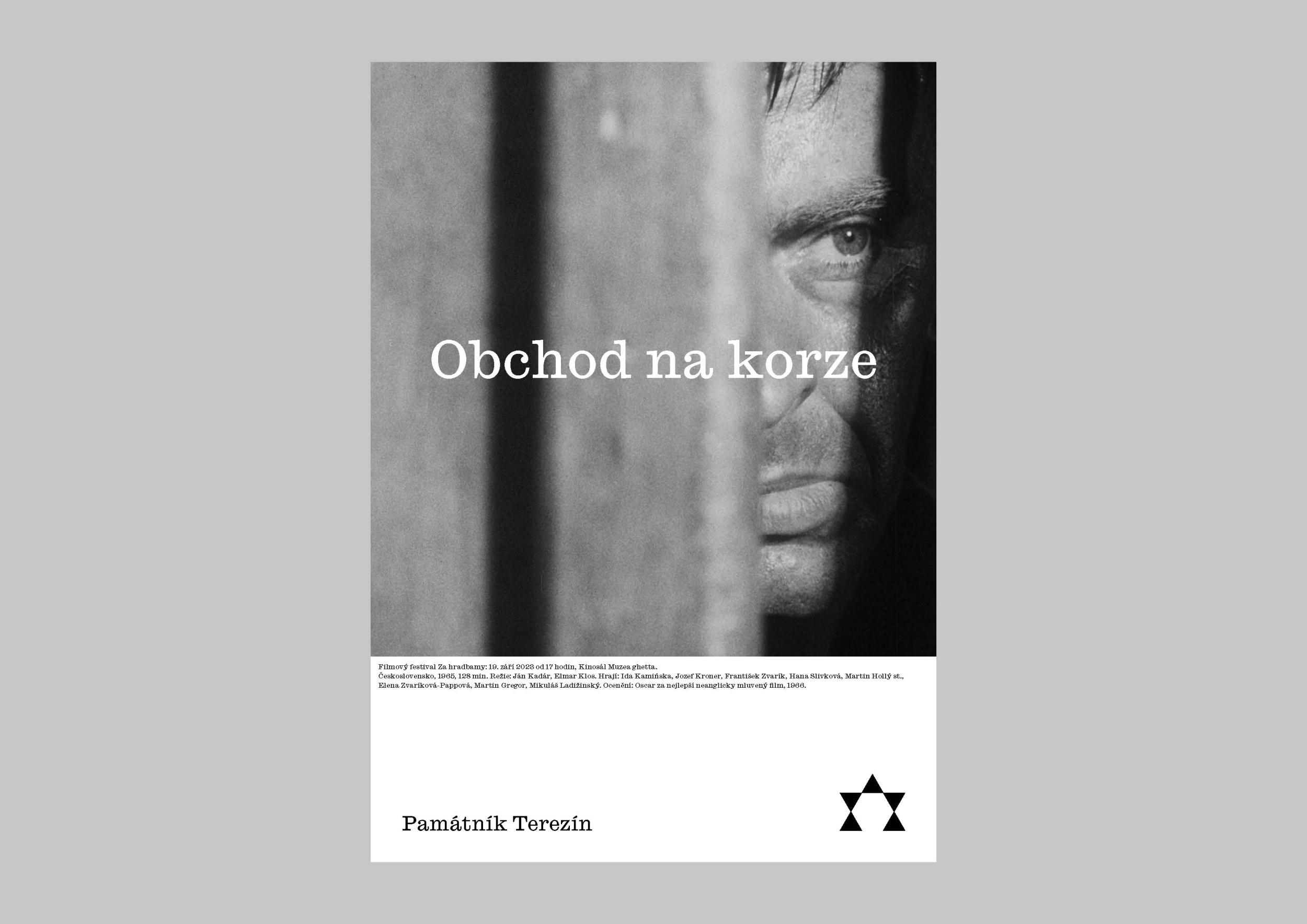
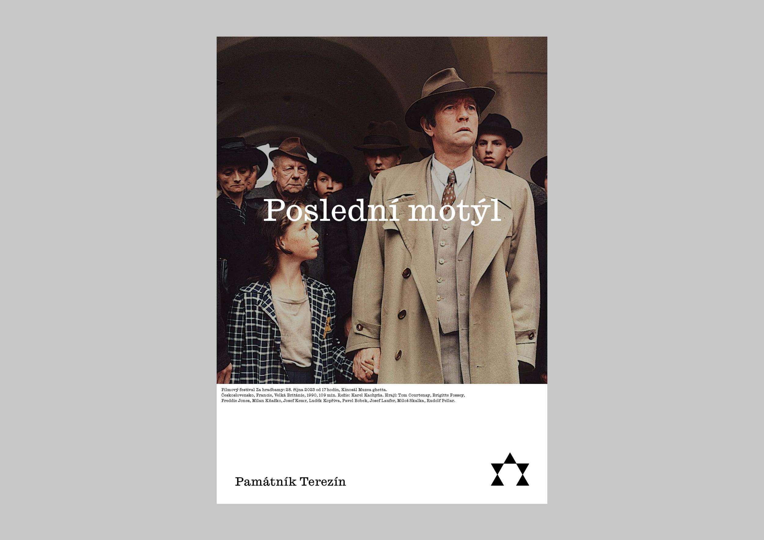
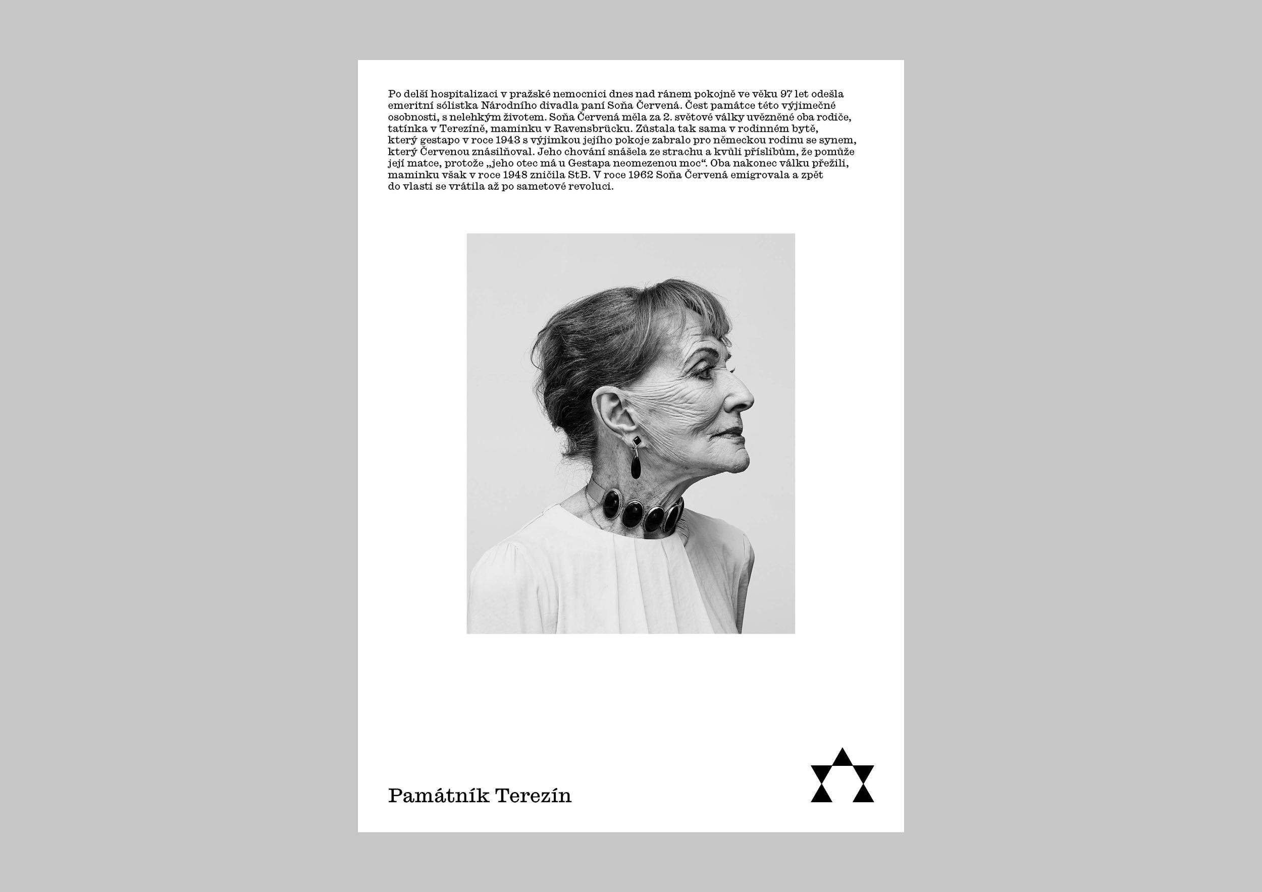
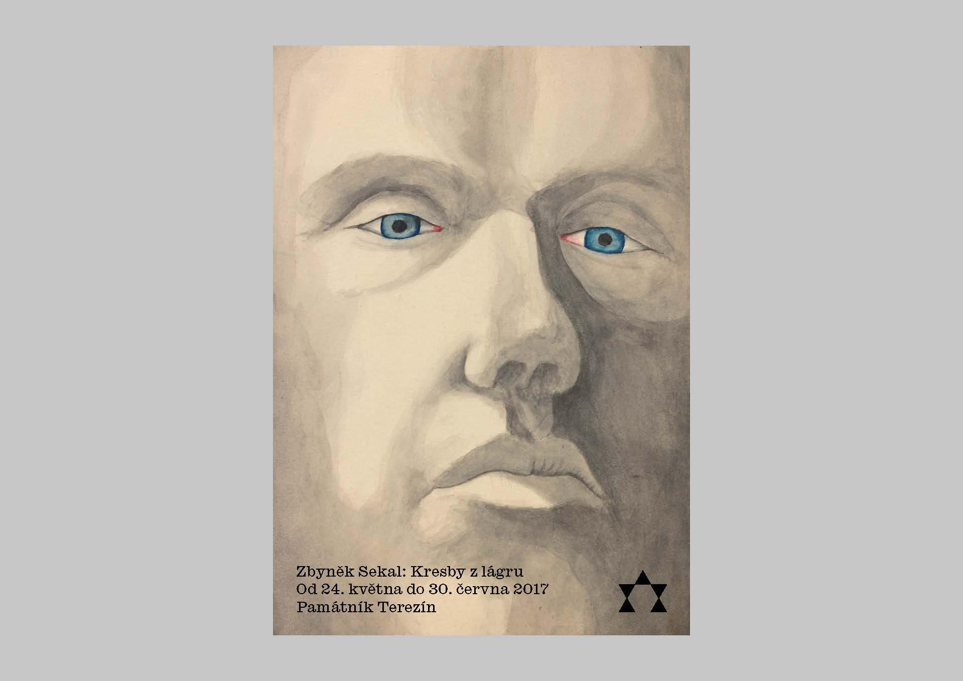
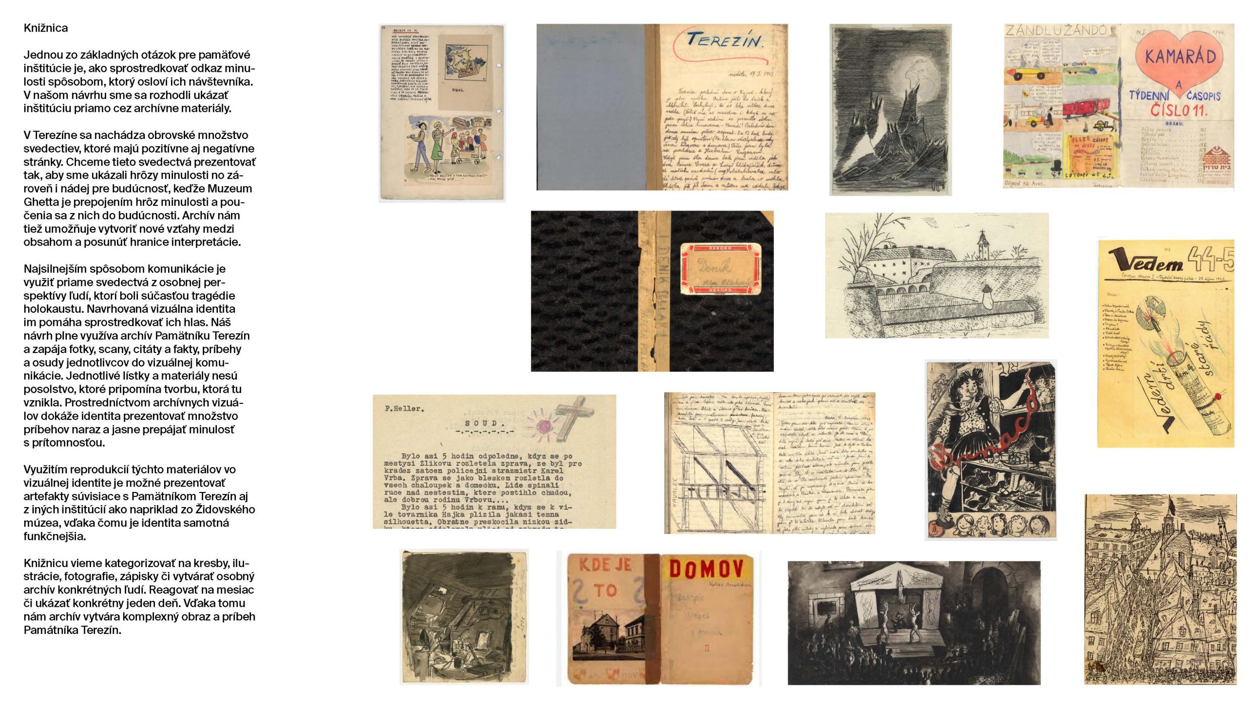
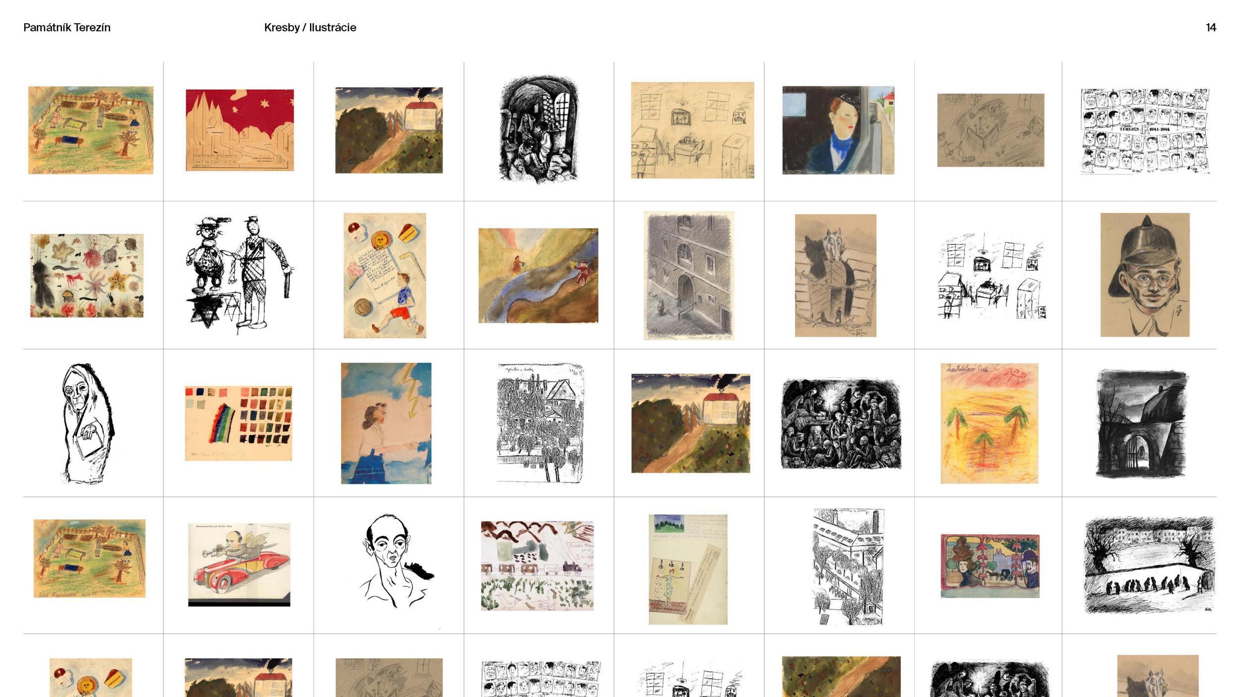
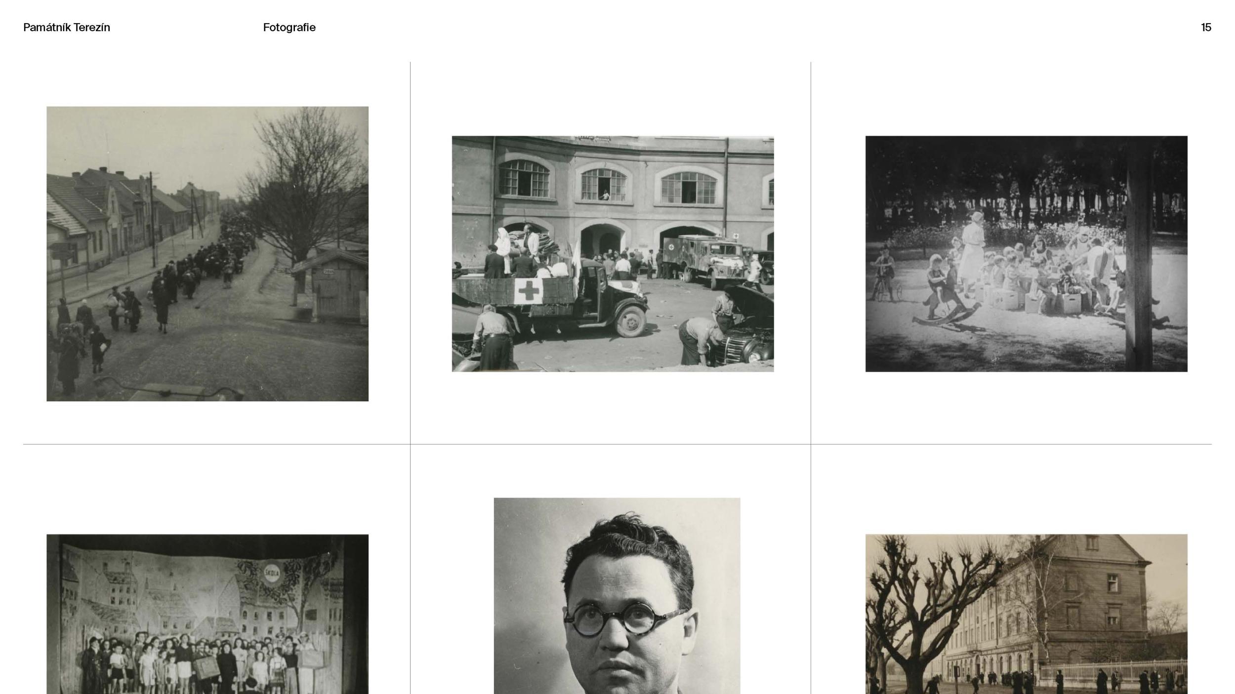
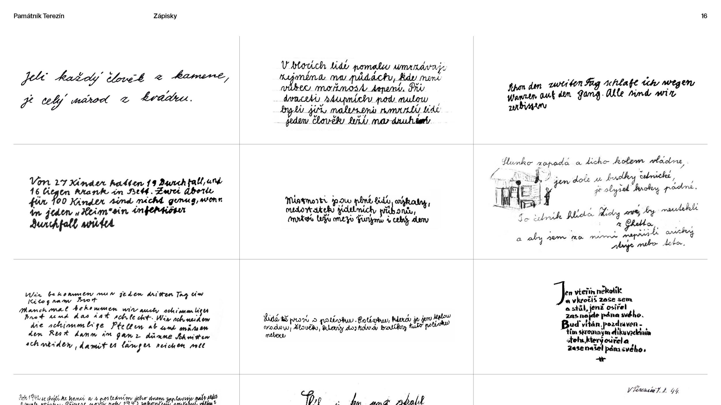
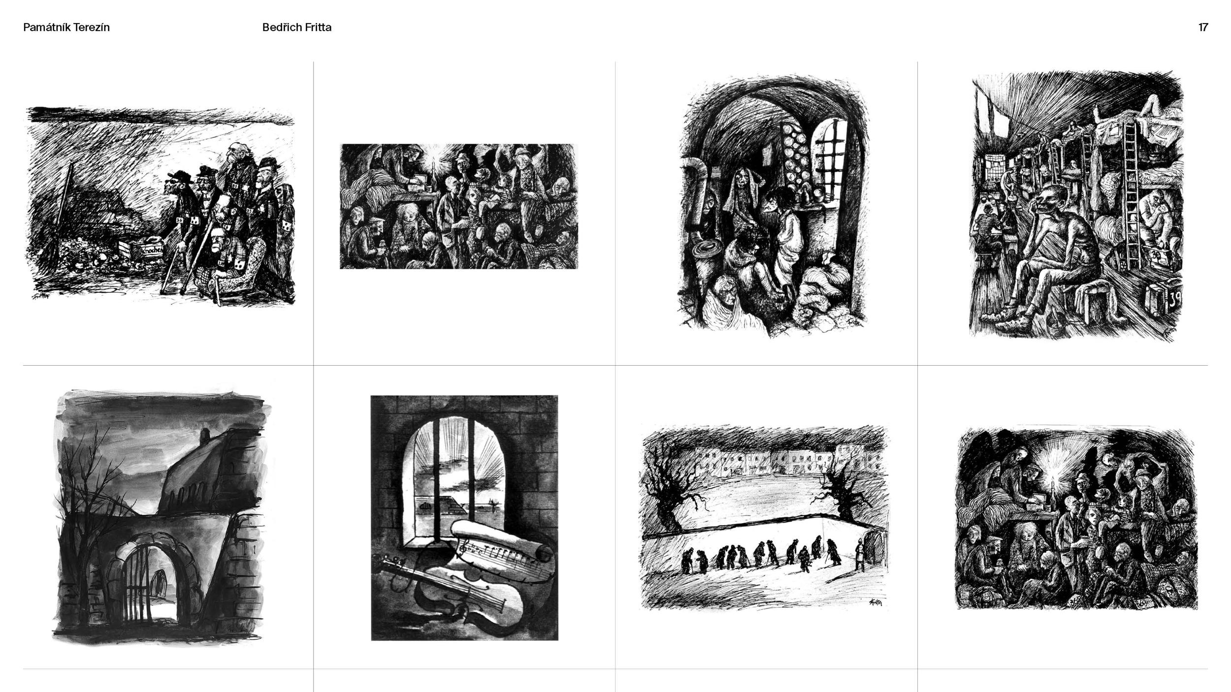
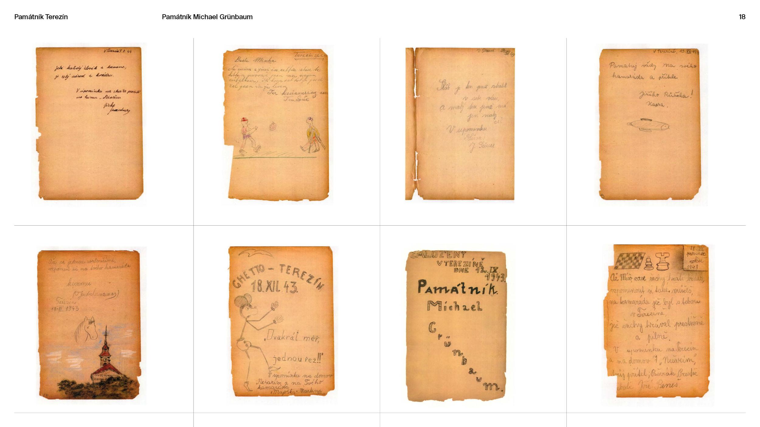
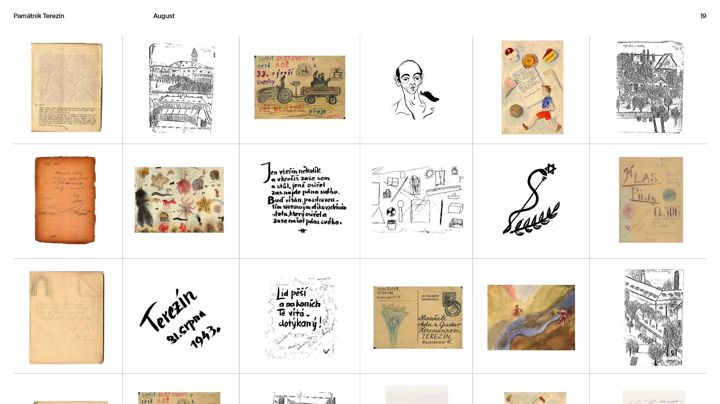
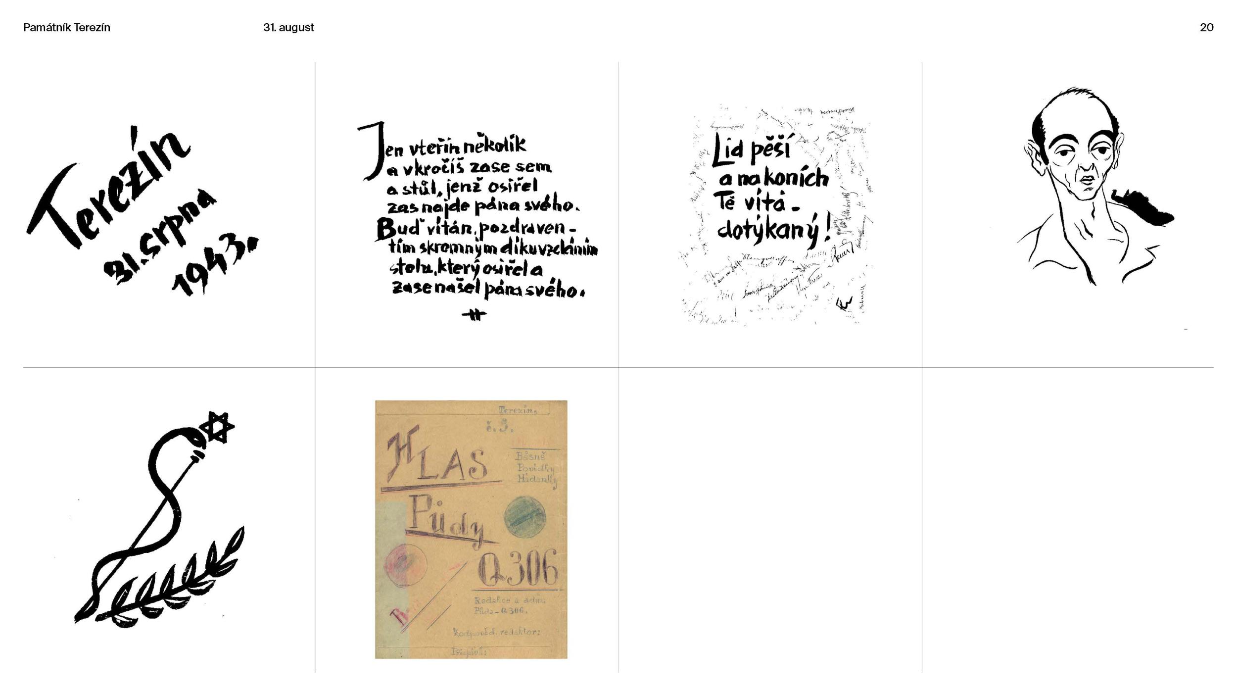
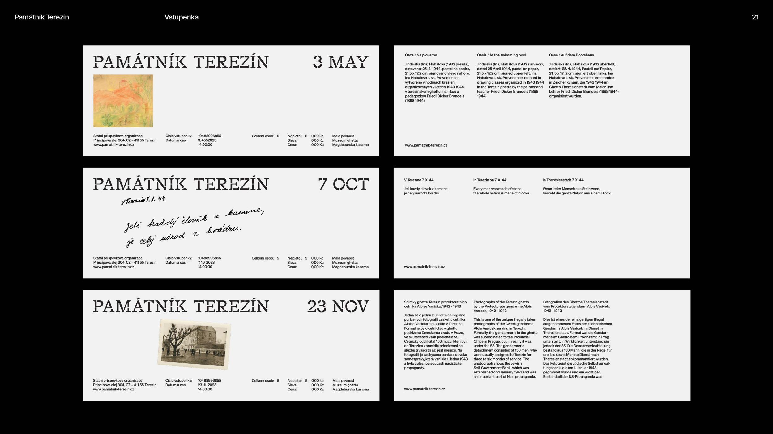
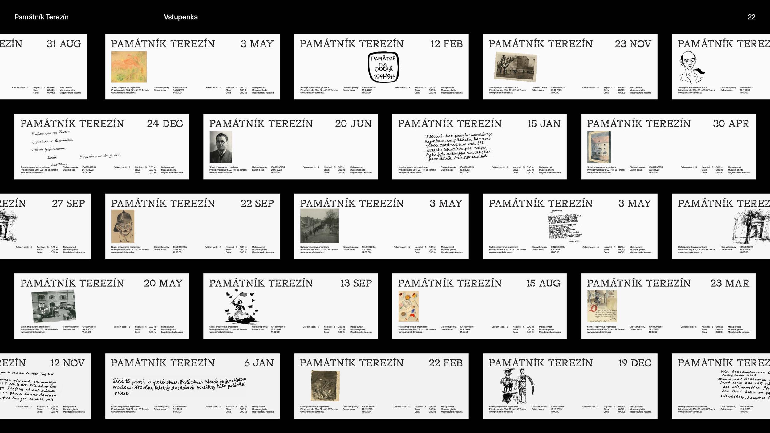
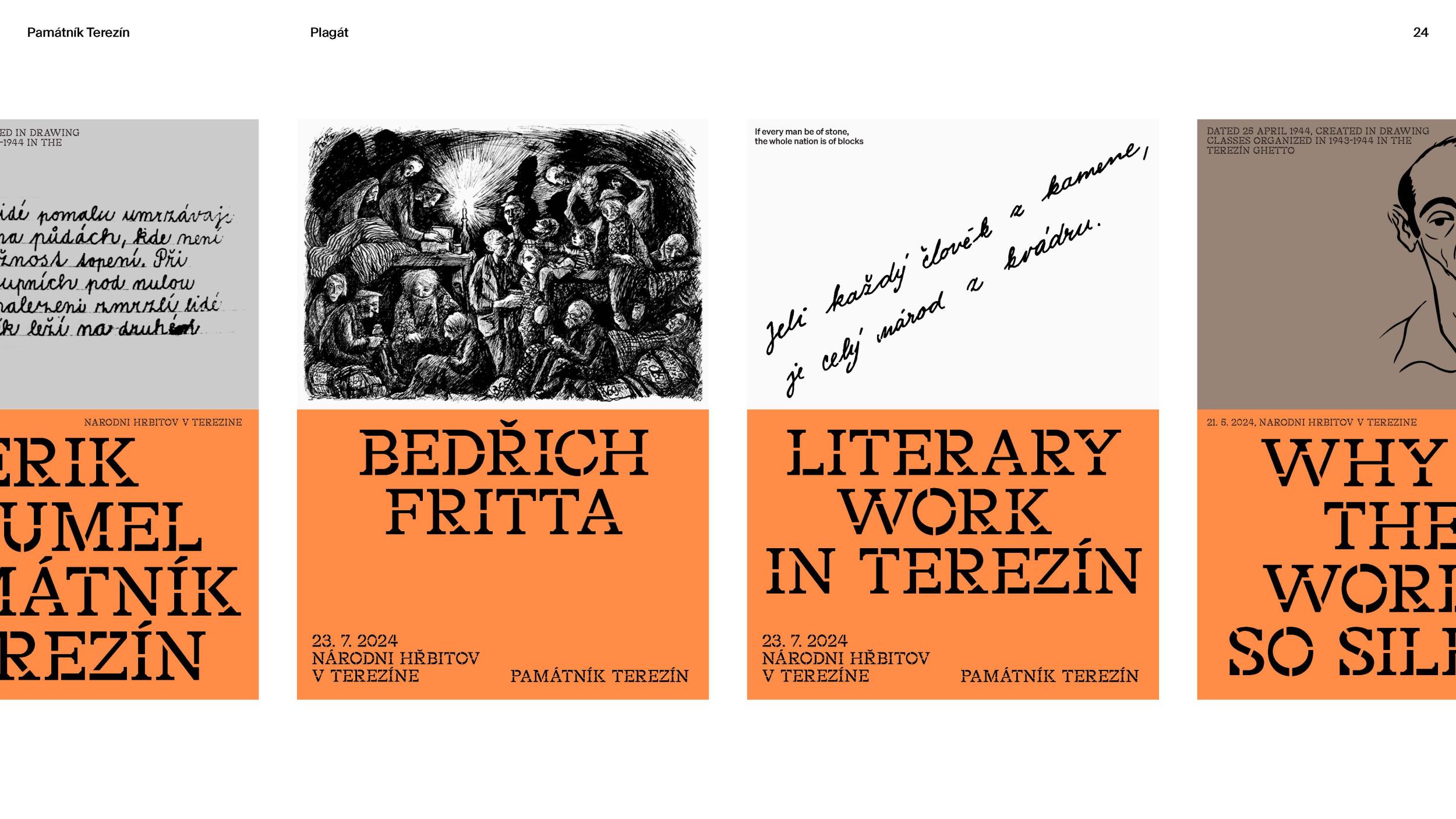
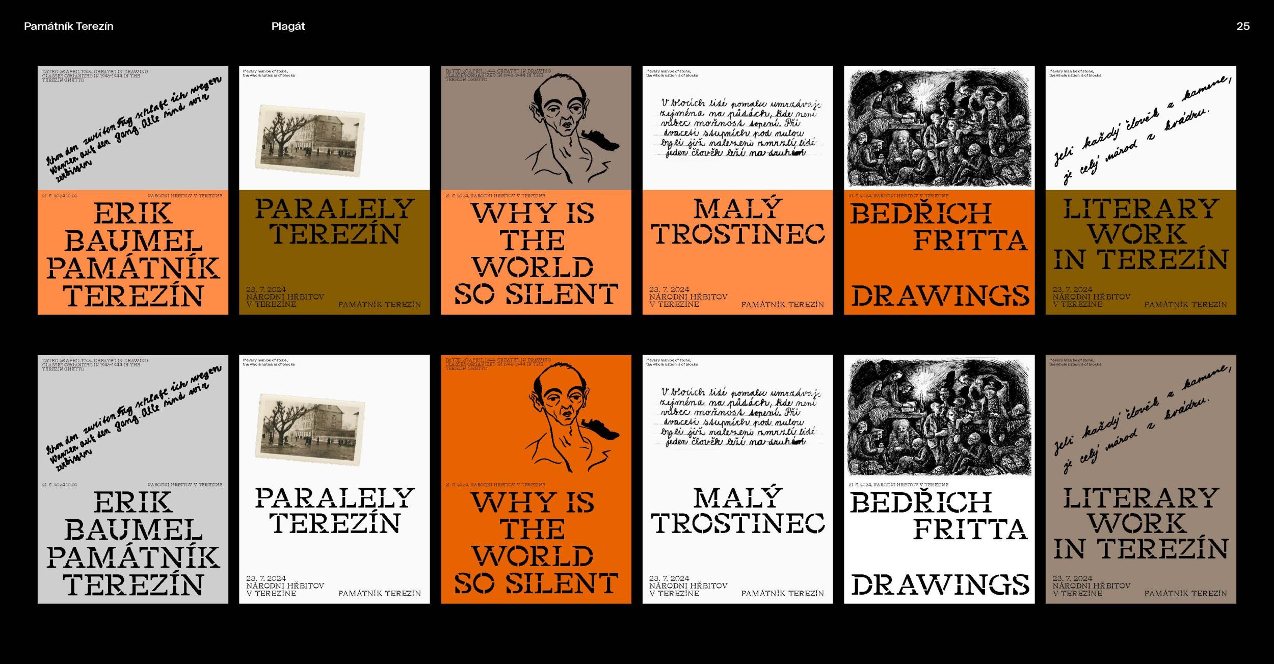
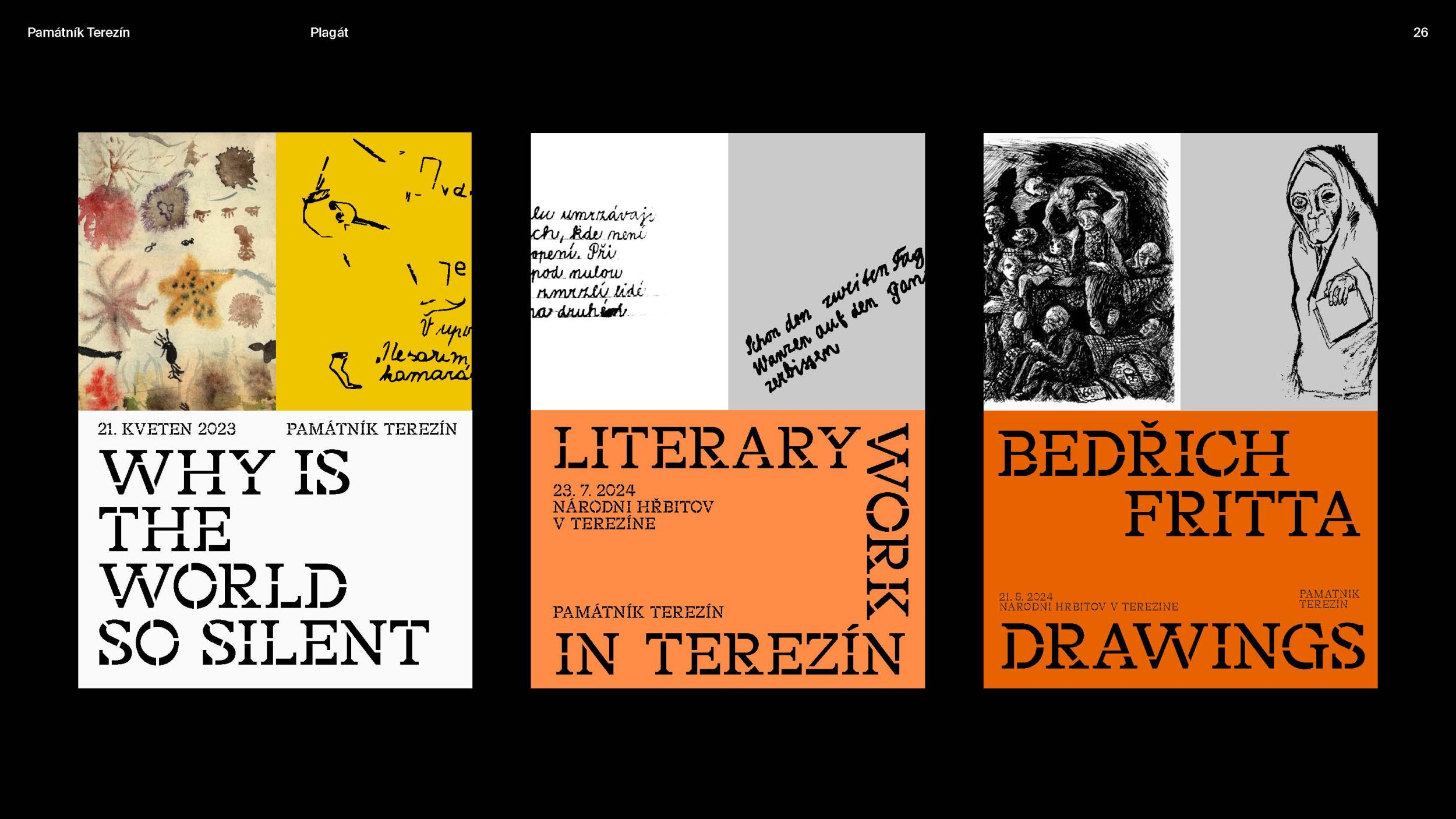
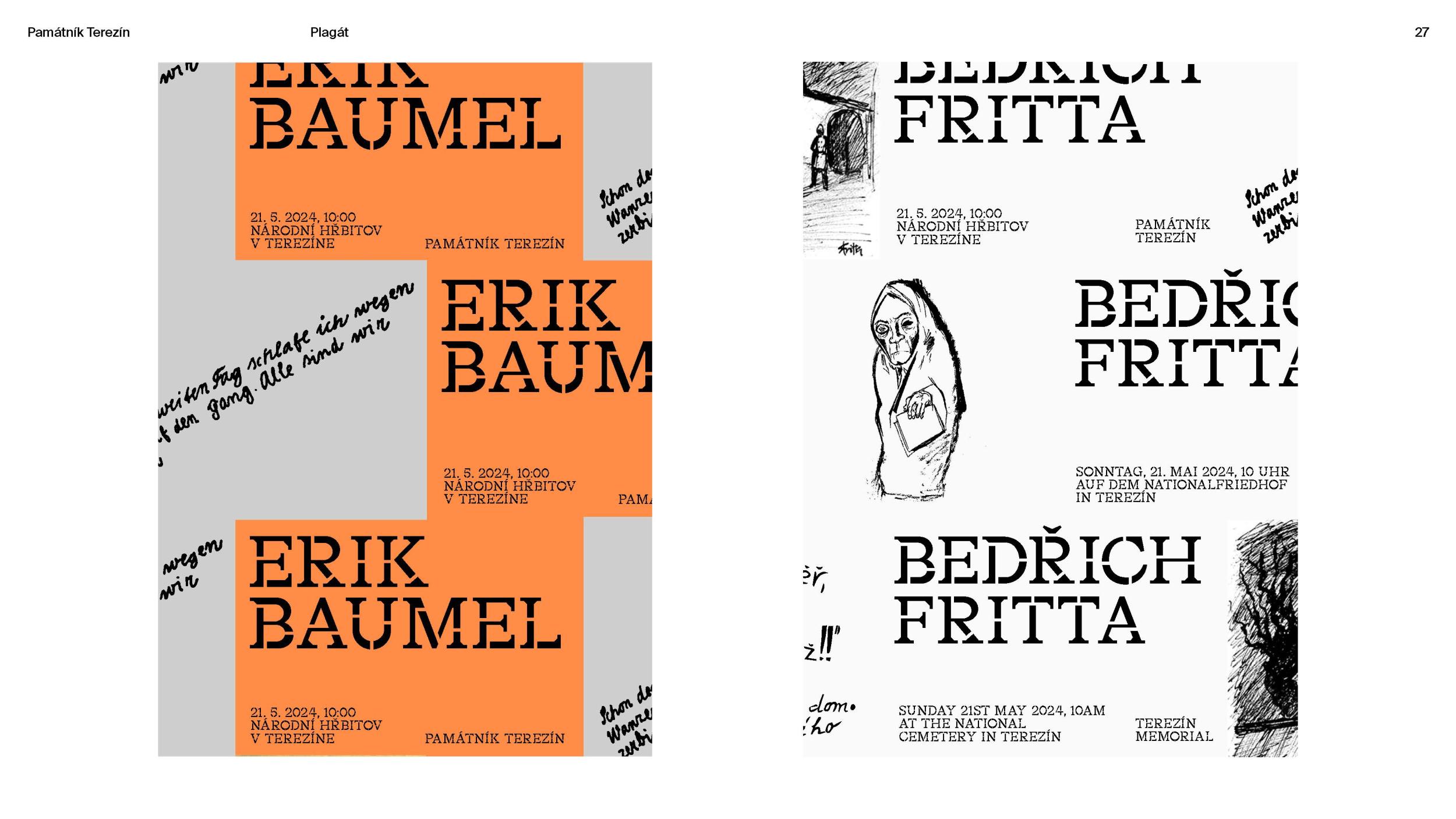
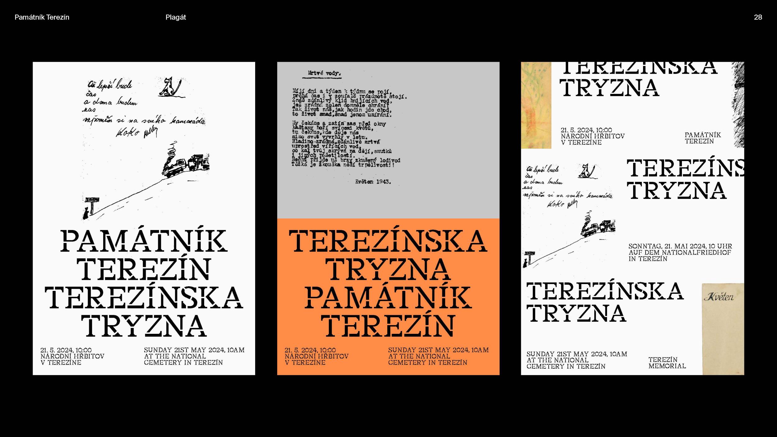
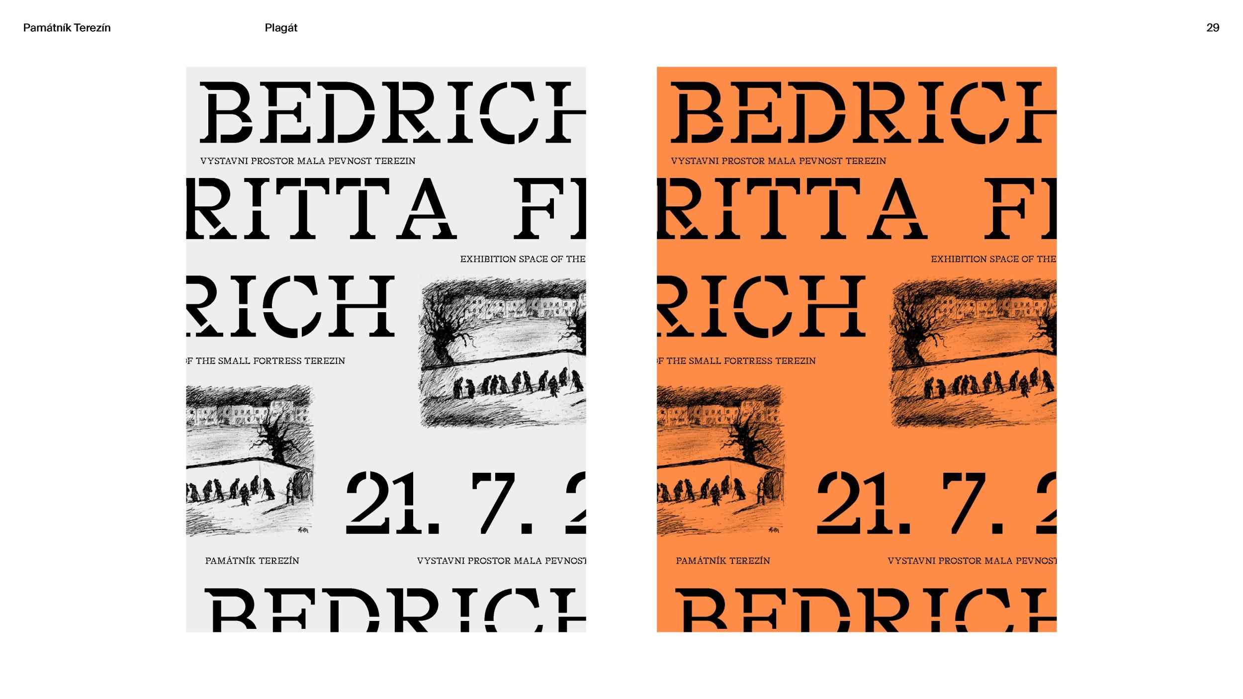
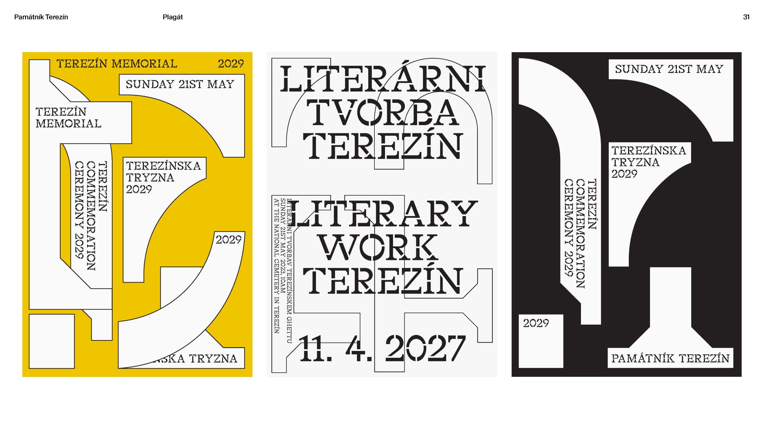
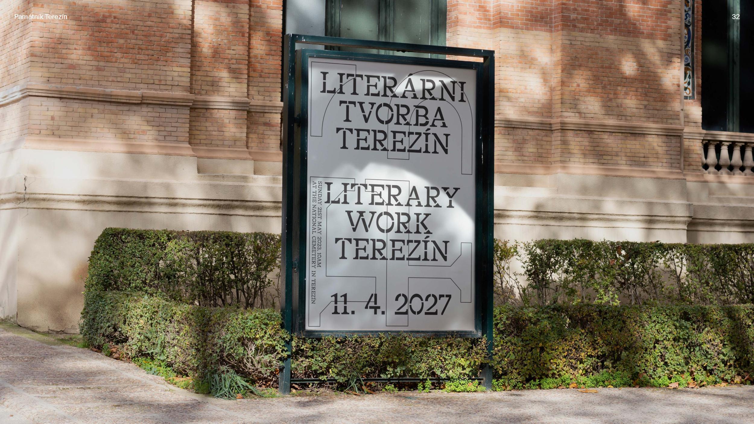
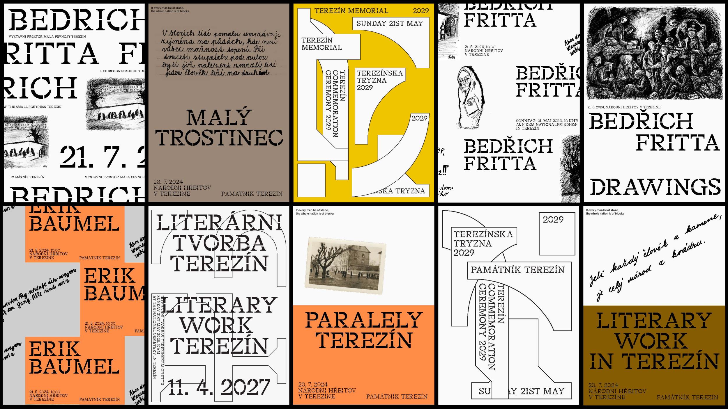
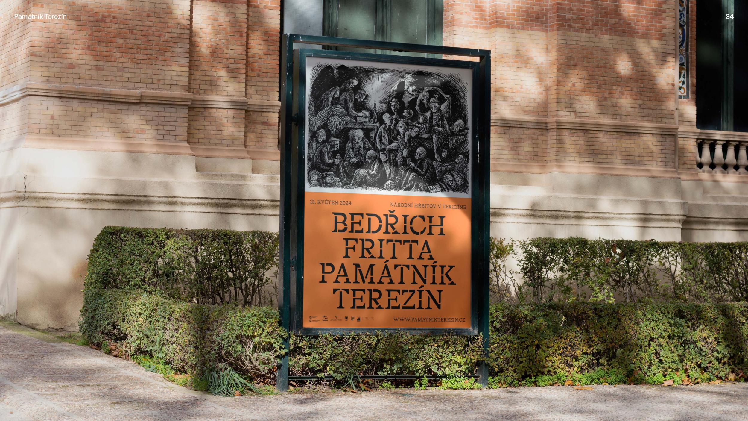
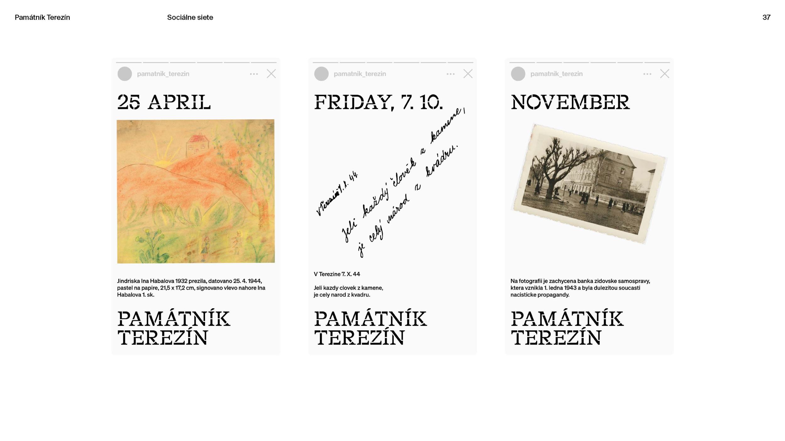
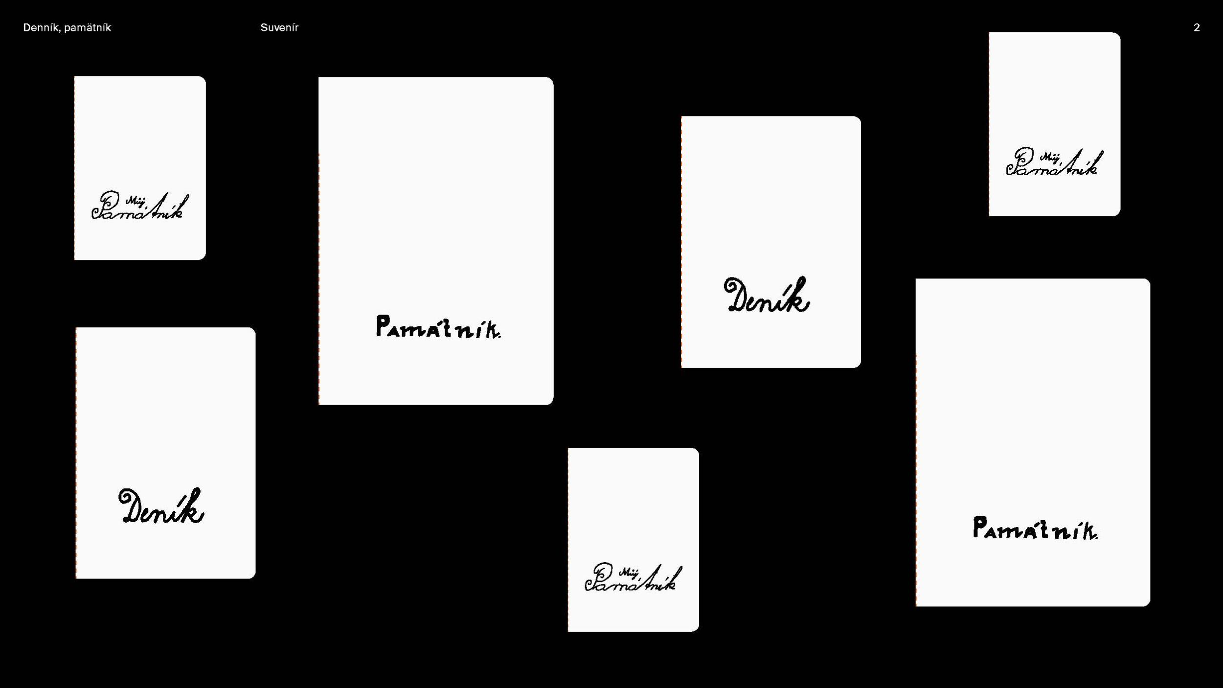
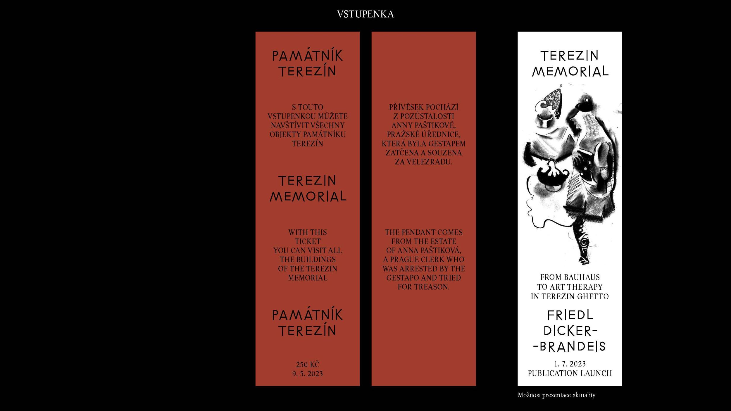
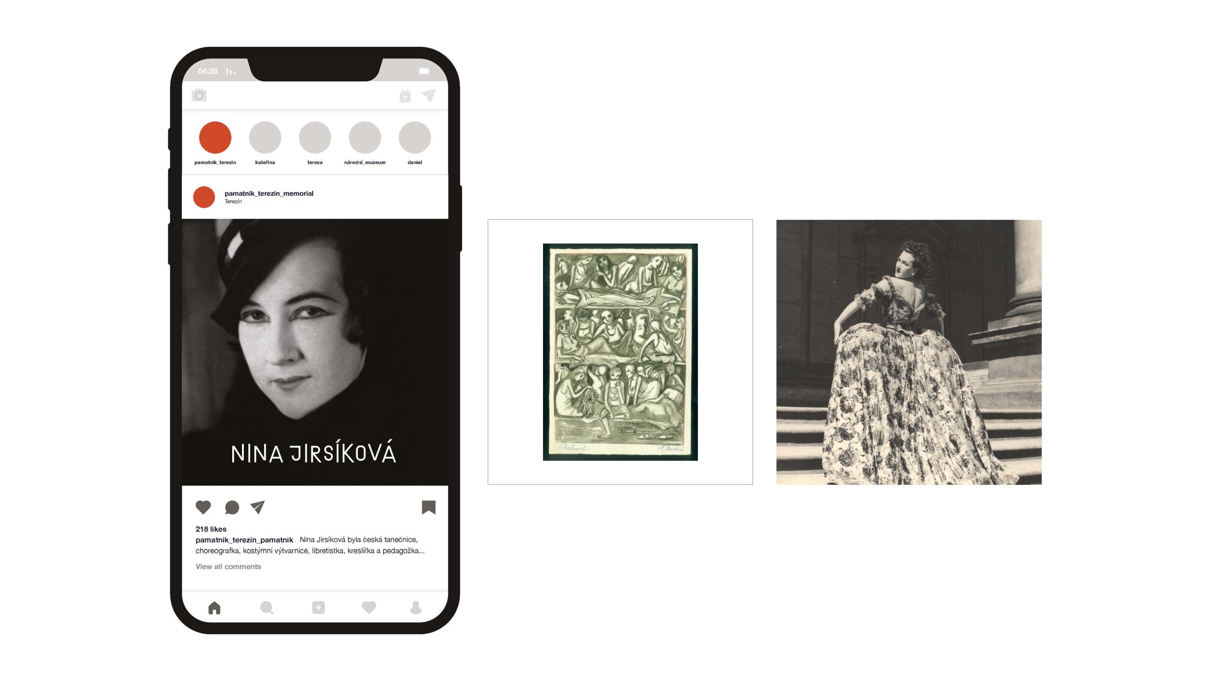
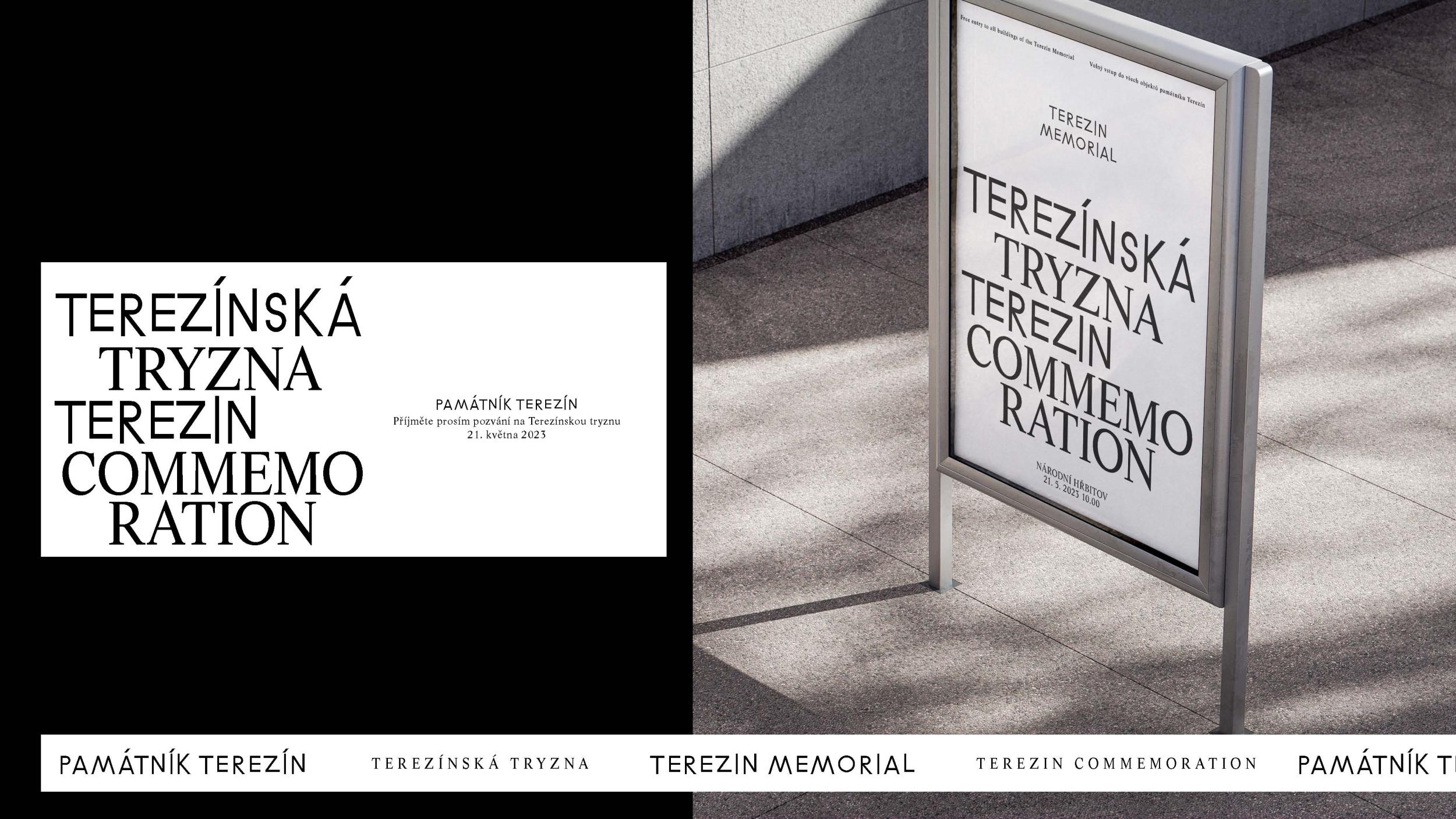
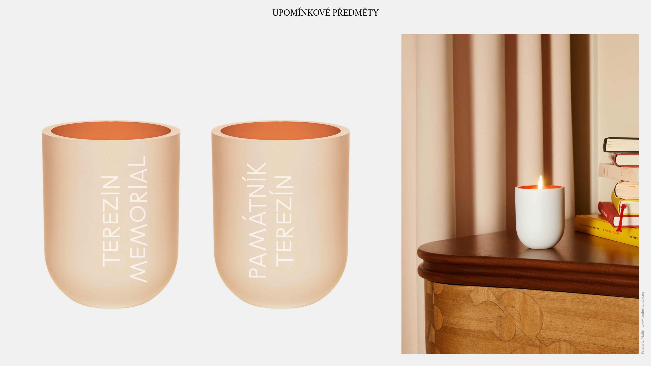
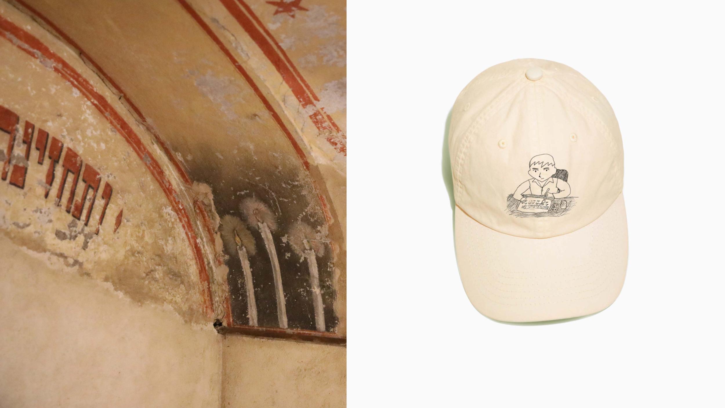
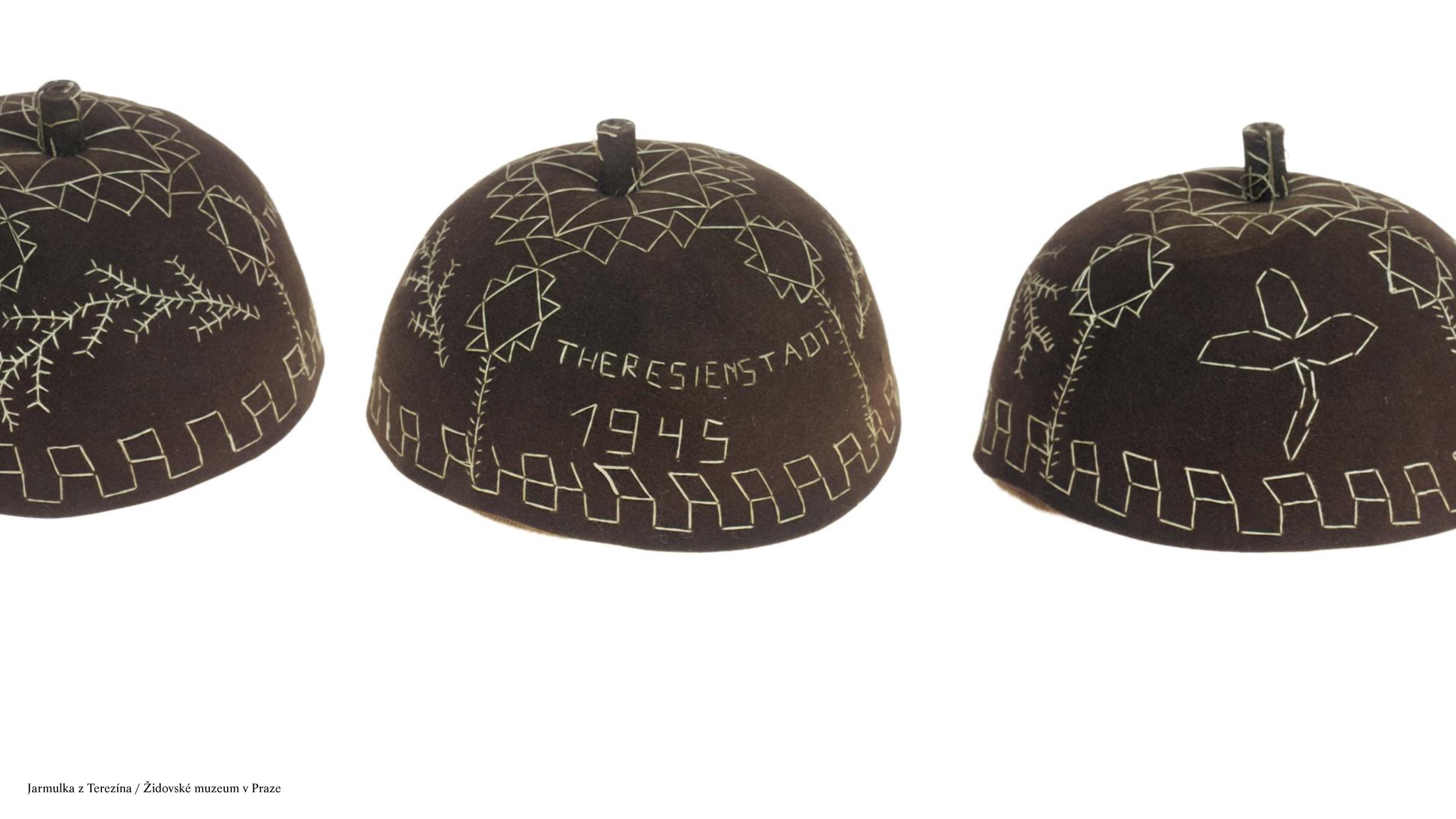
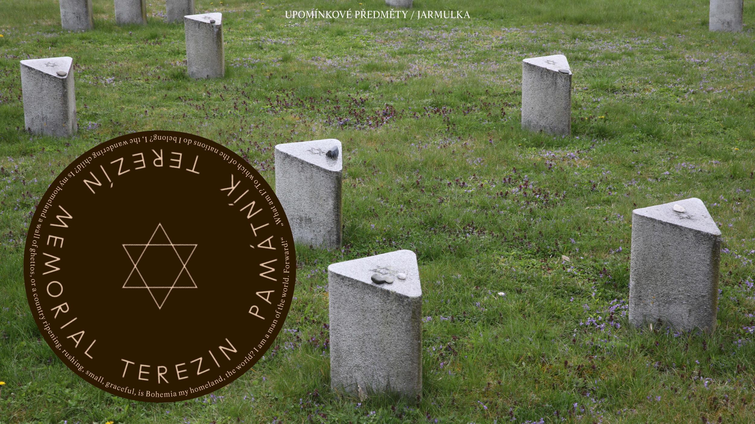
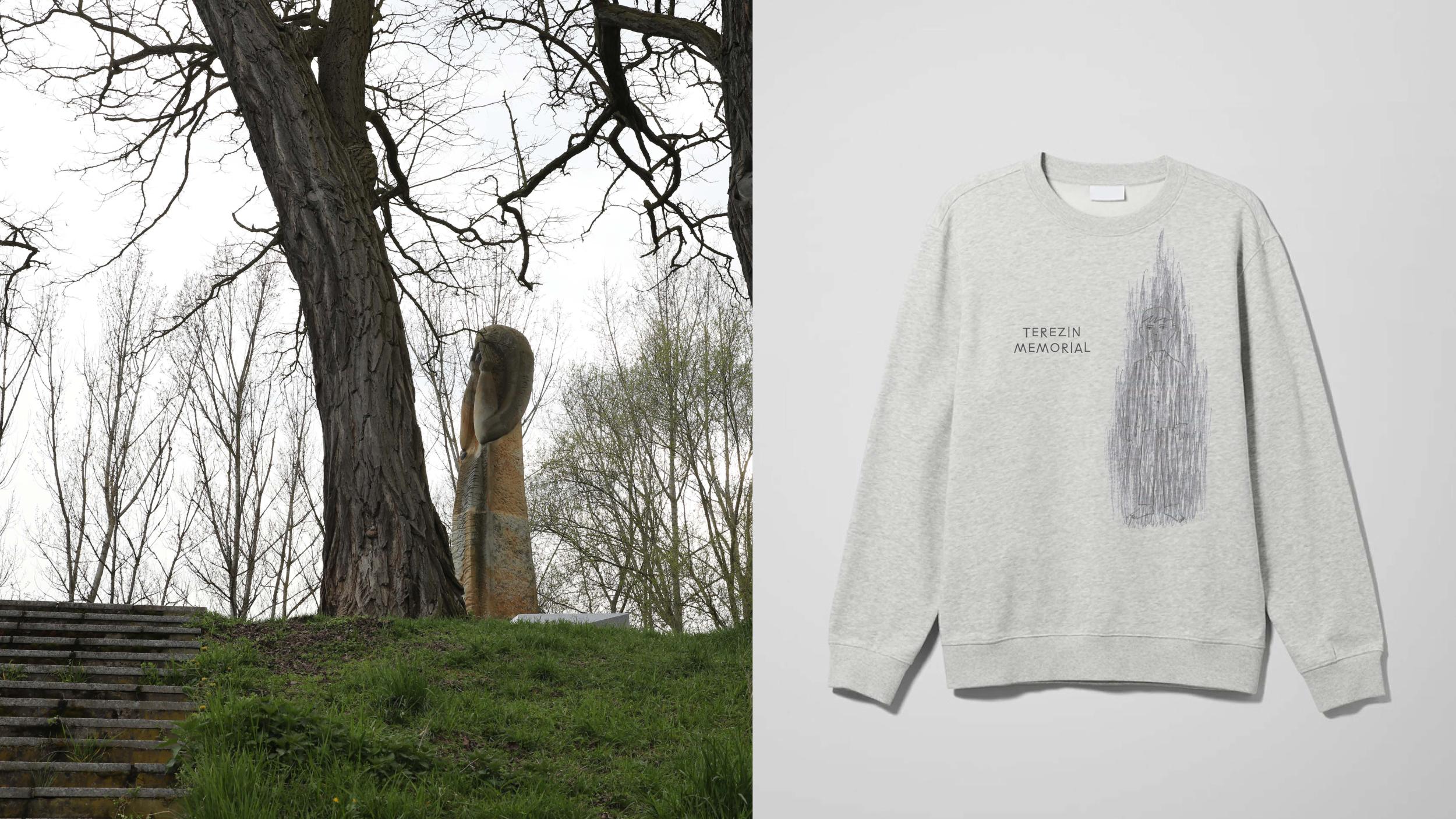
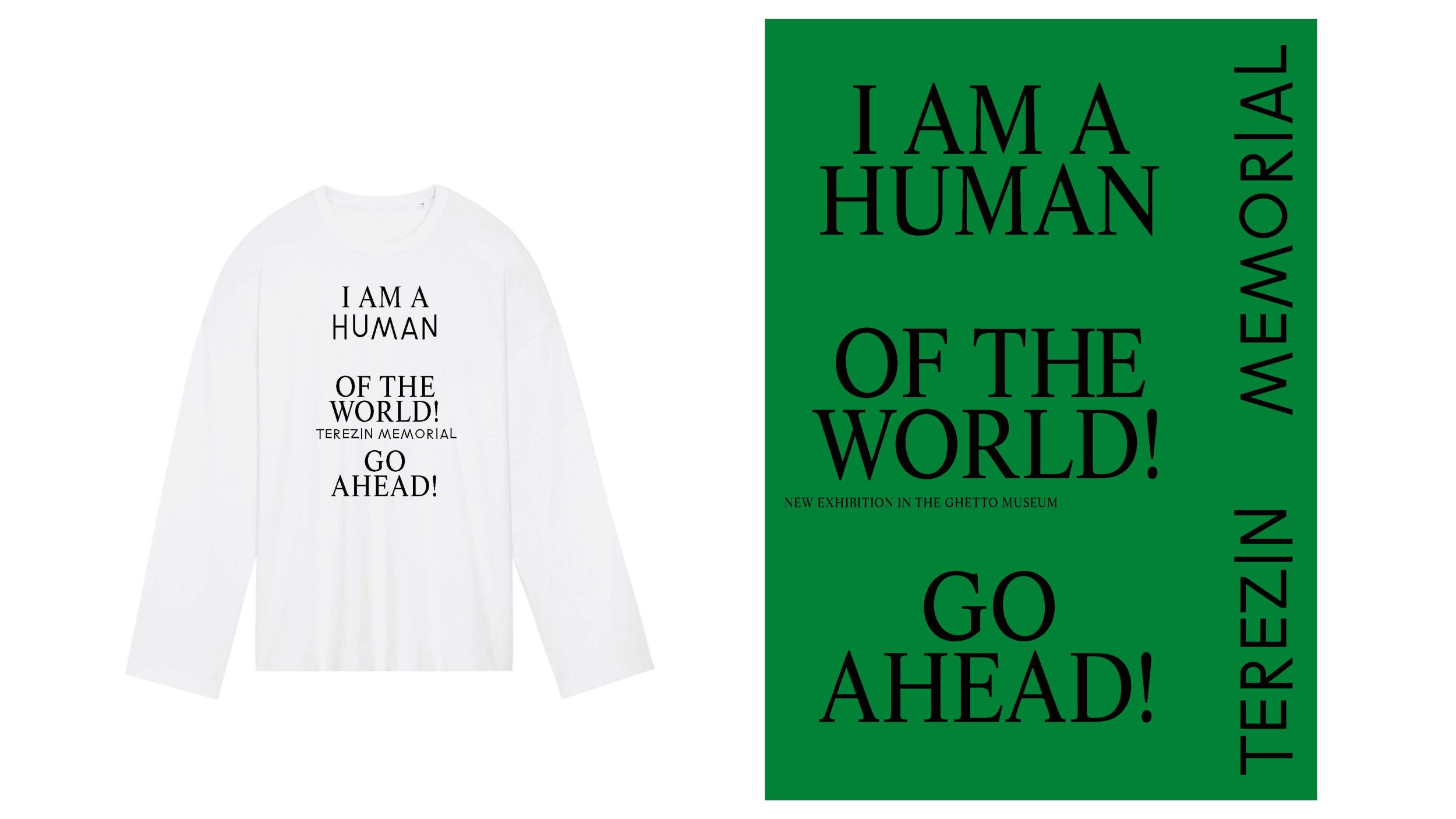
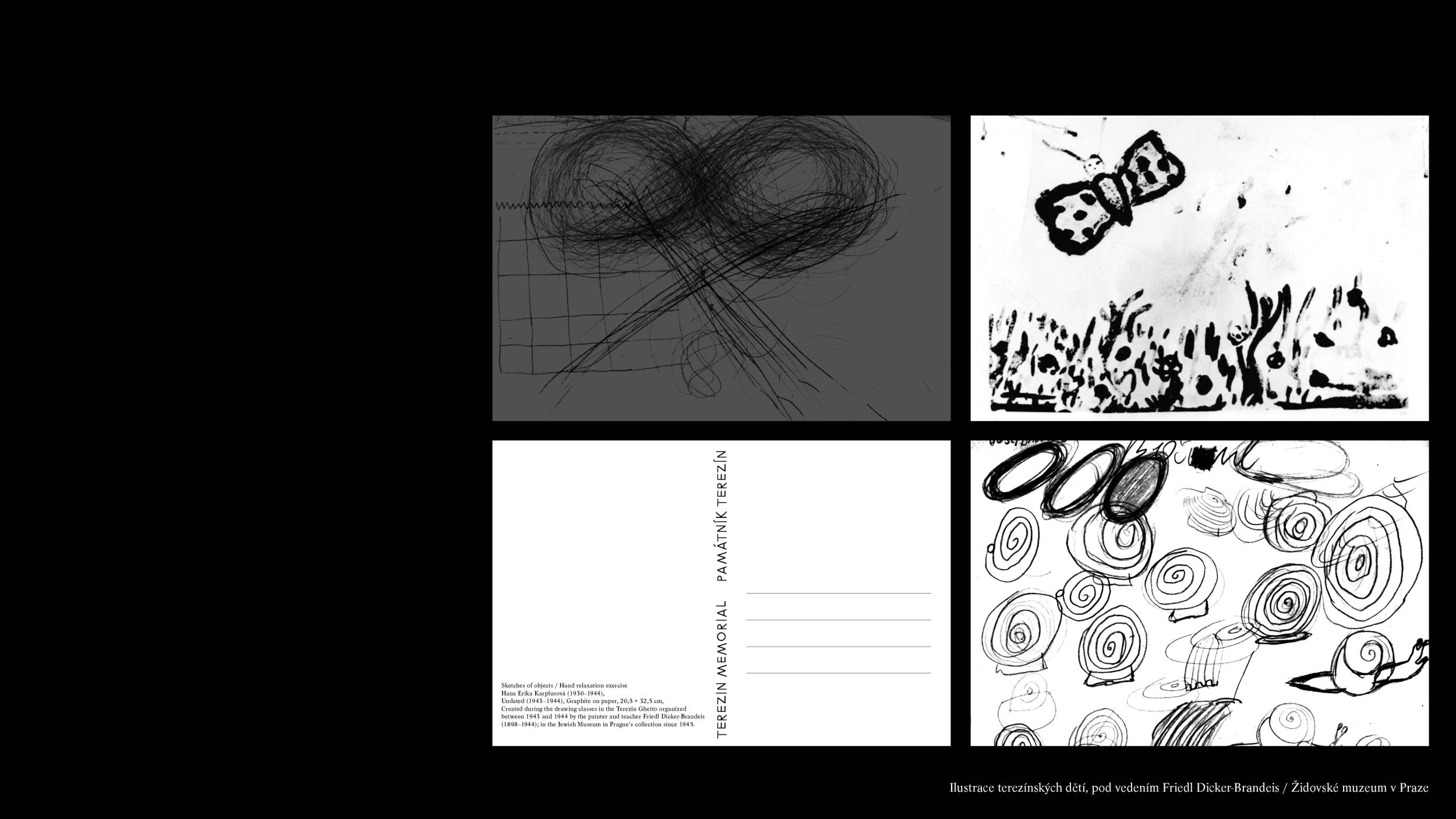
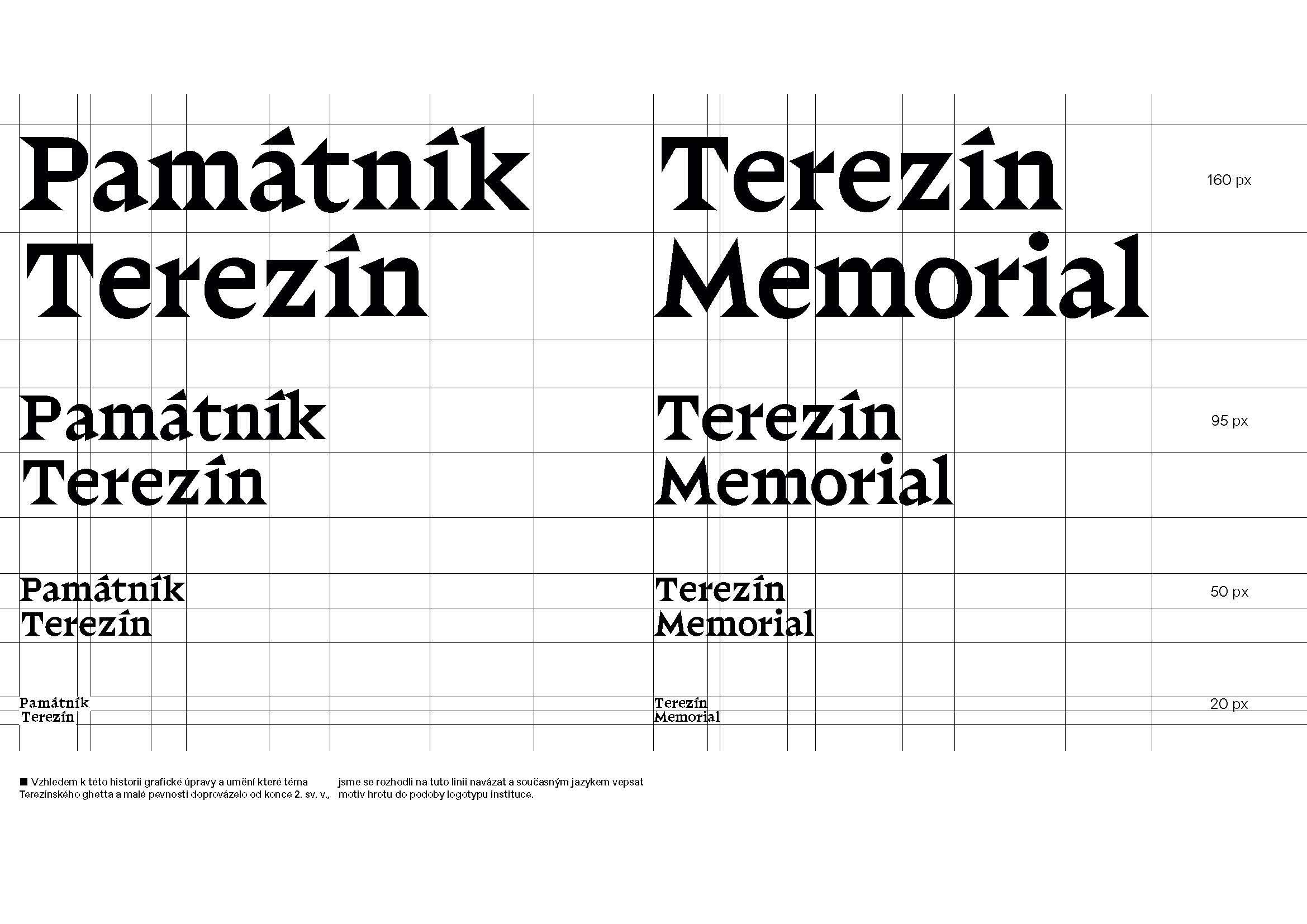
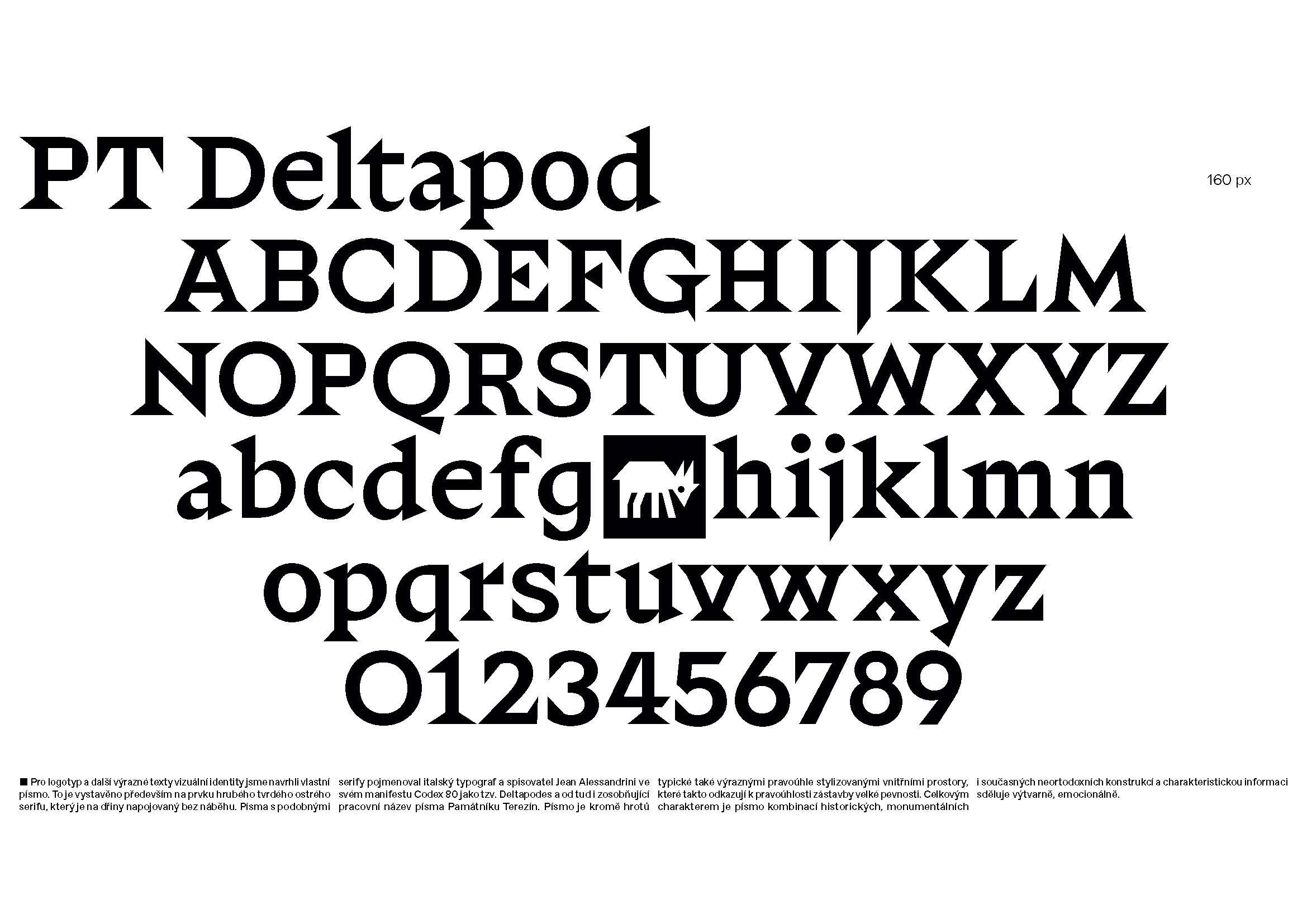
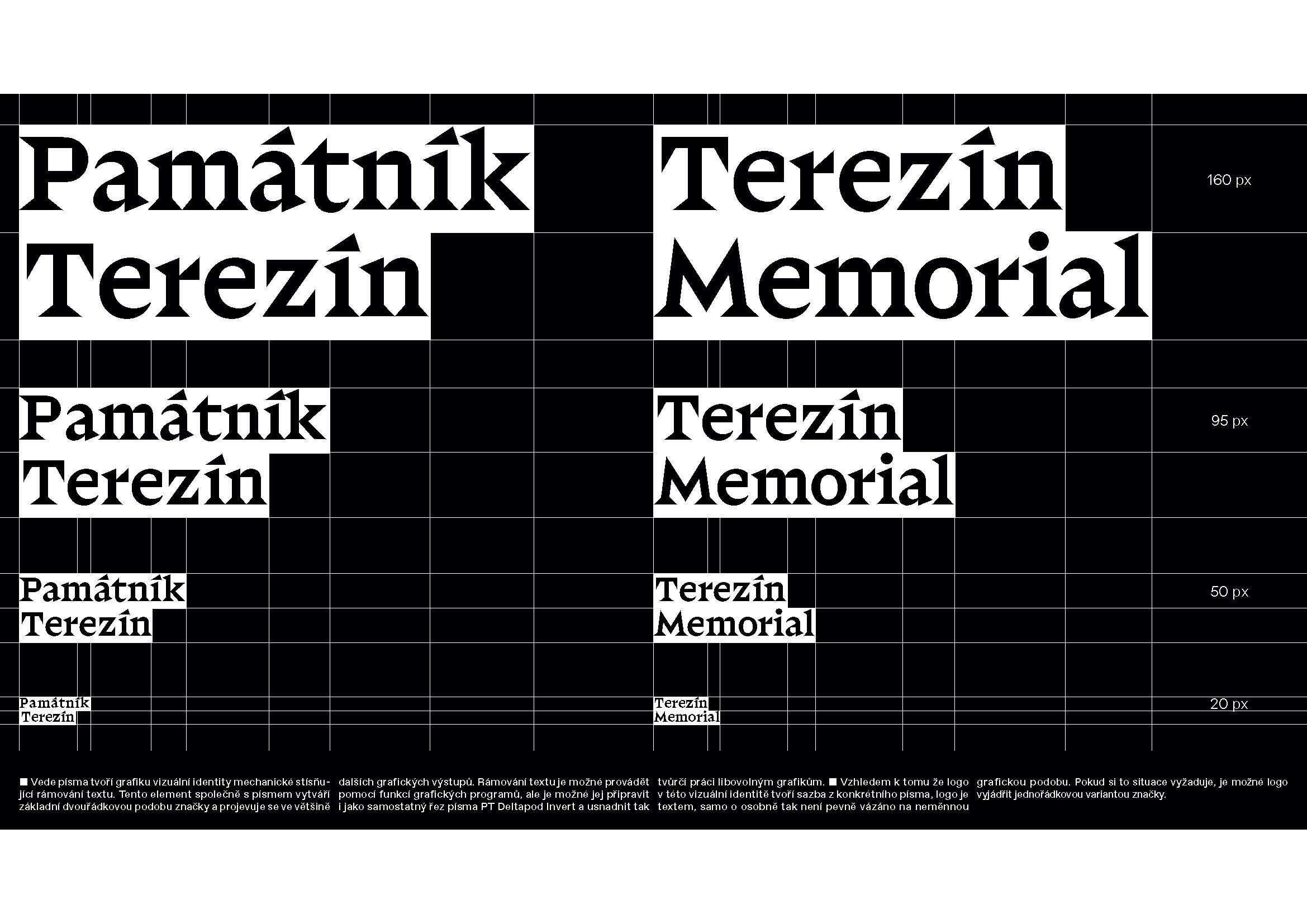
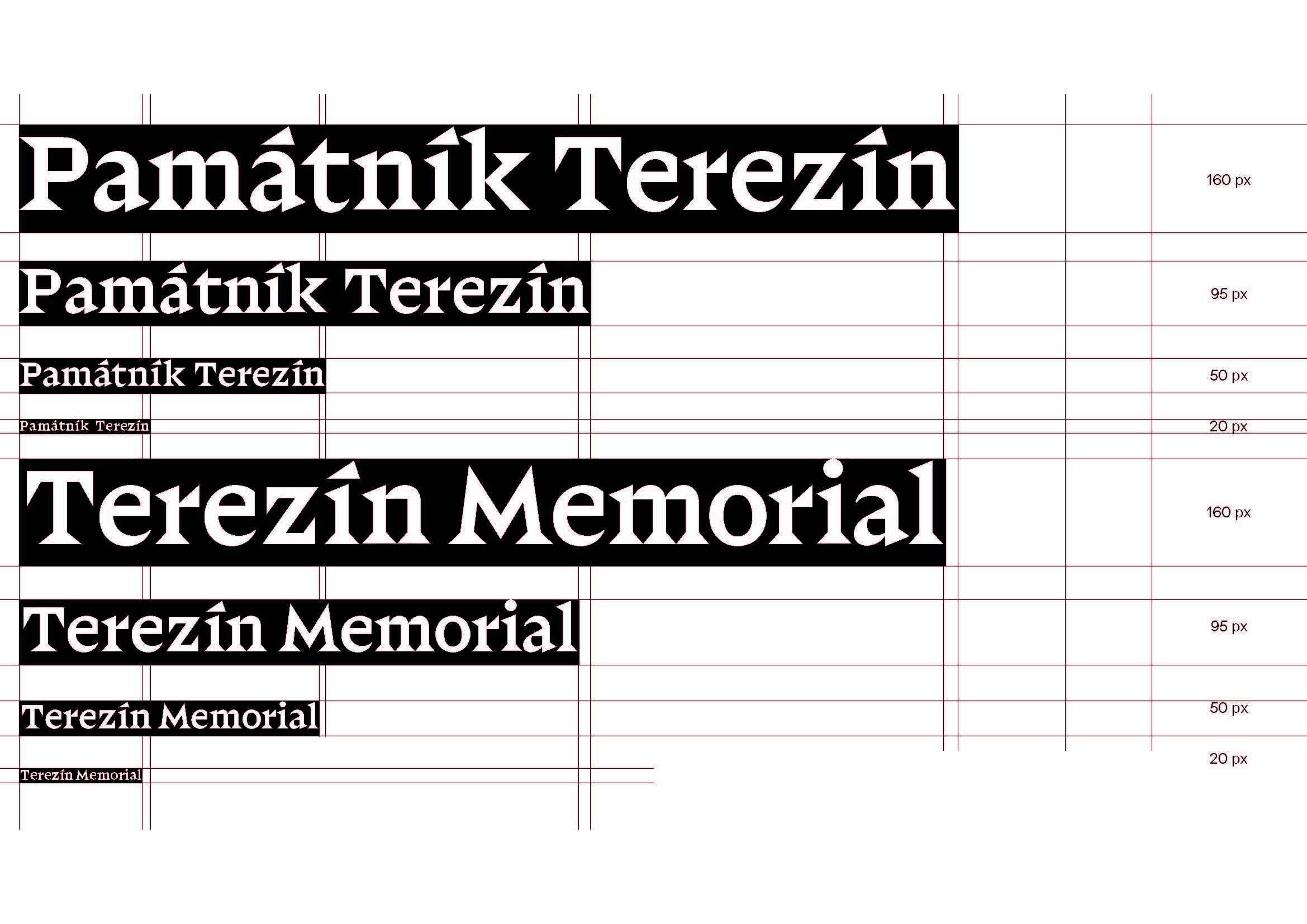
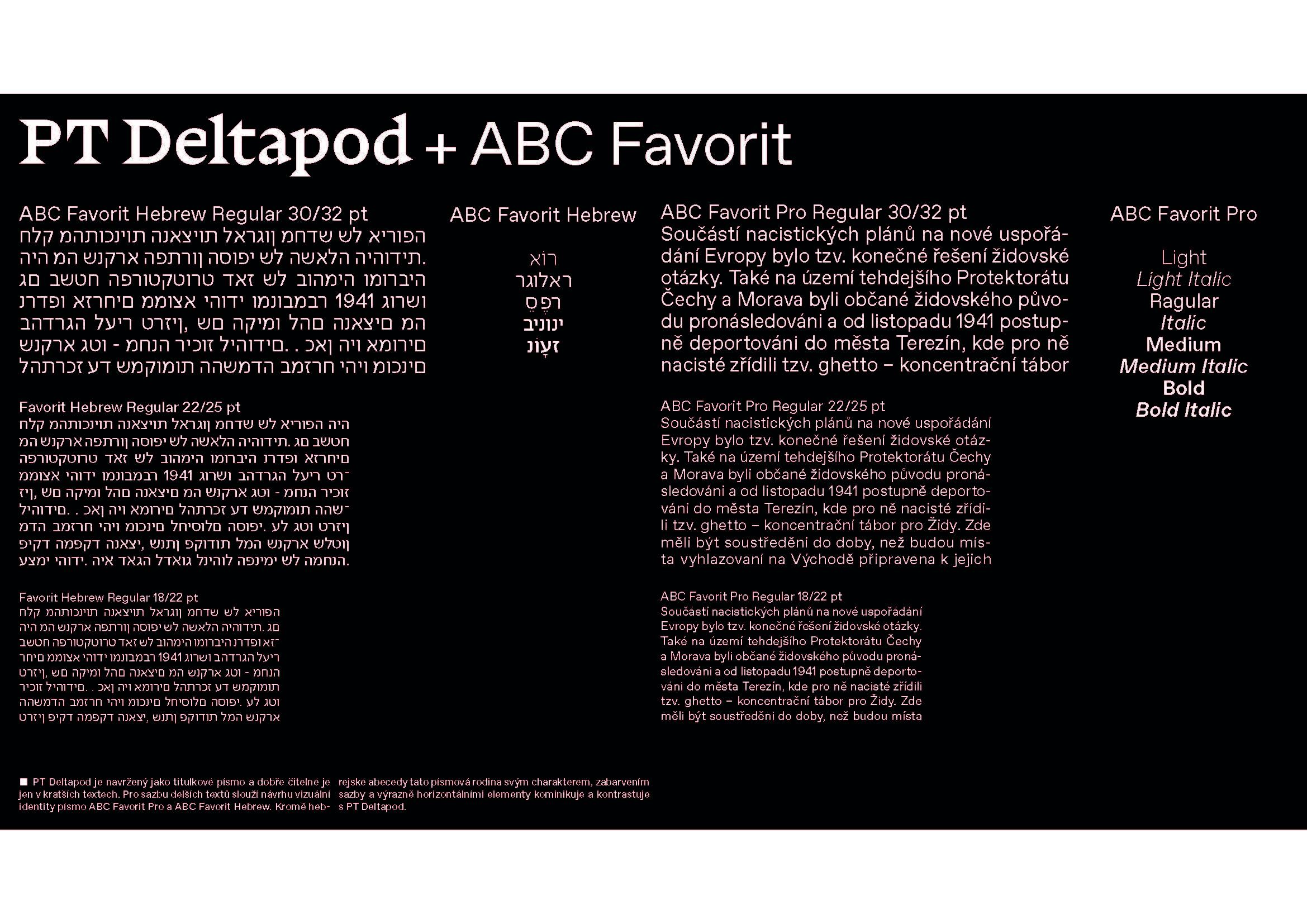
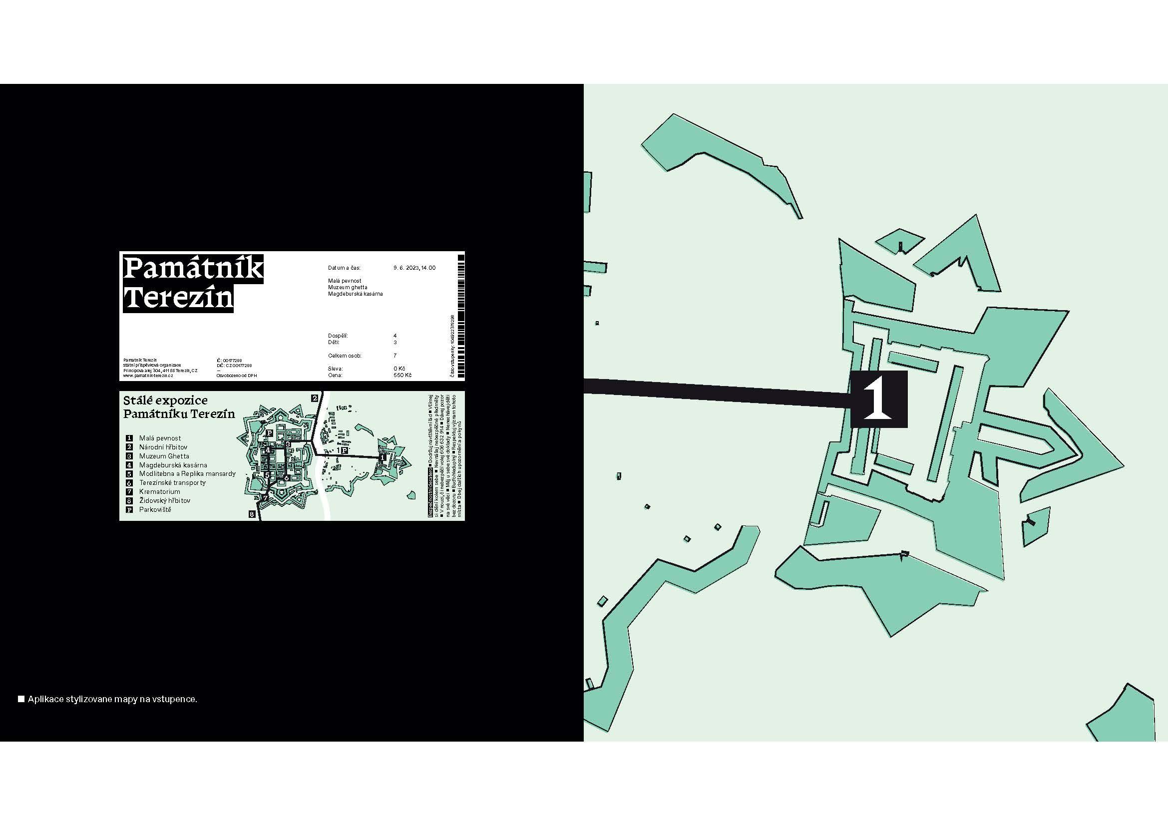
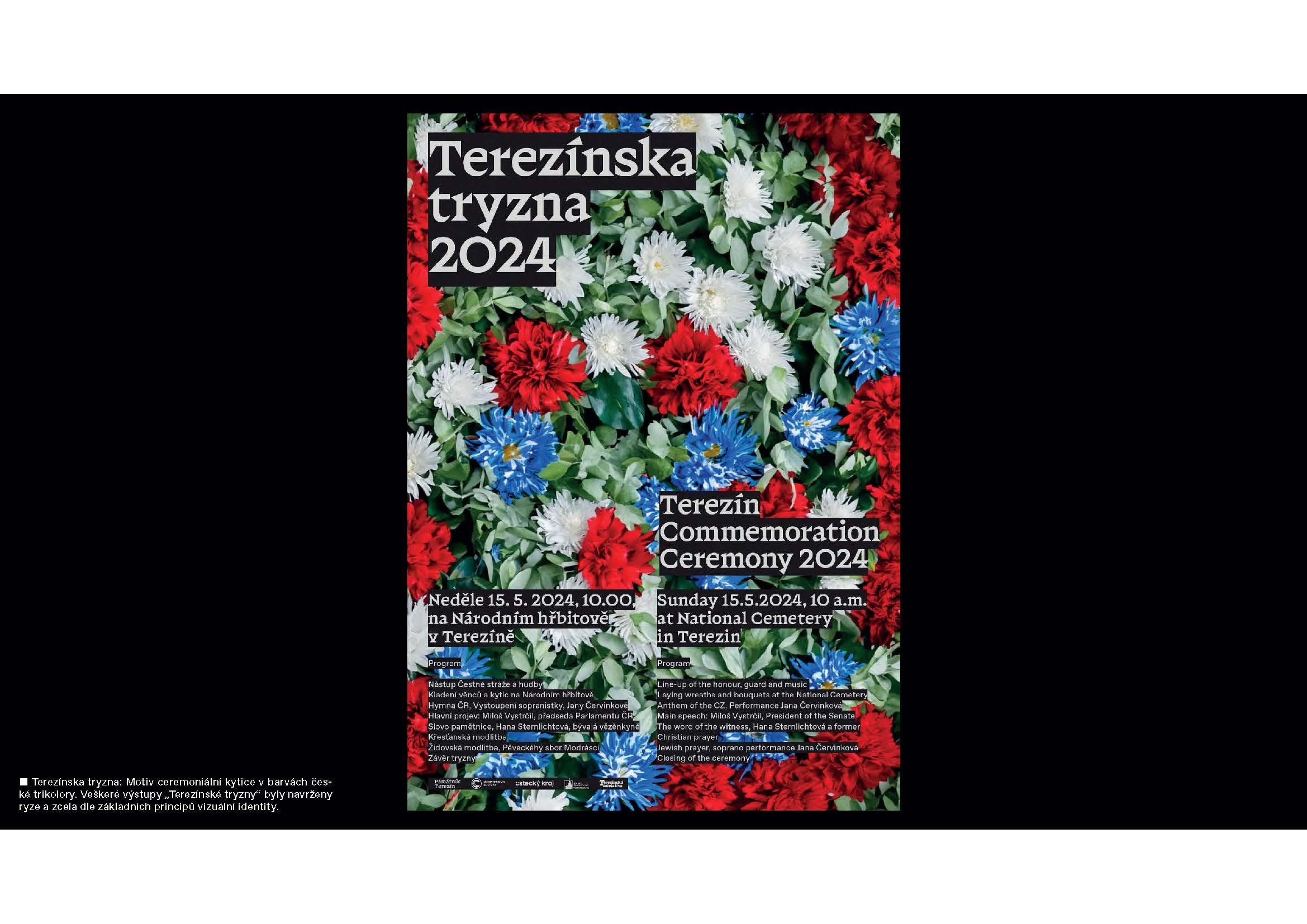
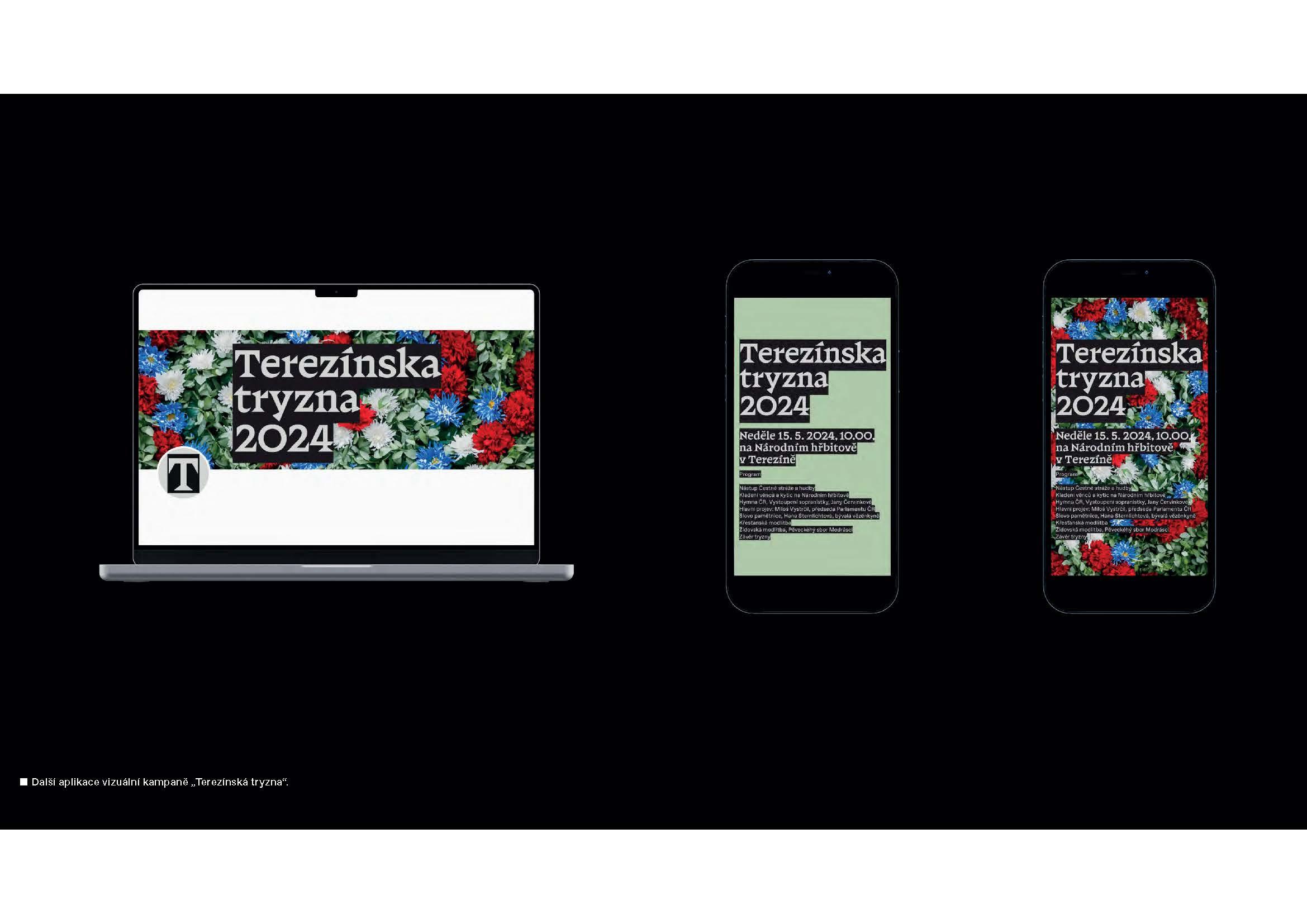
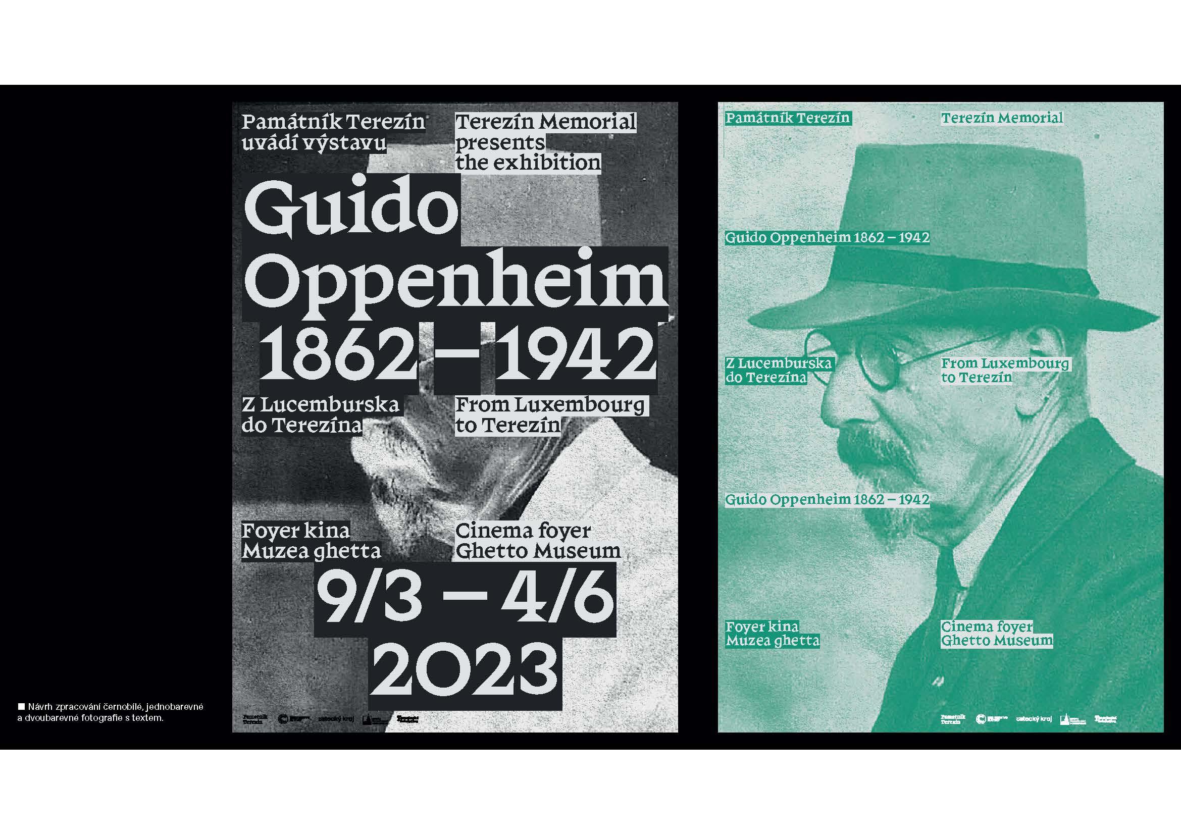
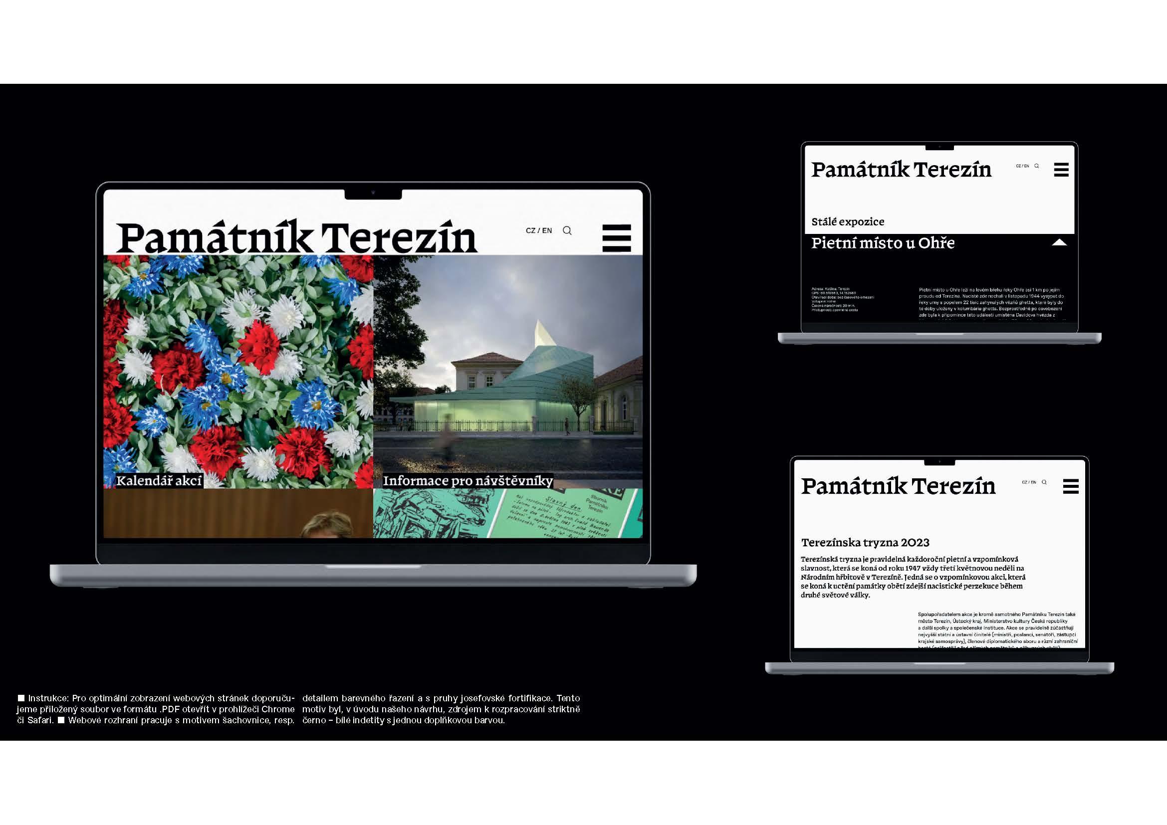
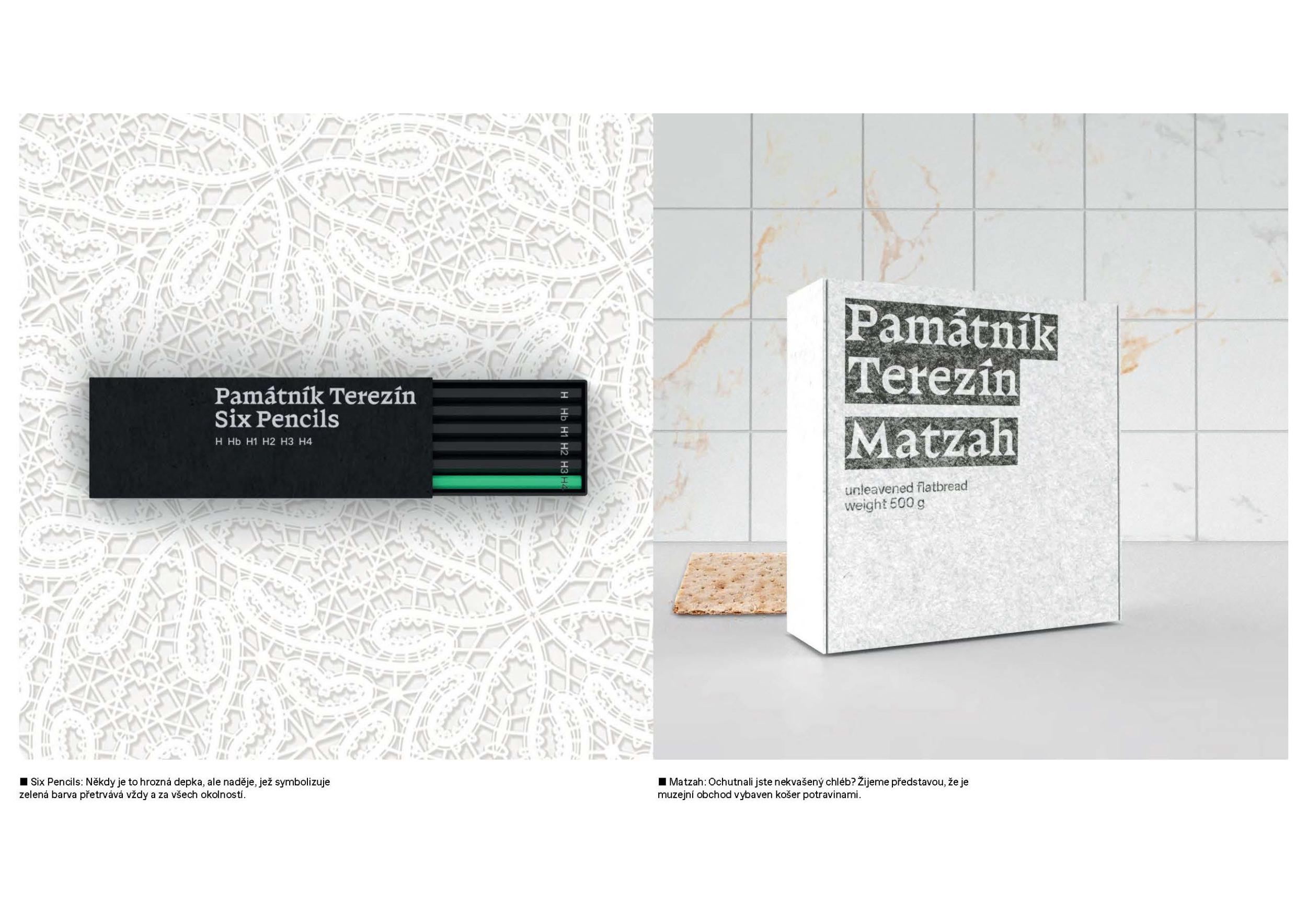
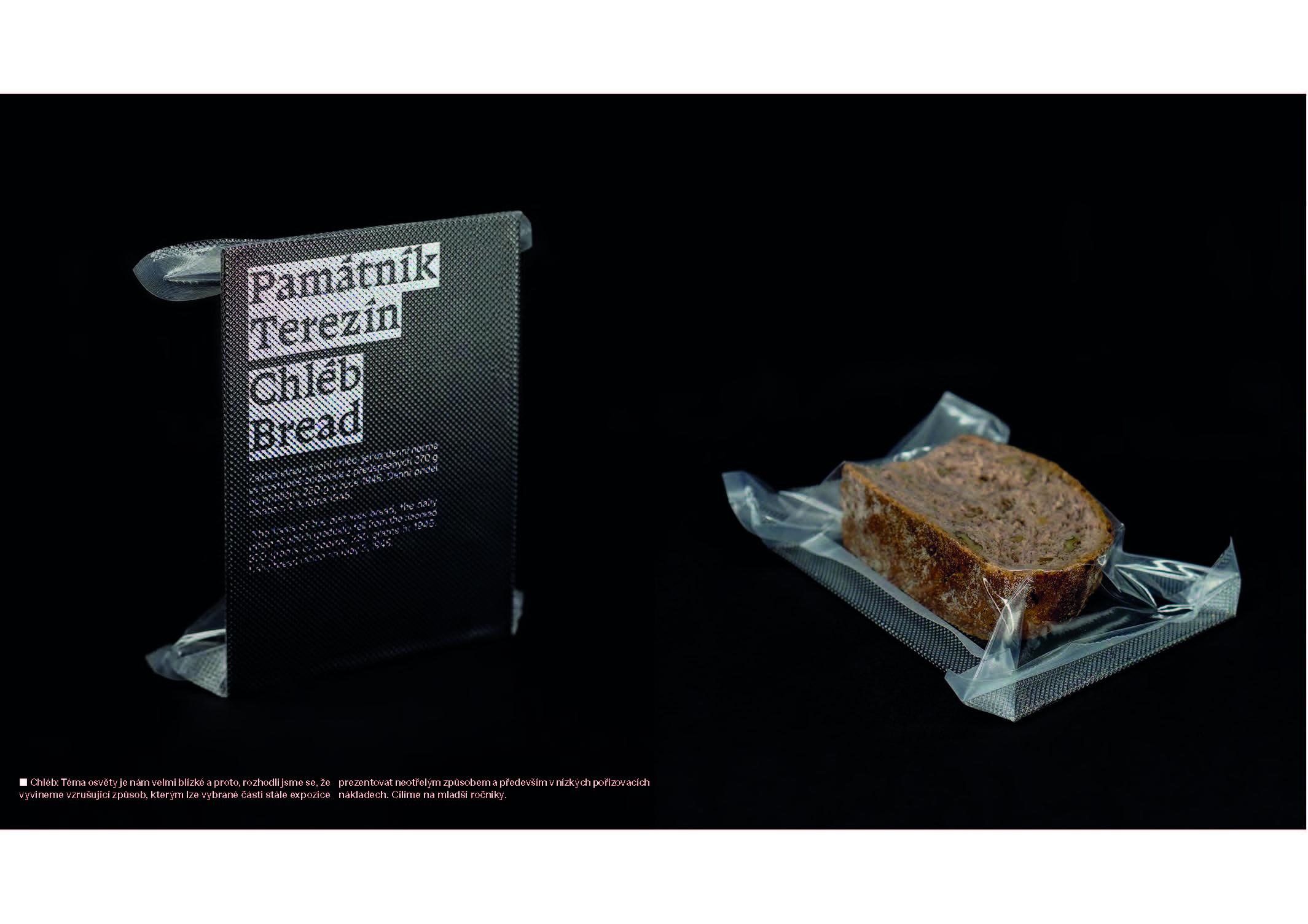
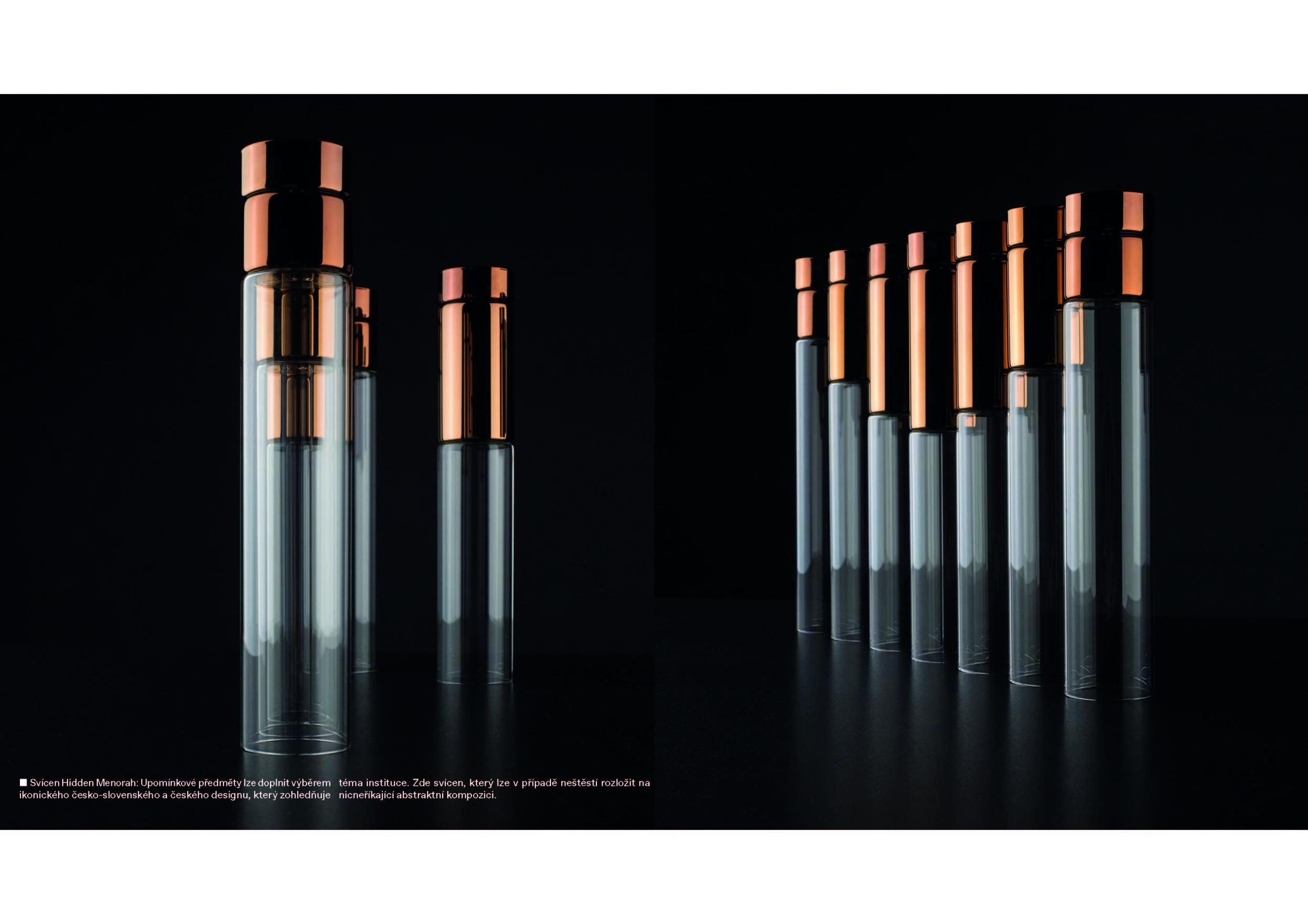
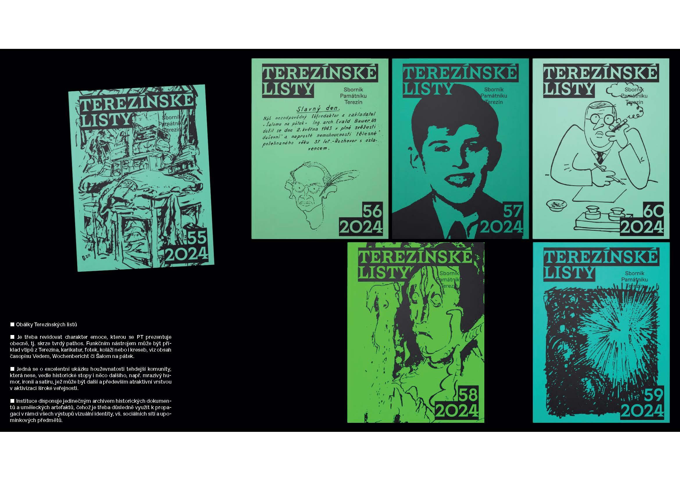
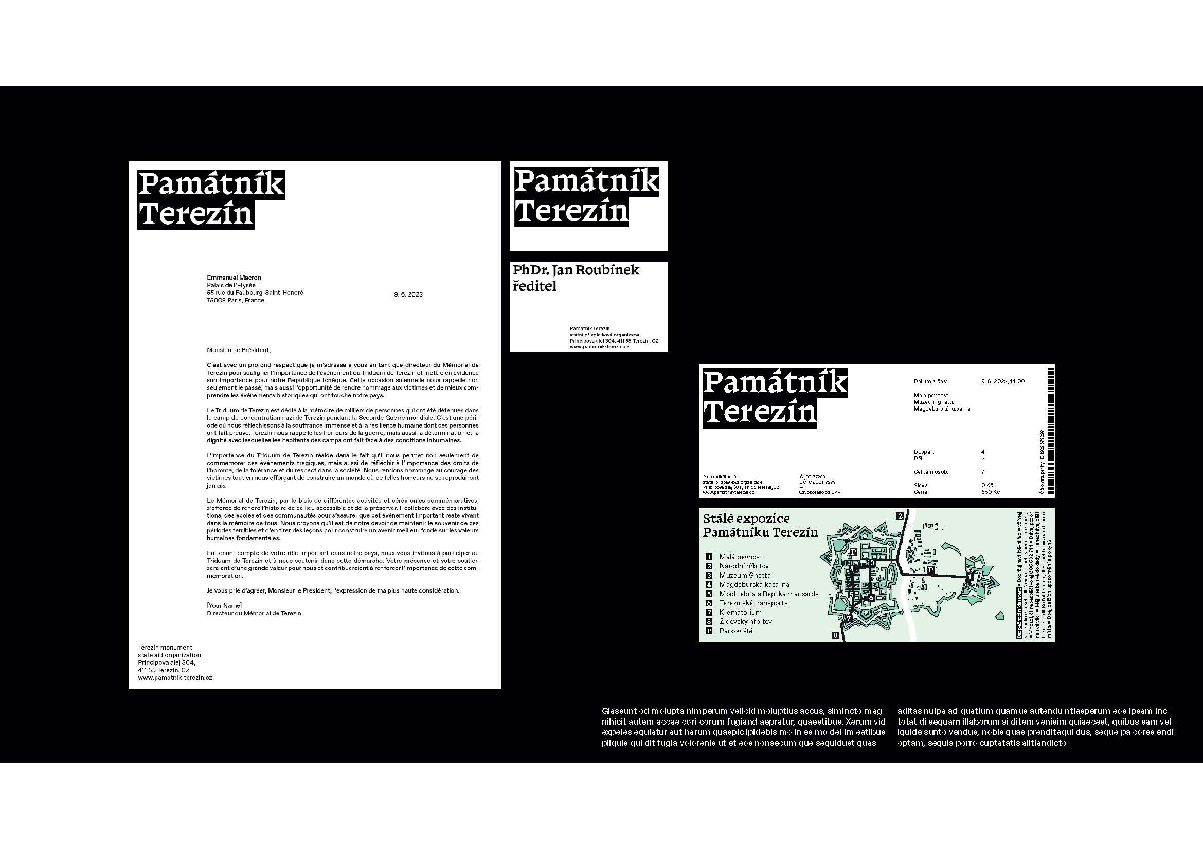
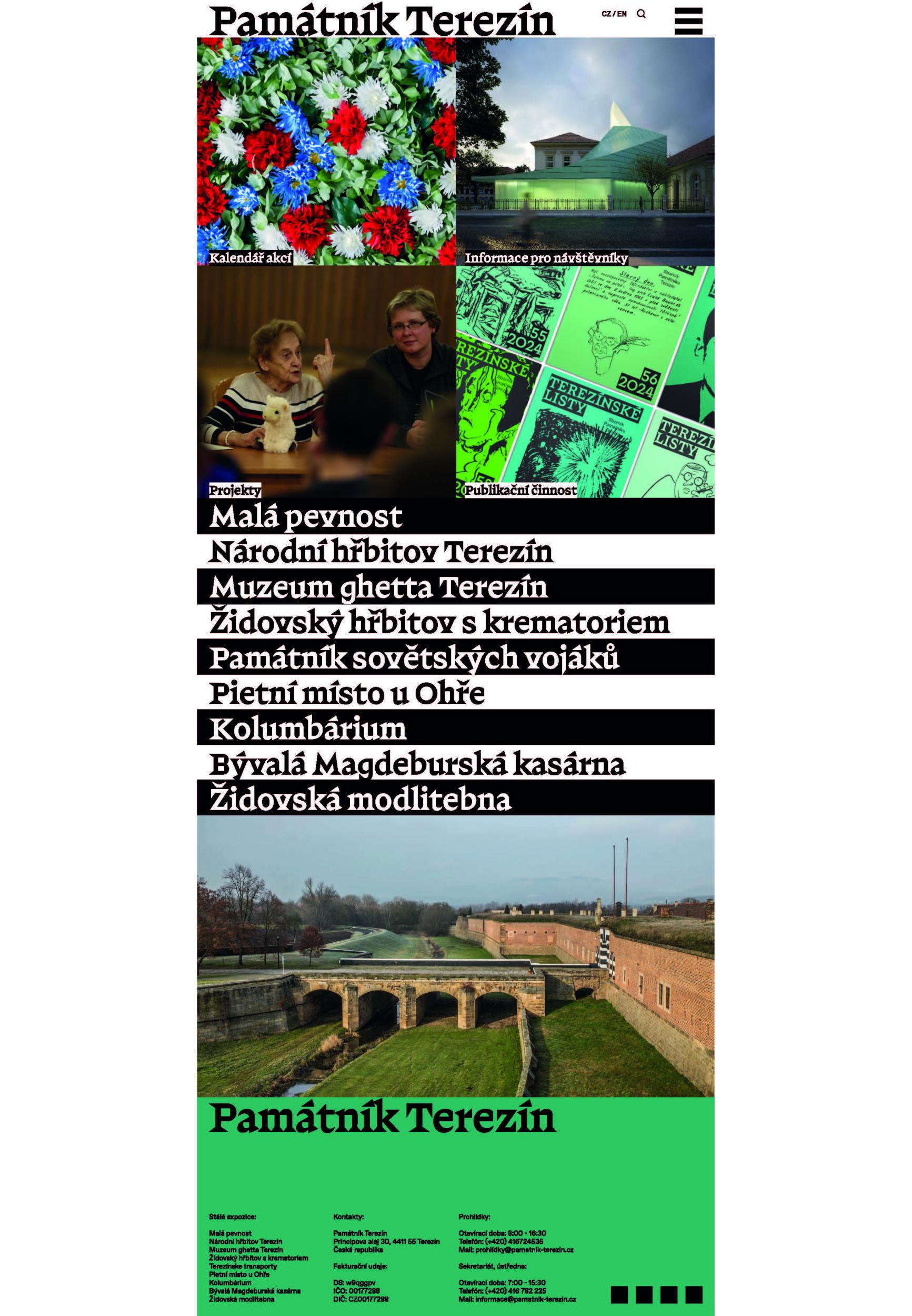
Along with the logo change, we are designing a graphic identity that aims to change the tone of the institution and its approach to communication. It is not just about the design and application of the logo on tickets, posters and museum objects, but a thoughtful change including the selection of photographs and illustrations, the style of accompanying texts, and the appearance of social media. What we have called a "change of tone" is the intention to work clearly and comprehensibly, without insensitive marketing strategies. The ideal outcome of our work together is to feel more like a personal letter - a story, not a product. The basic motif of this approach should be a selection of texts from the archive and a new slogan. ("Auschwitz. Not long ago. Not far away." serves as a placeholder slogan and is taken from the Auschwitz memorial. The other texts are selected from the materials of the Terezín Memorial.) The new way and consistency of writing down information continues on a practical level. A clearly functional and established way of writing and communicating information, e.g. the name of the event, exhibition, date, time and form of the text of the invitation or programme, are one of the few invisible keys on which visual styles and their derivatives in the form of promotion often fail. While this is an apparent detail and marginal, it is essential to a well-functioning visual identity.

Jury Evaluation

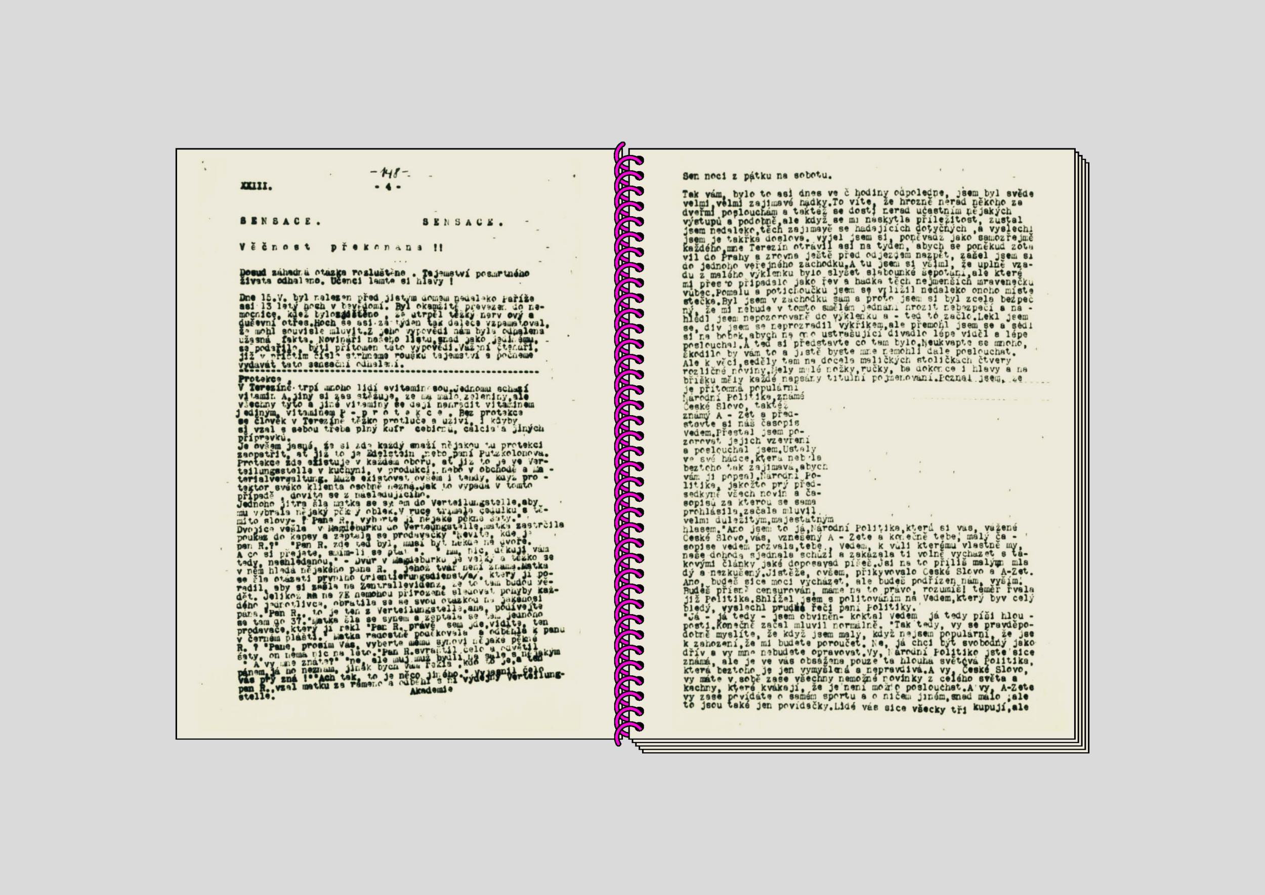
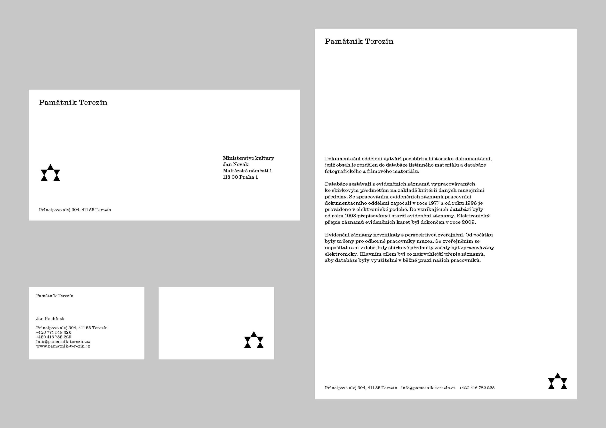
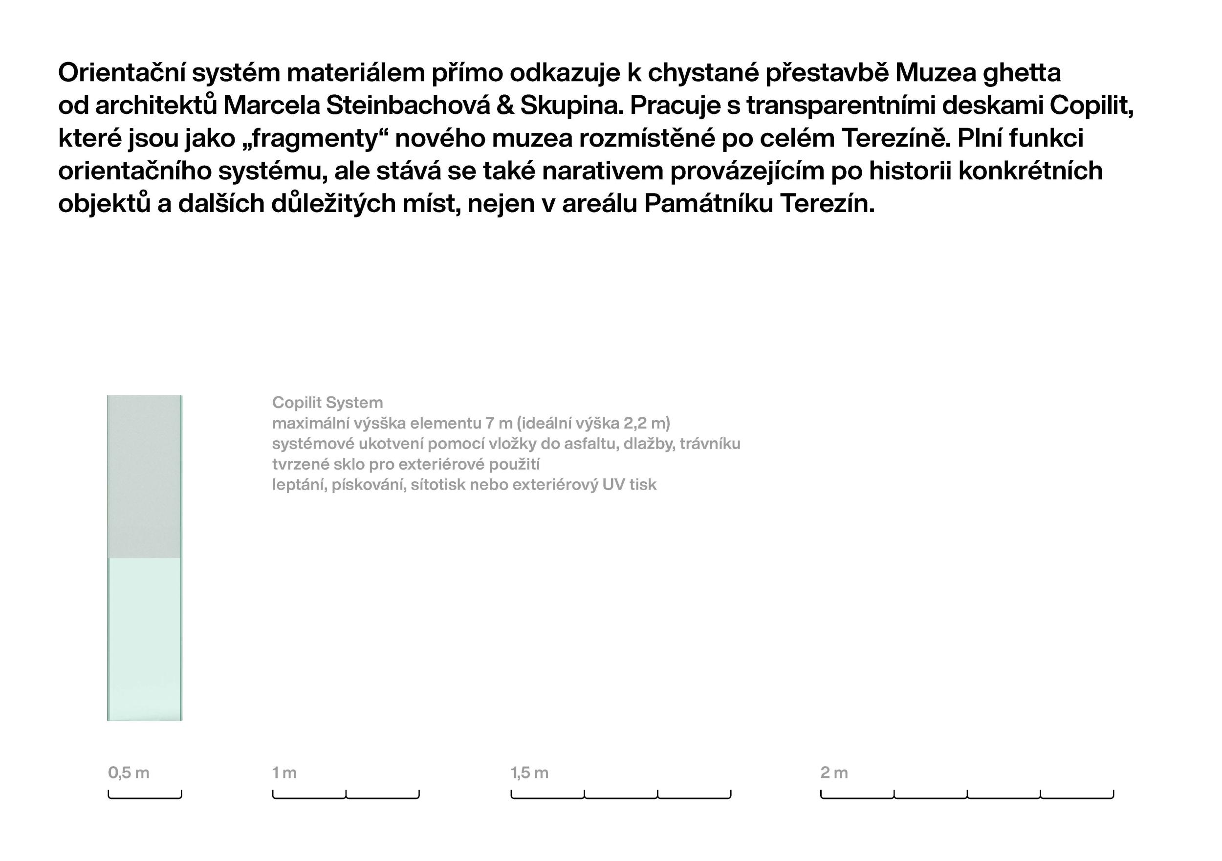
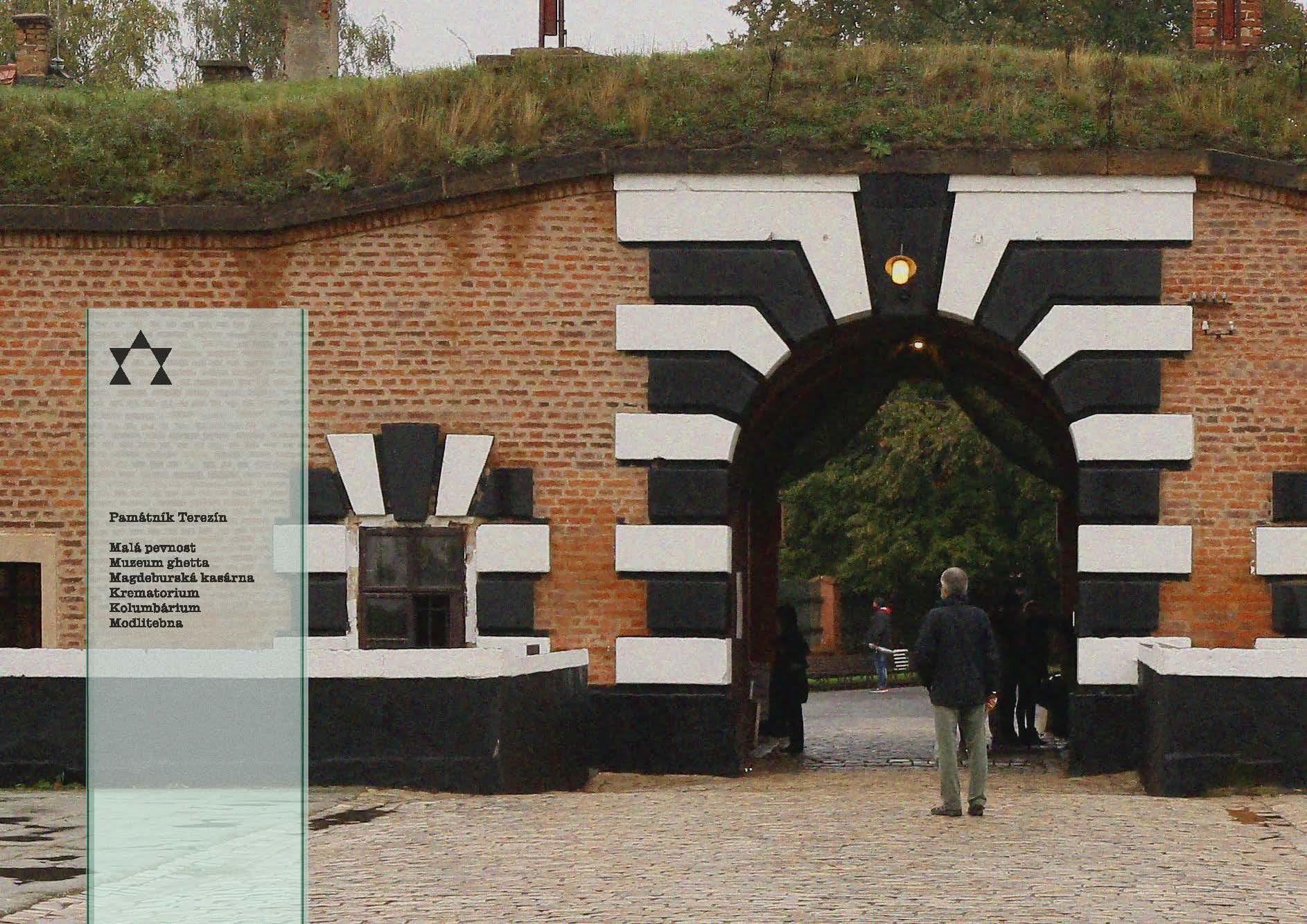
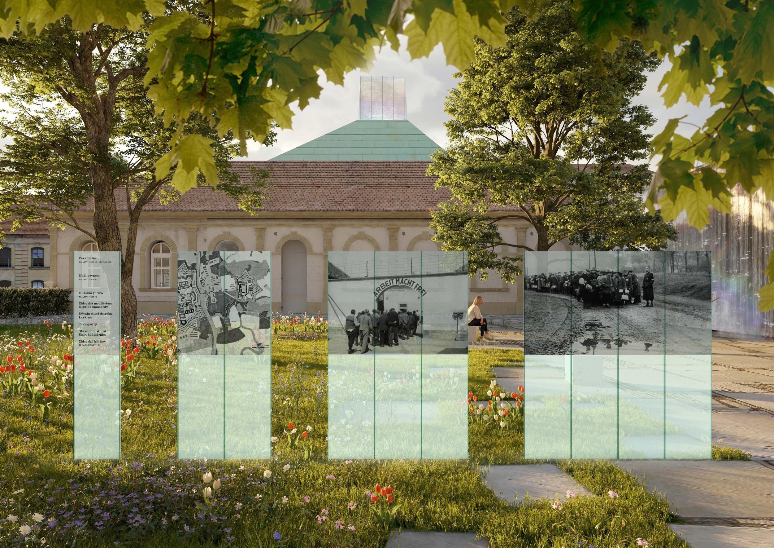
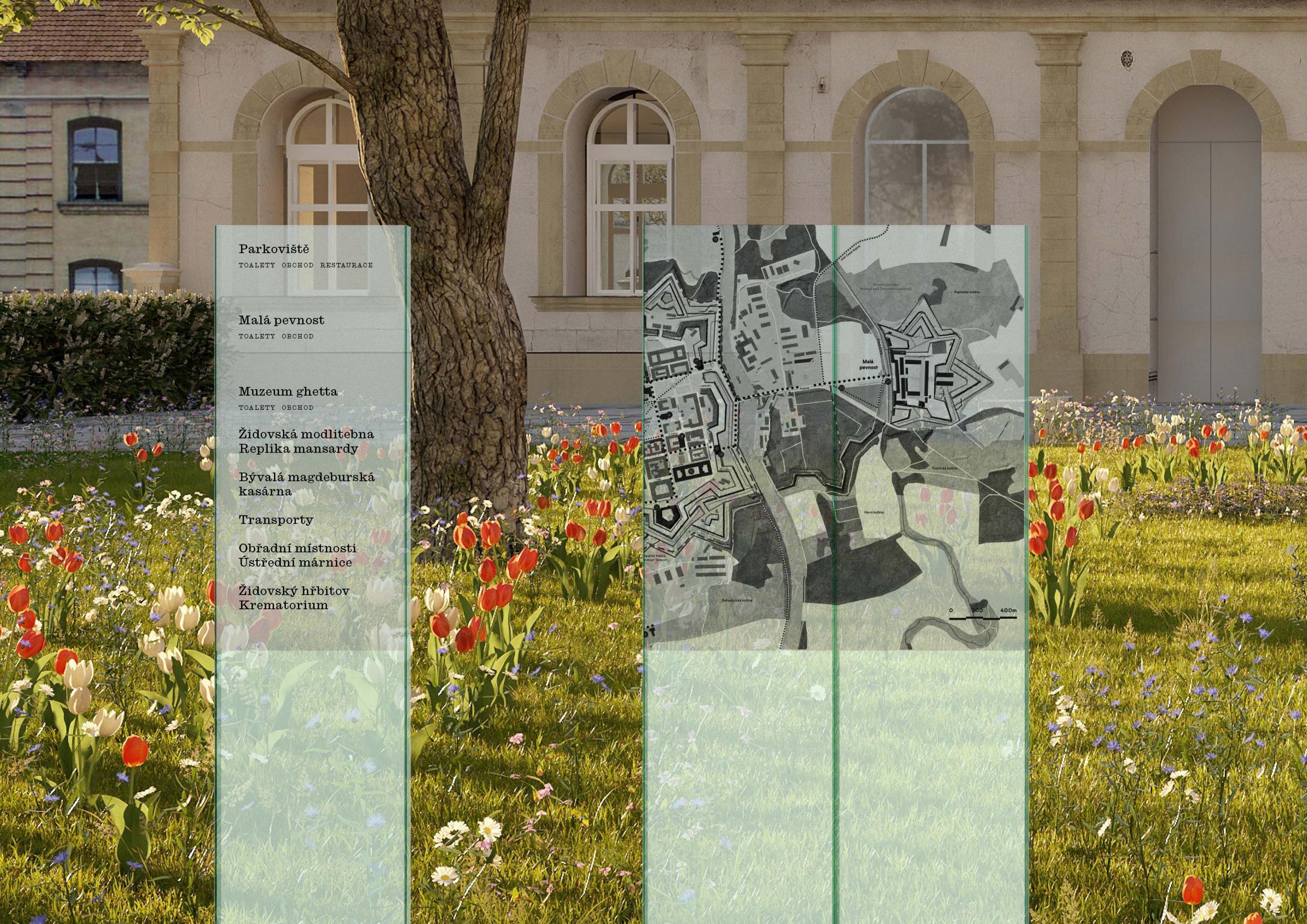
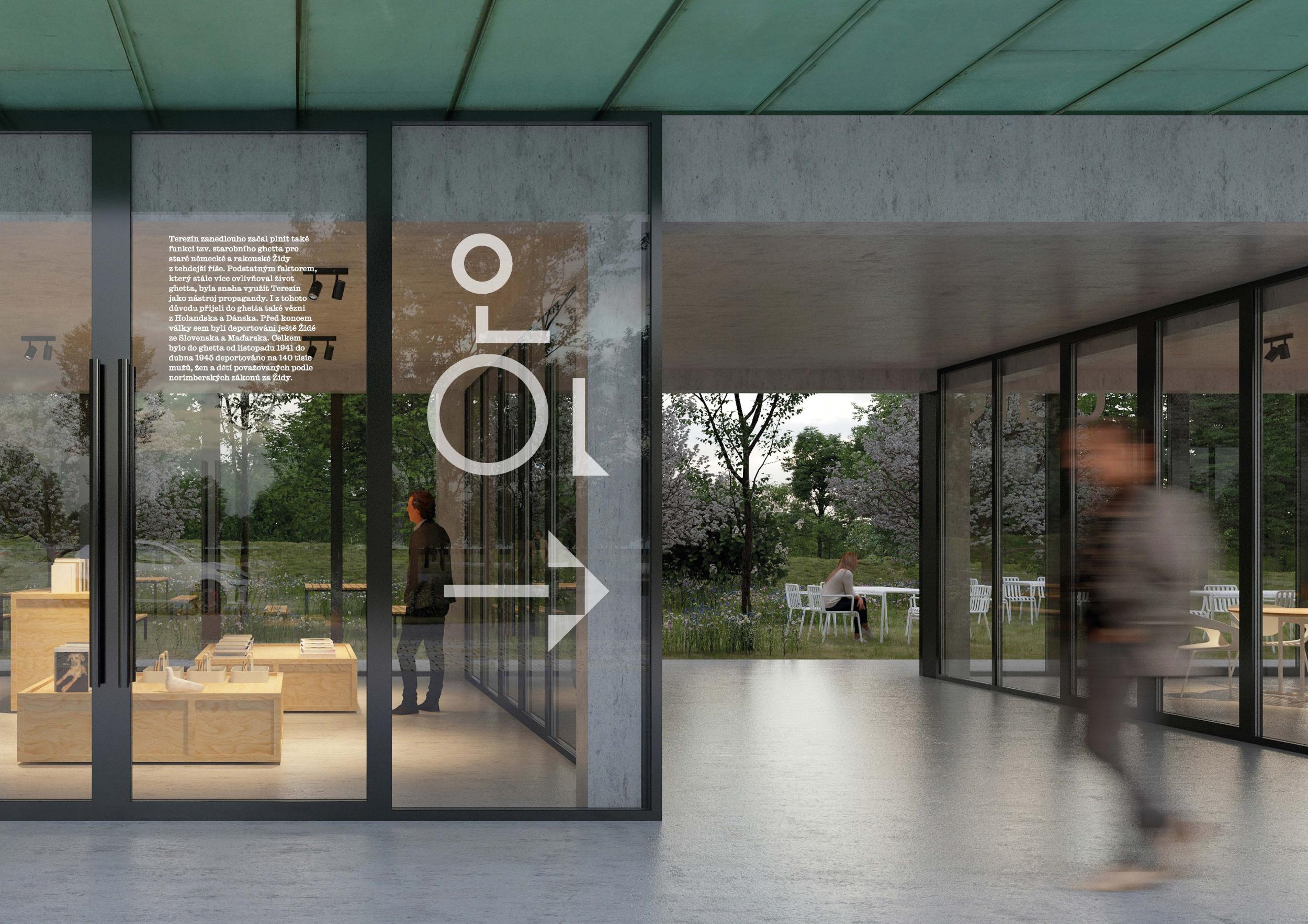
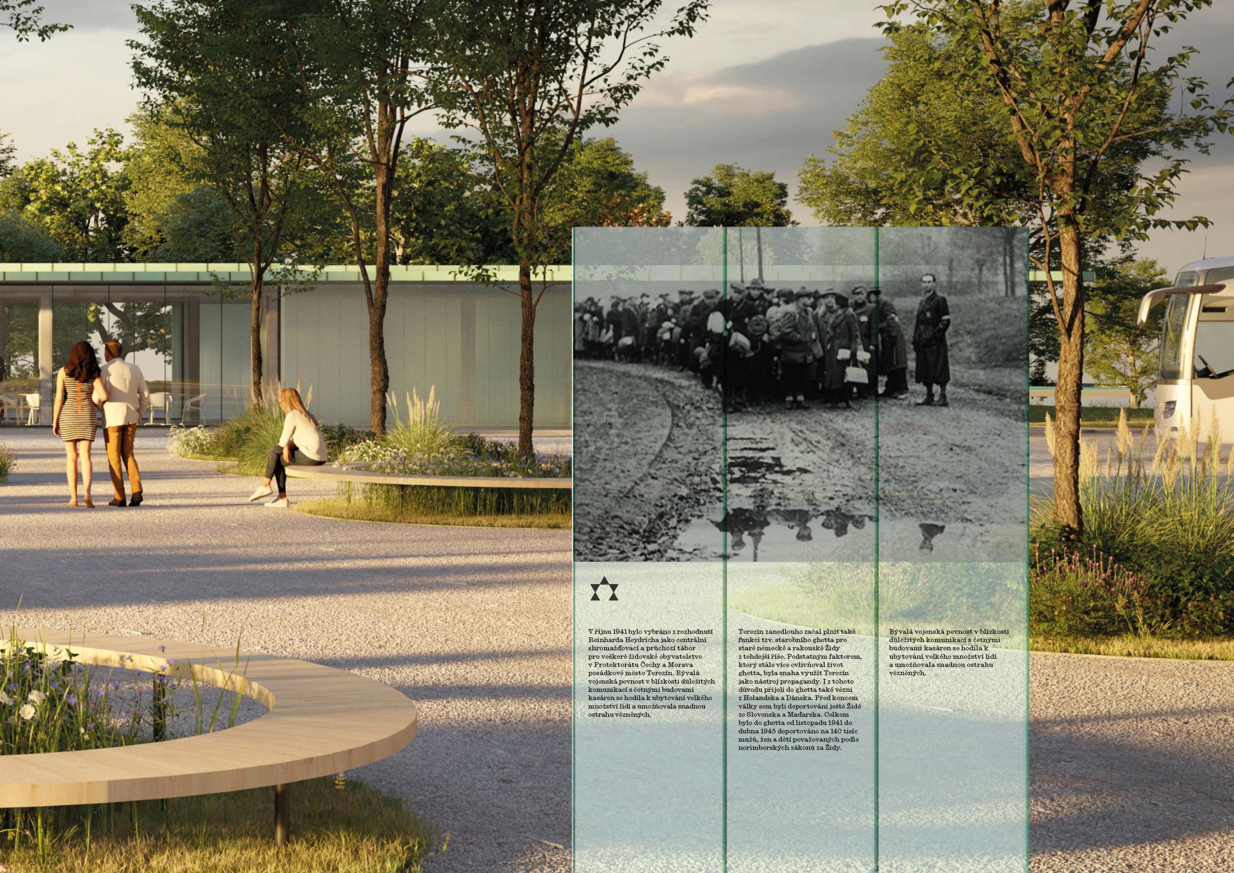
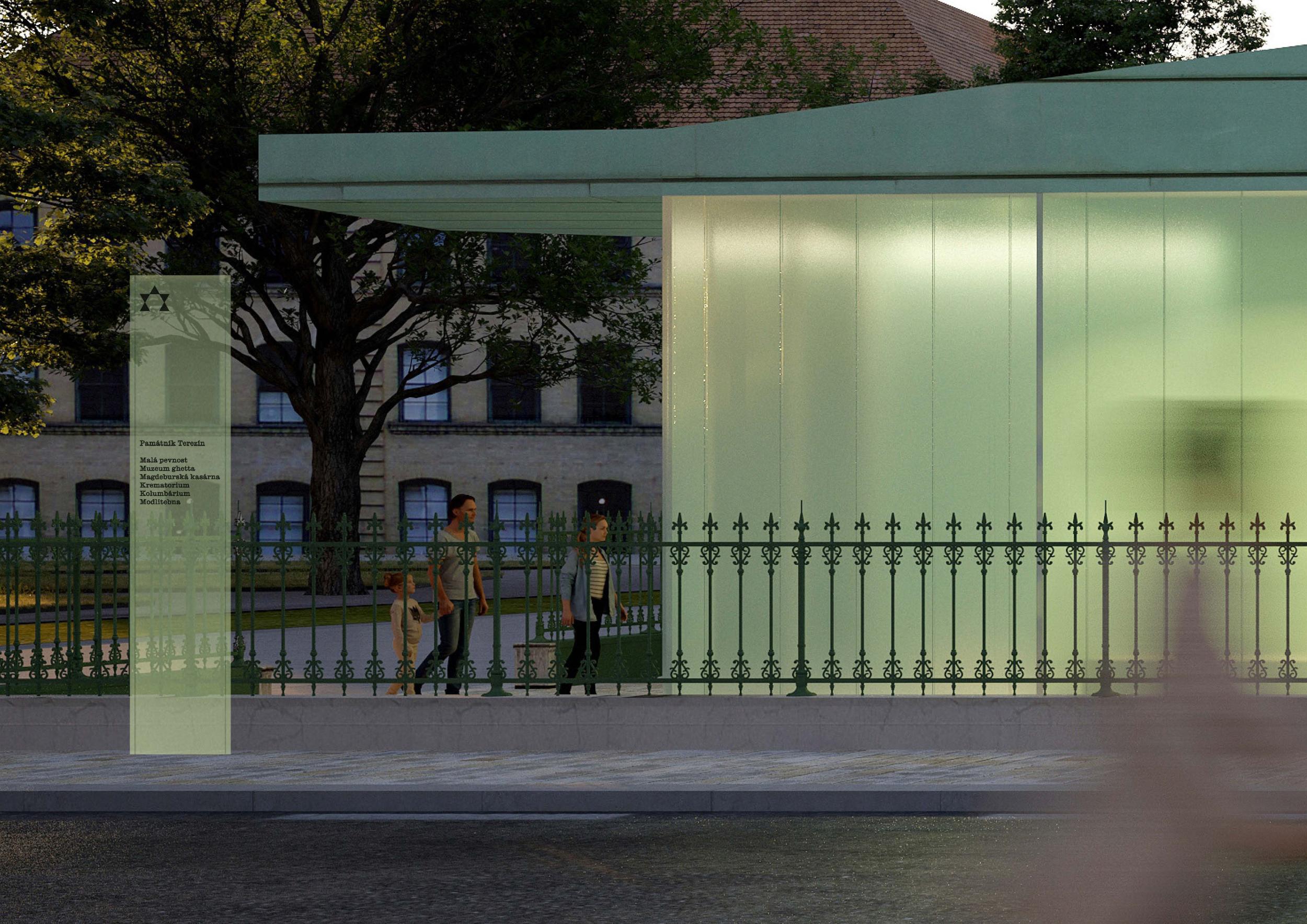
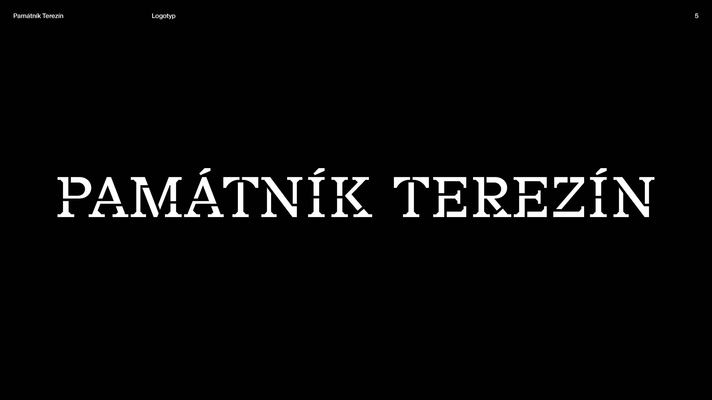
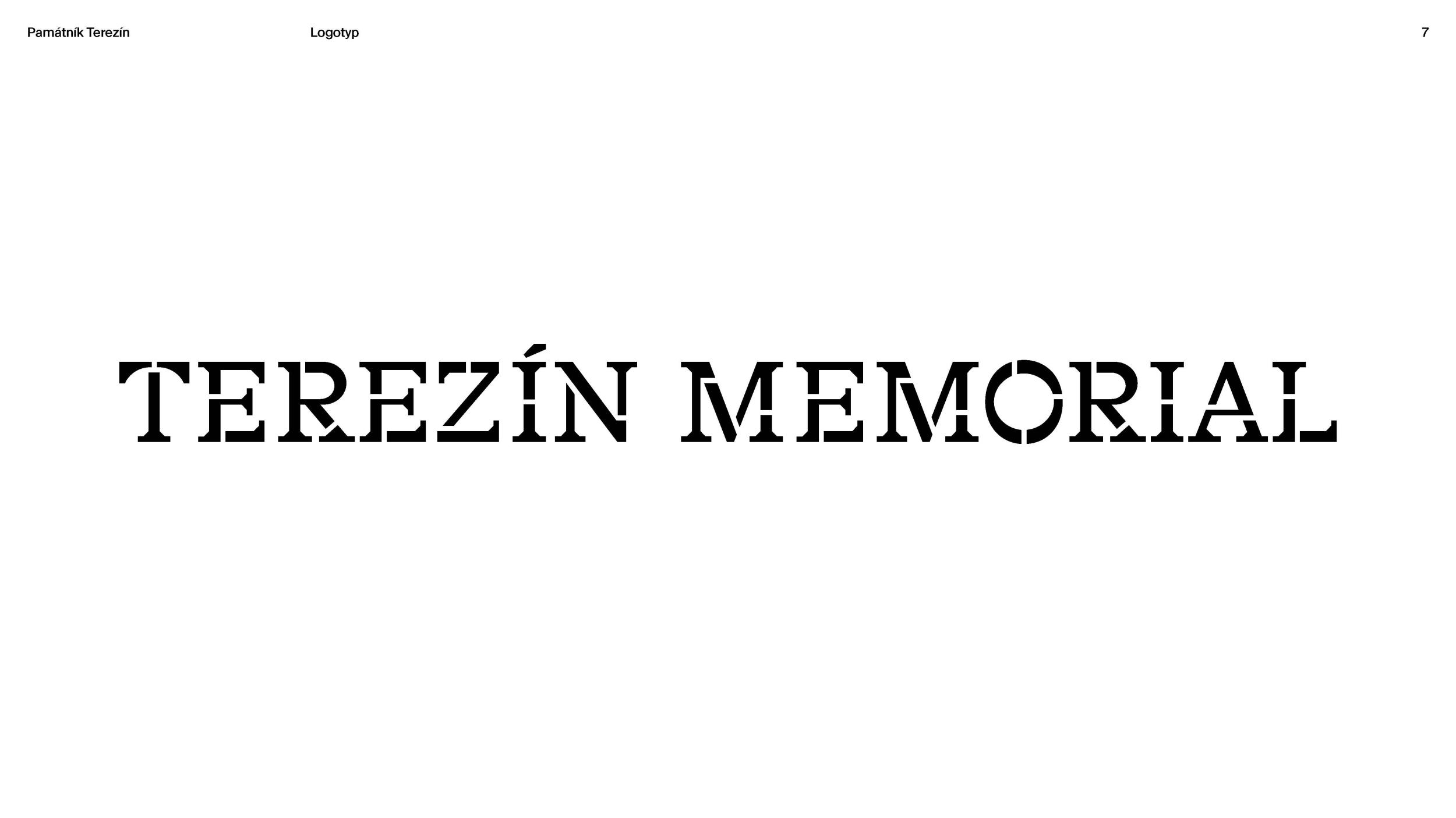
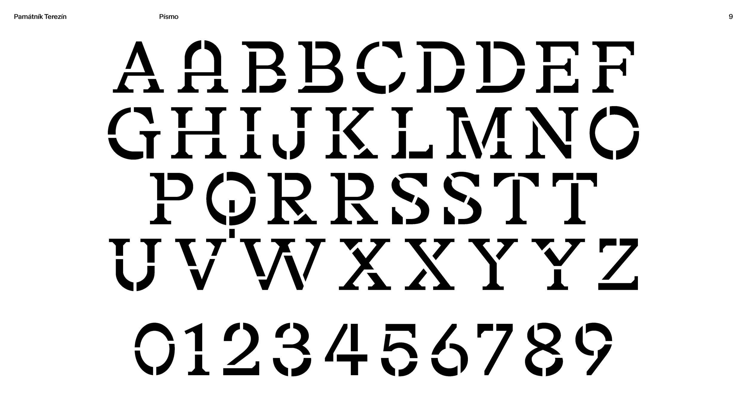
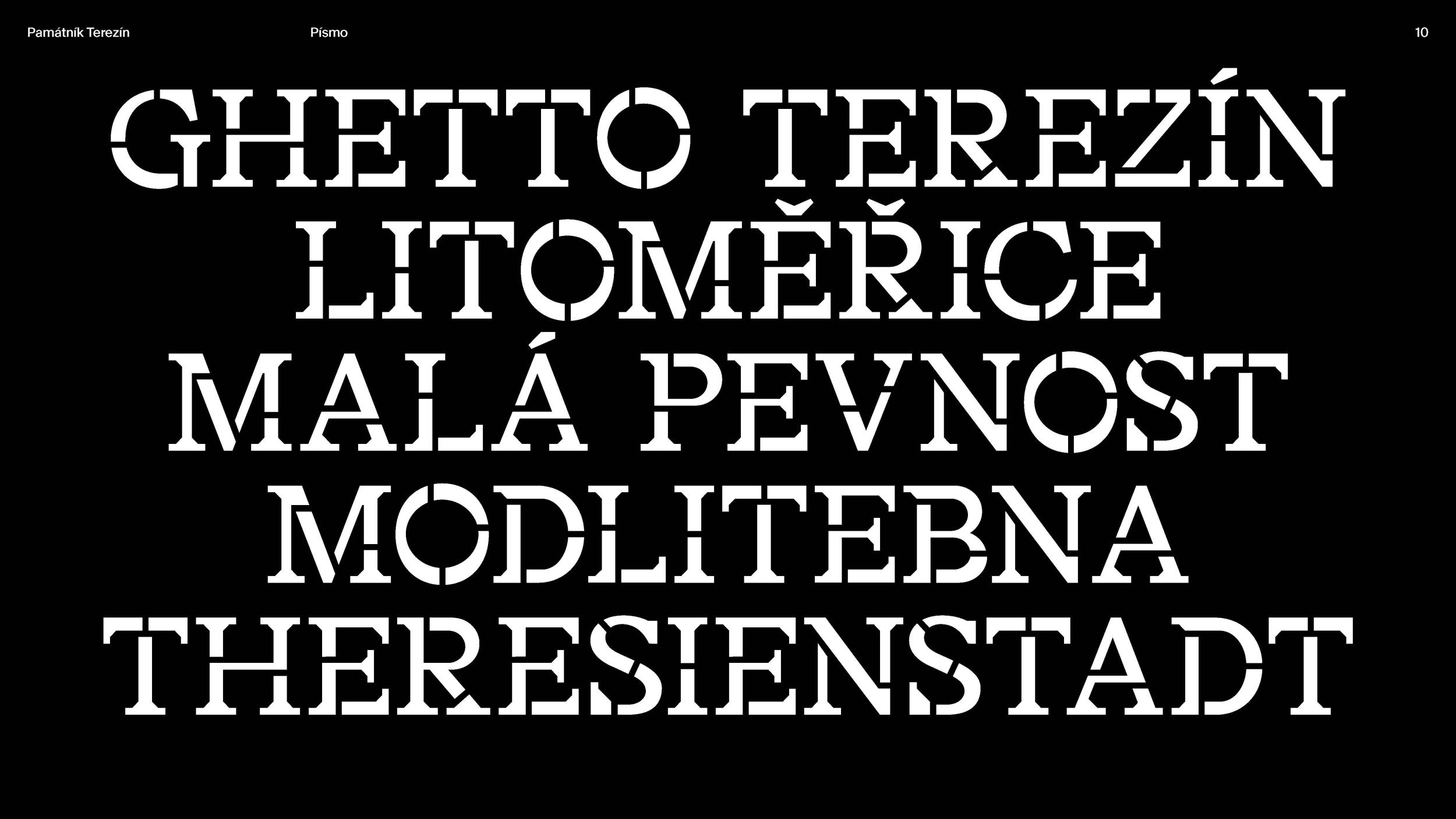
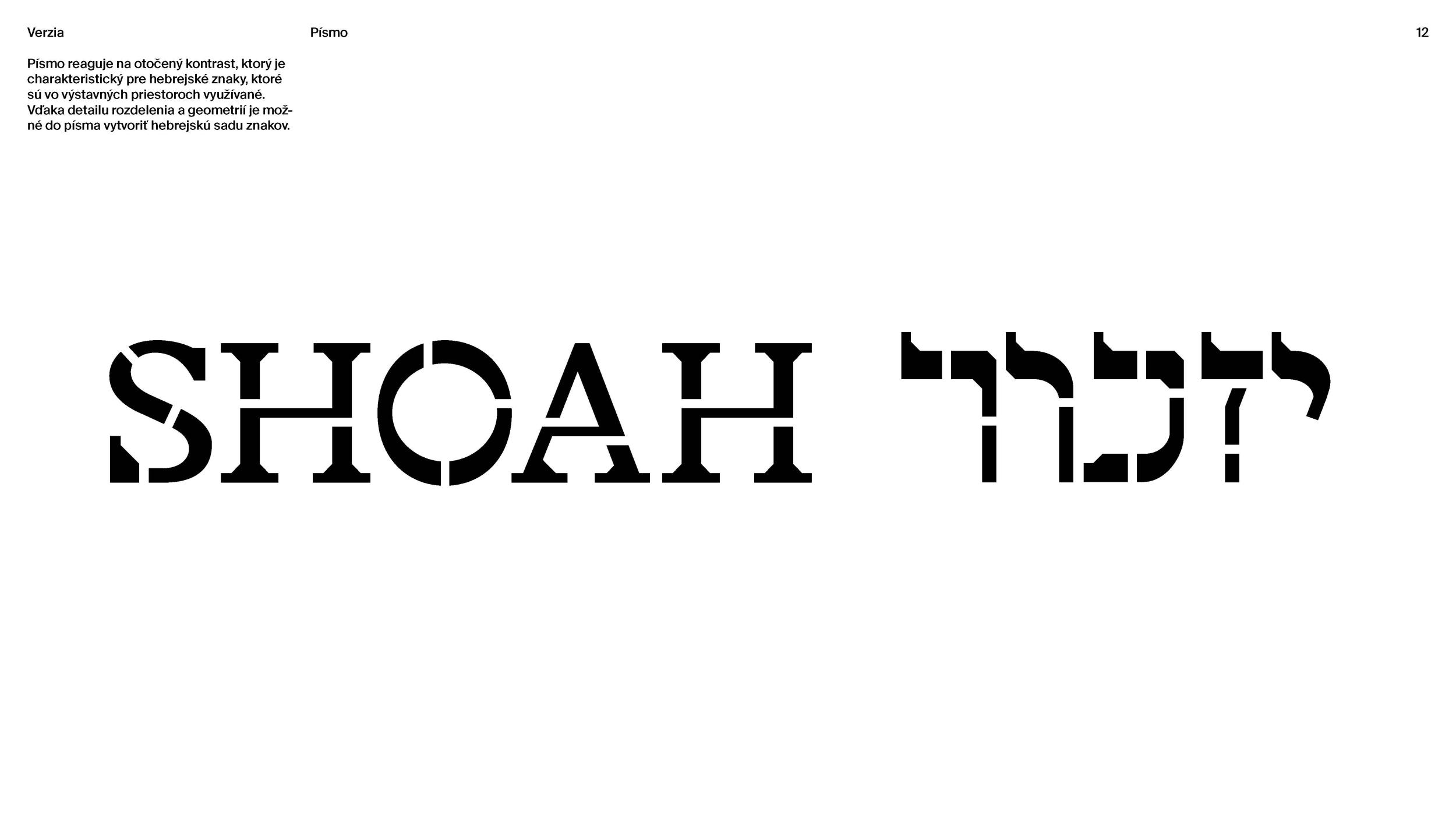
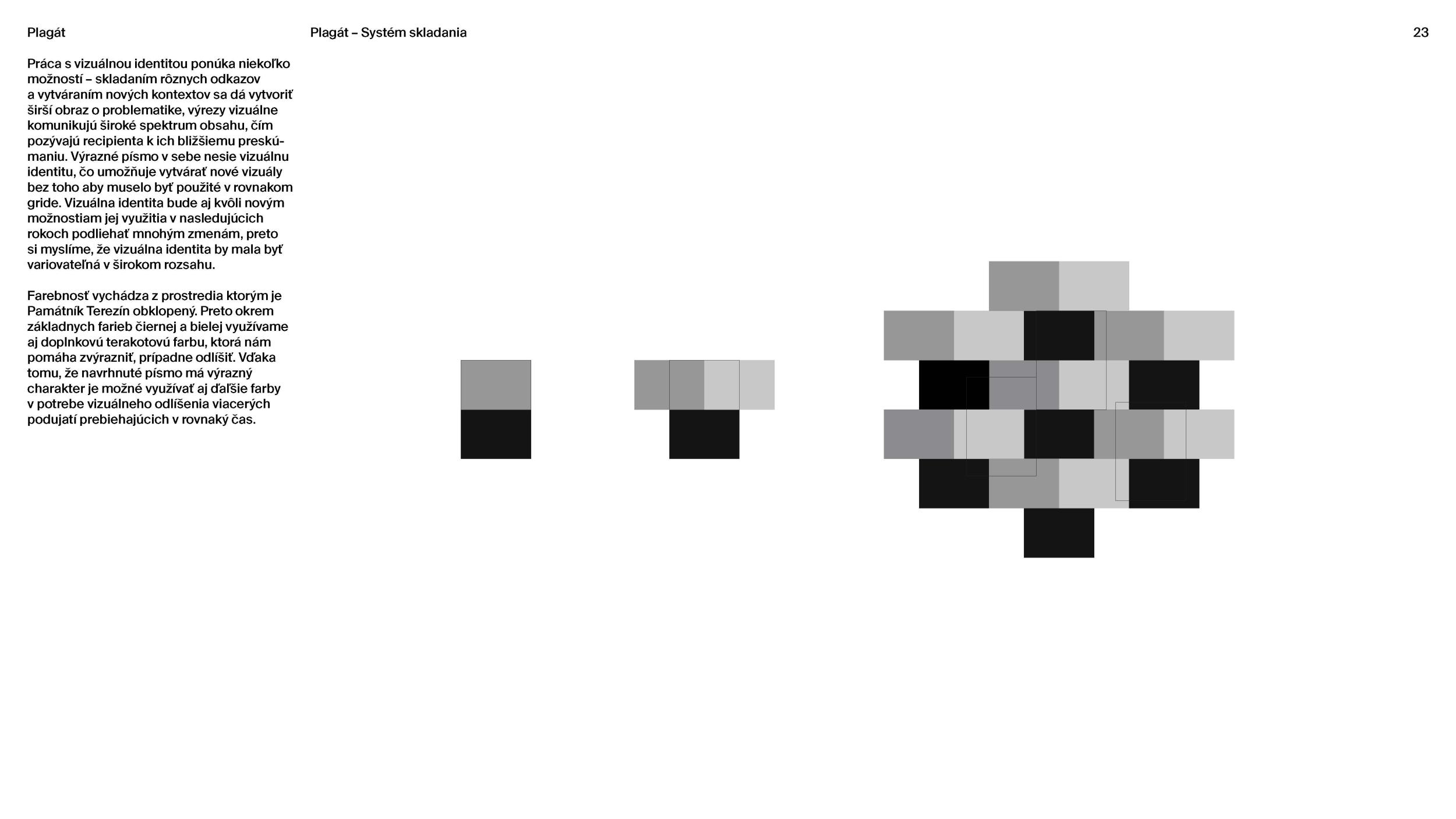
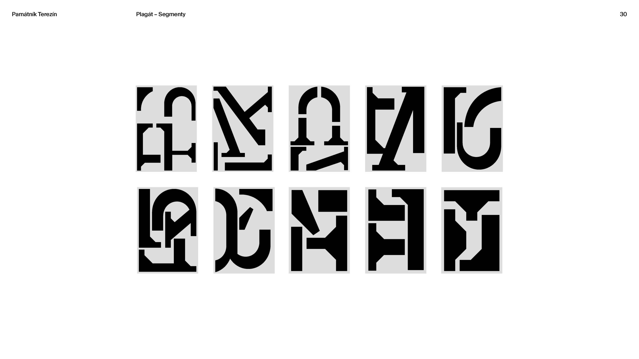
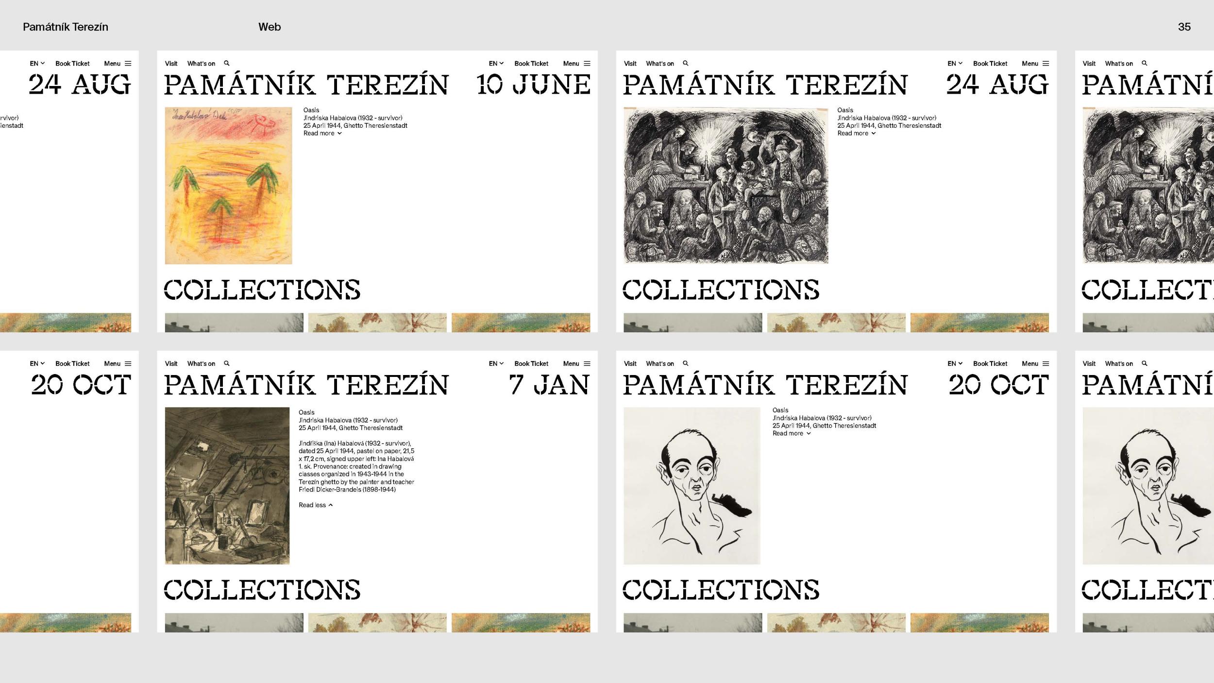
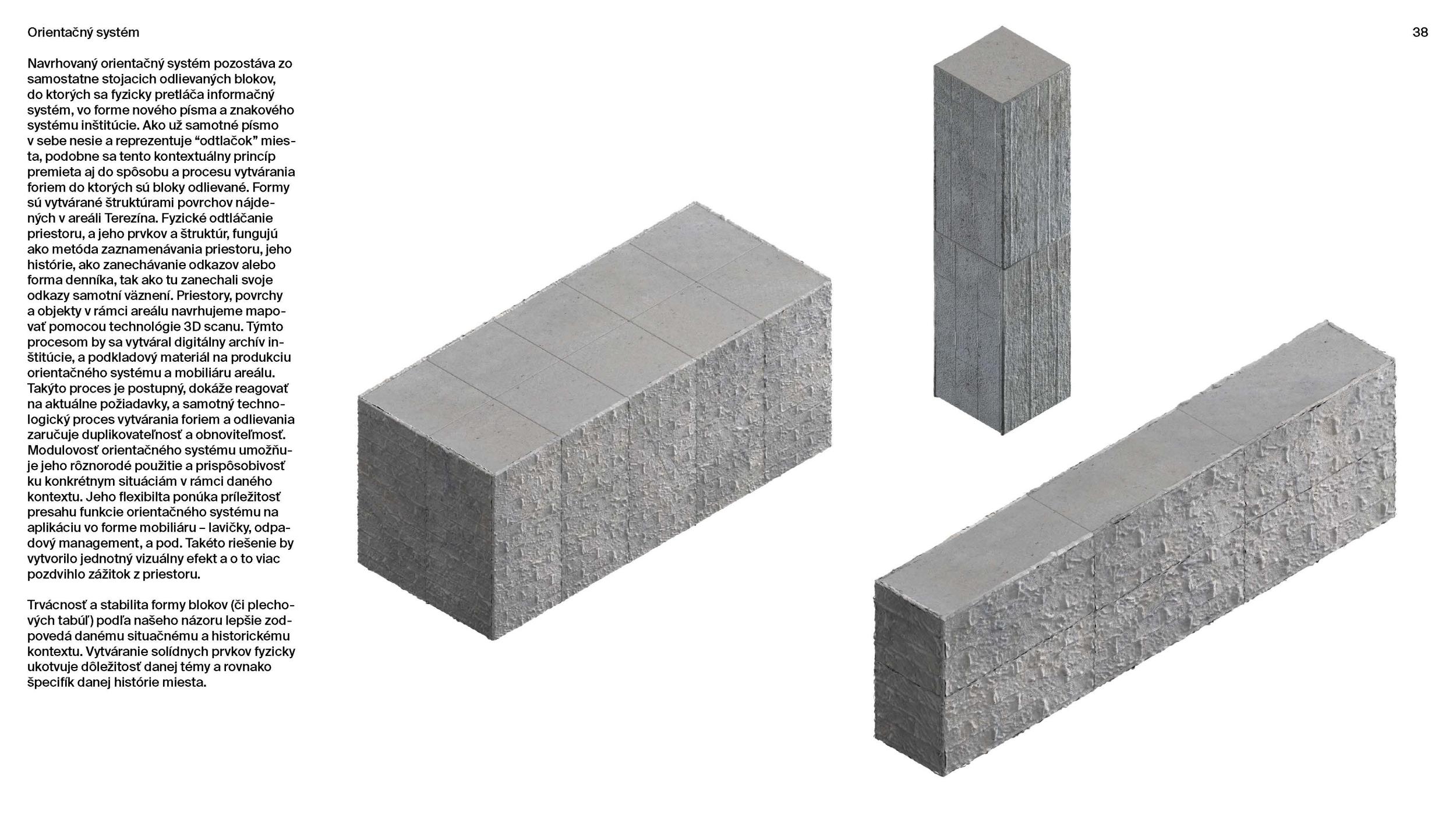
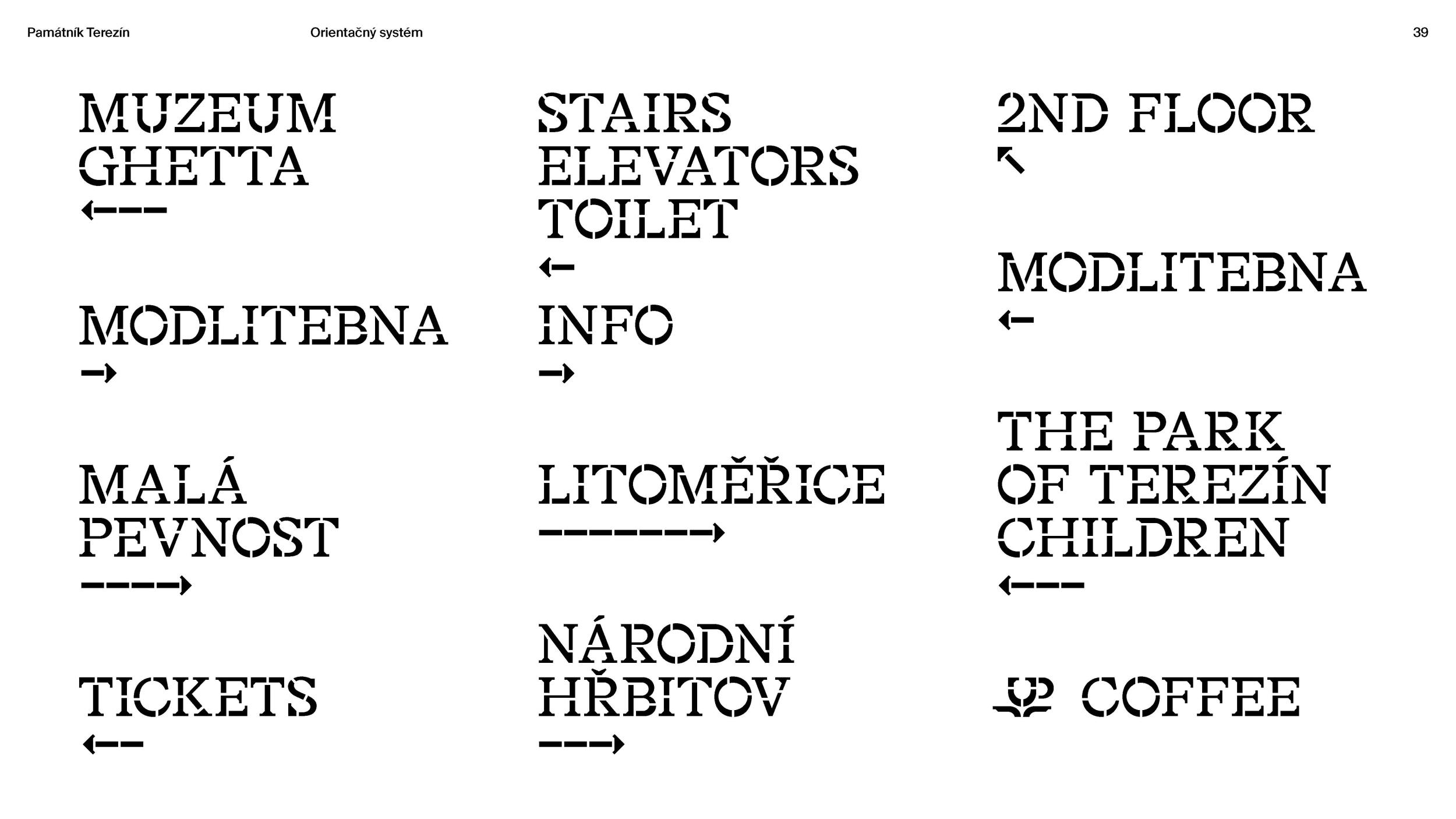
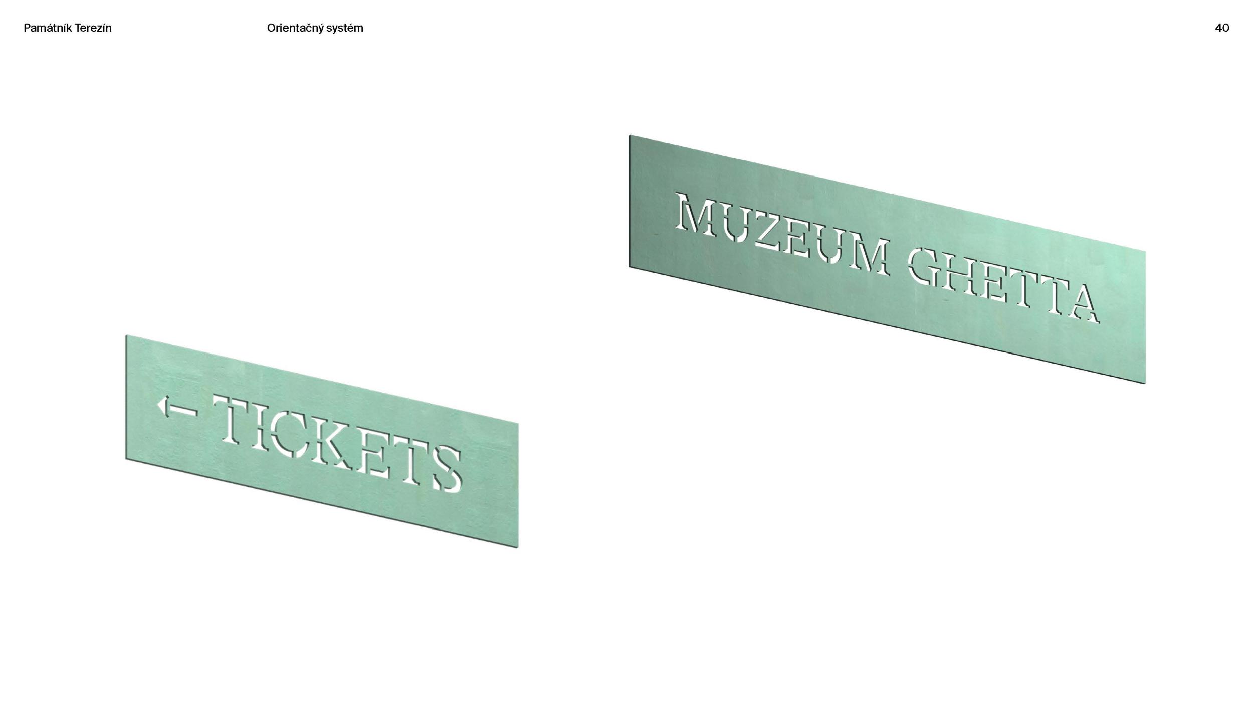
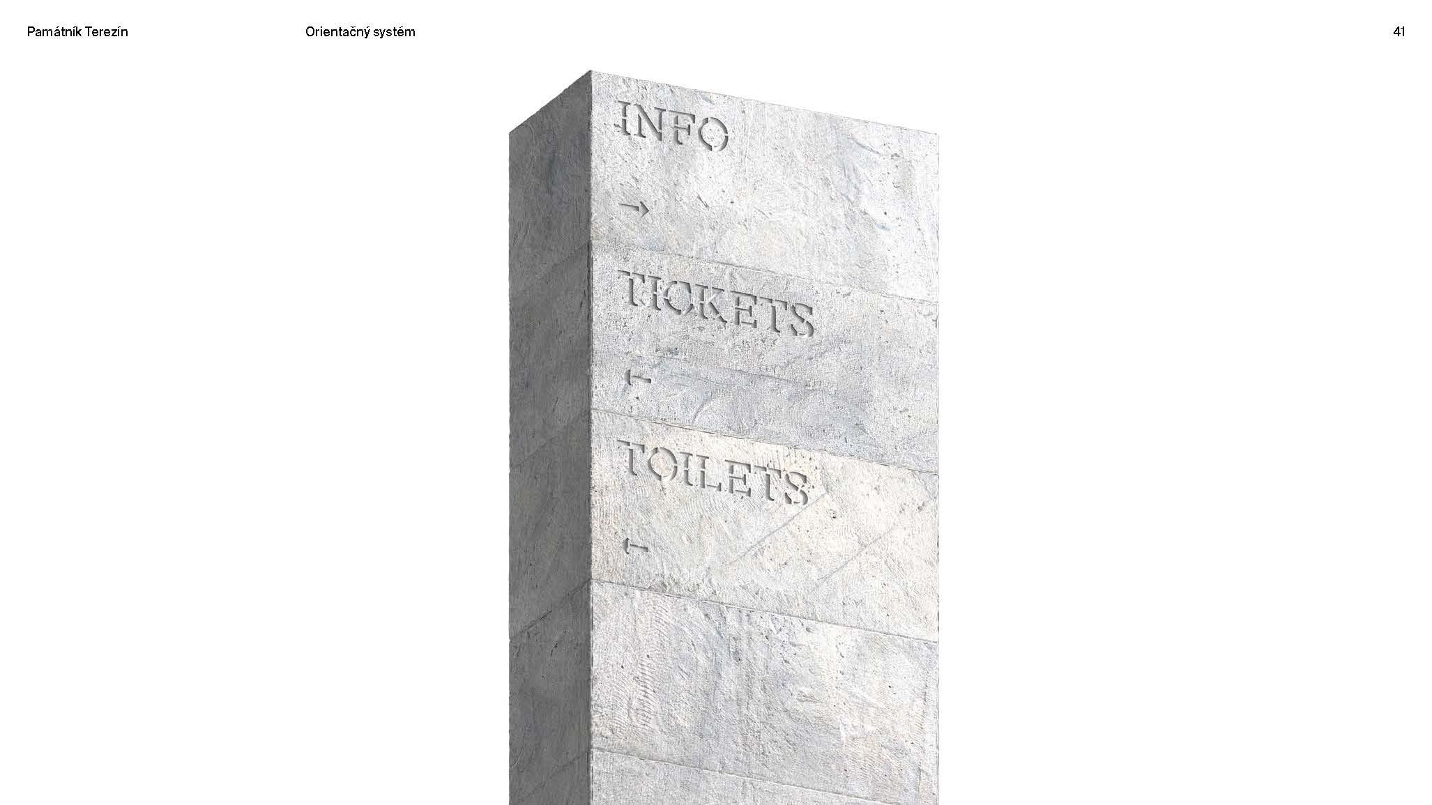
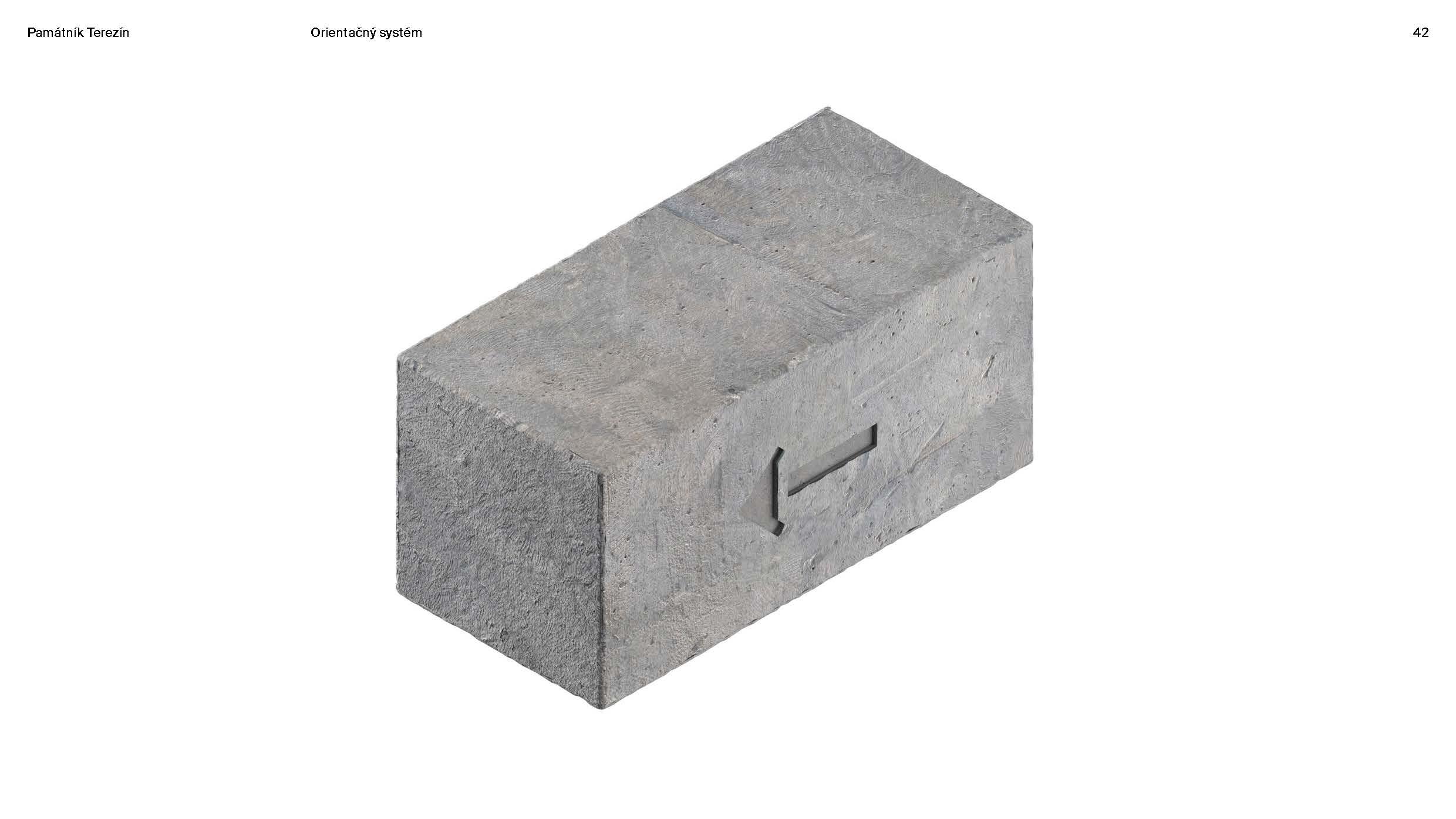
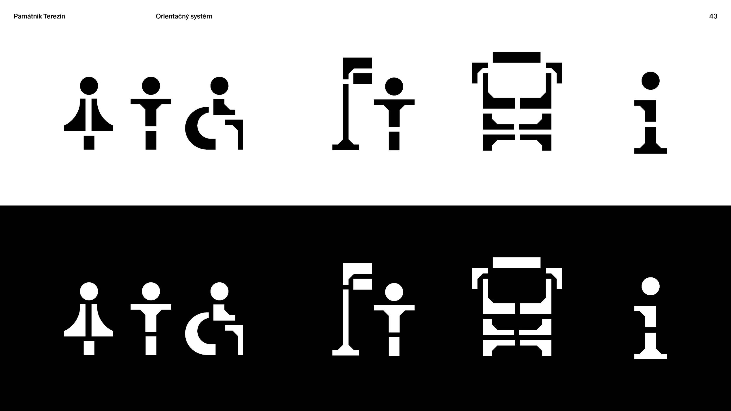
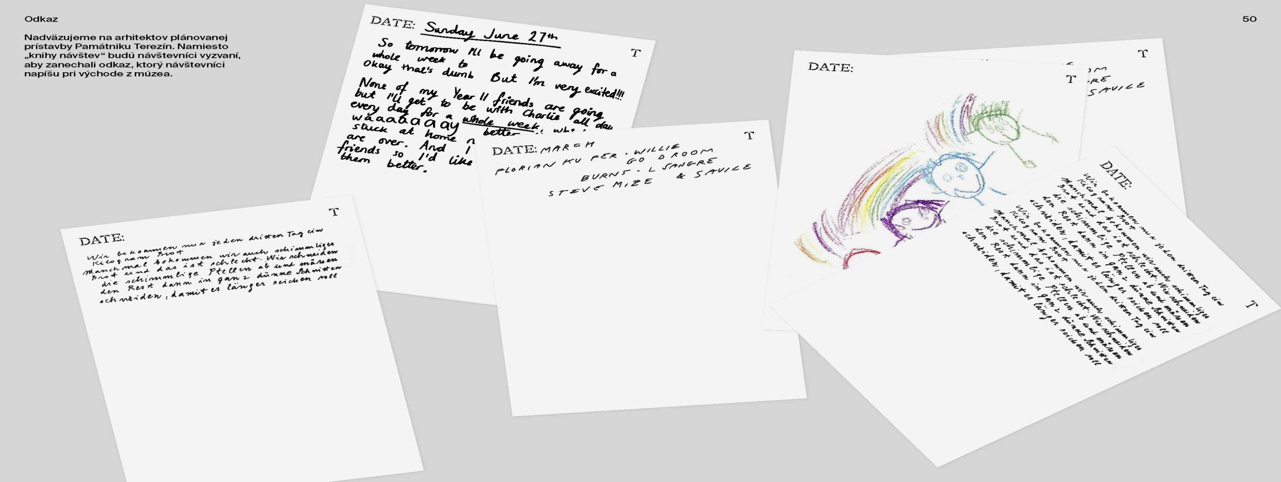
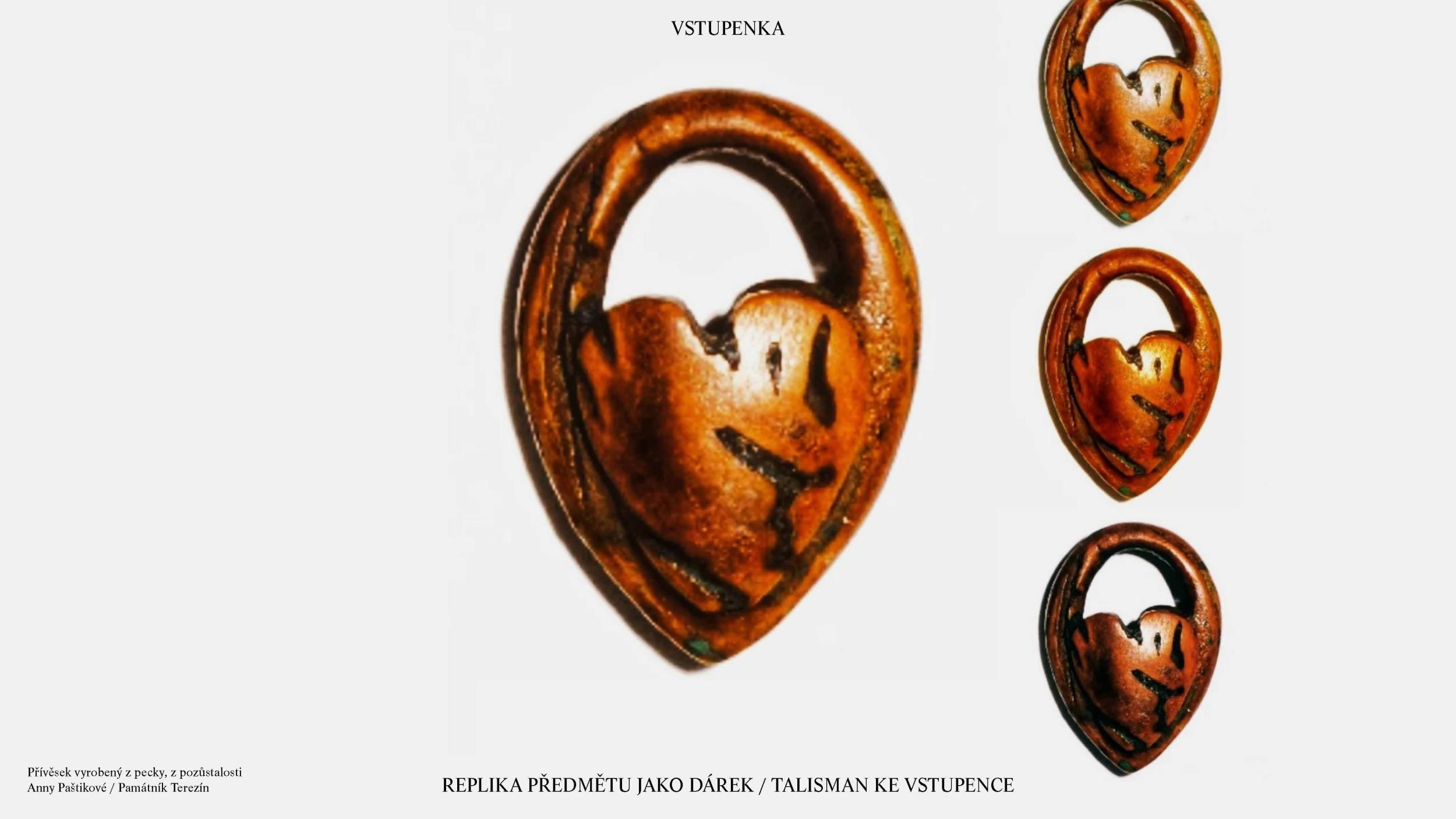
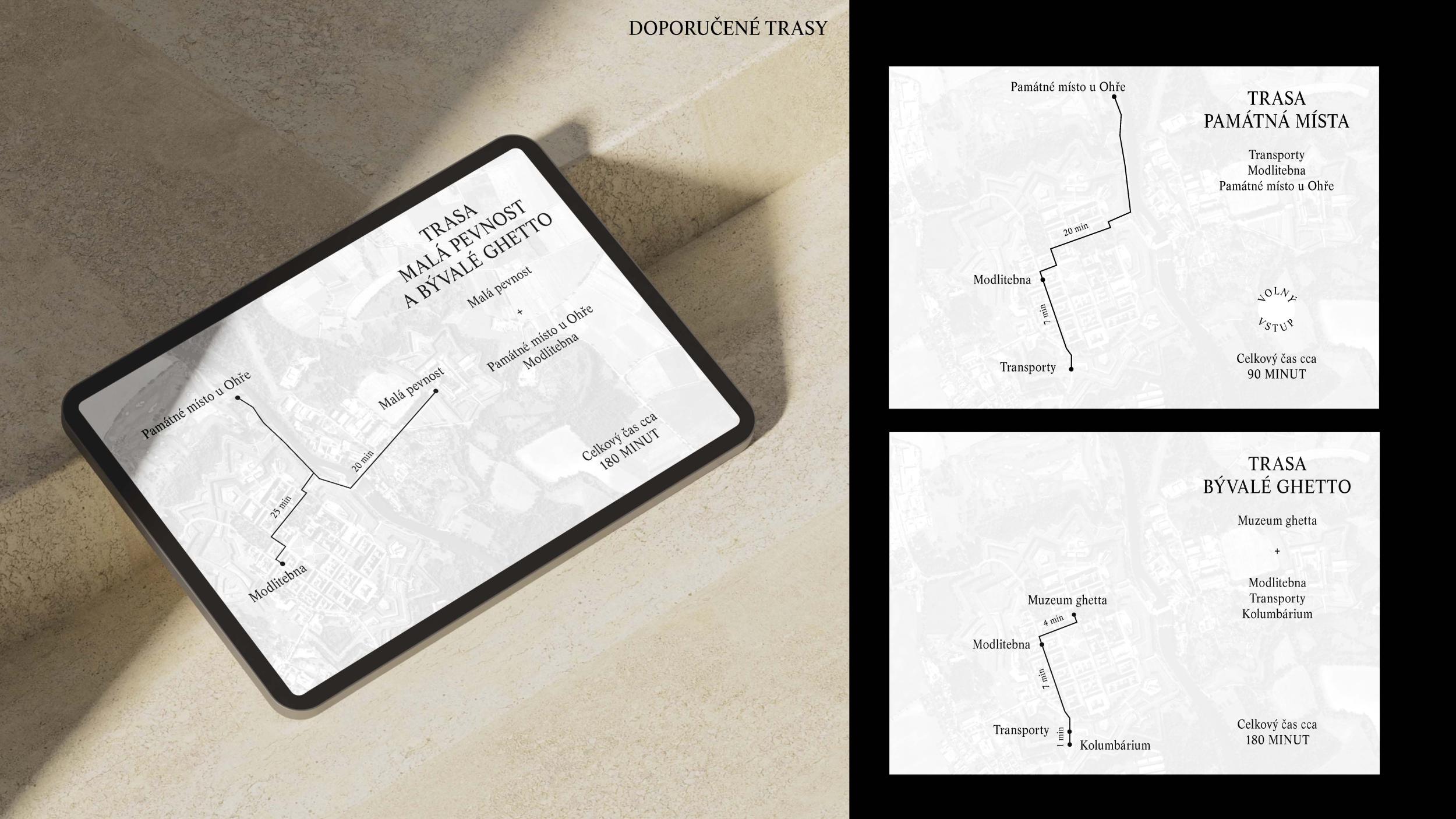
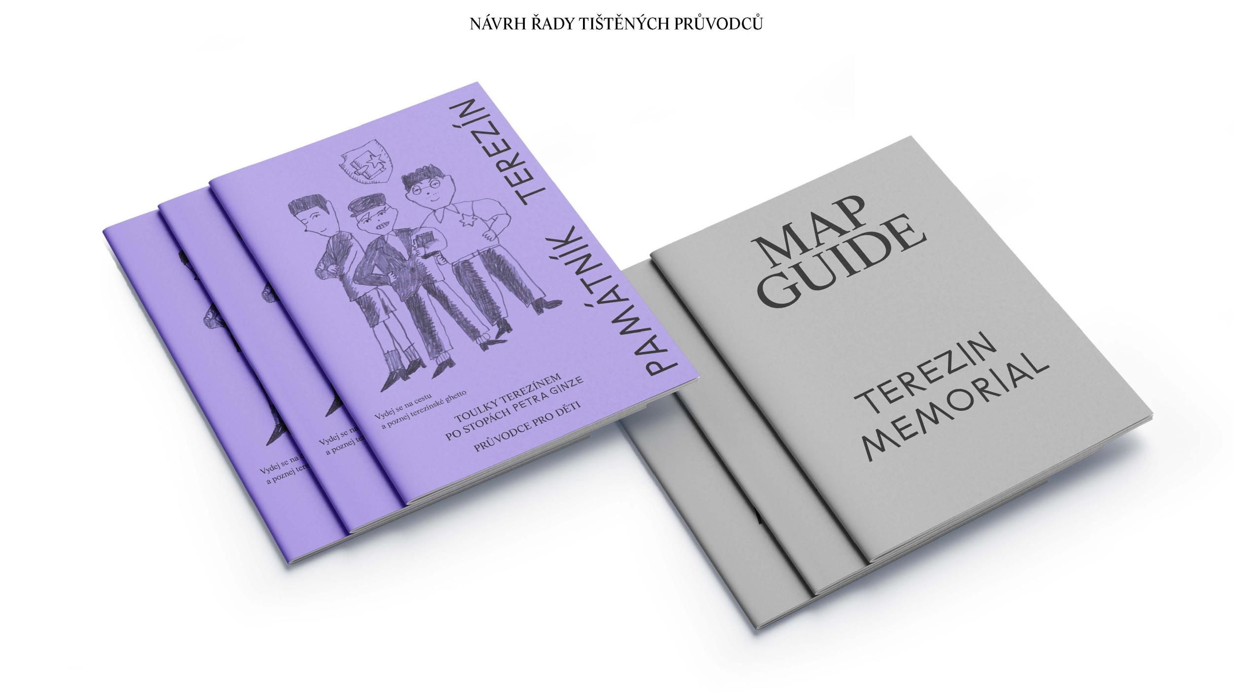
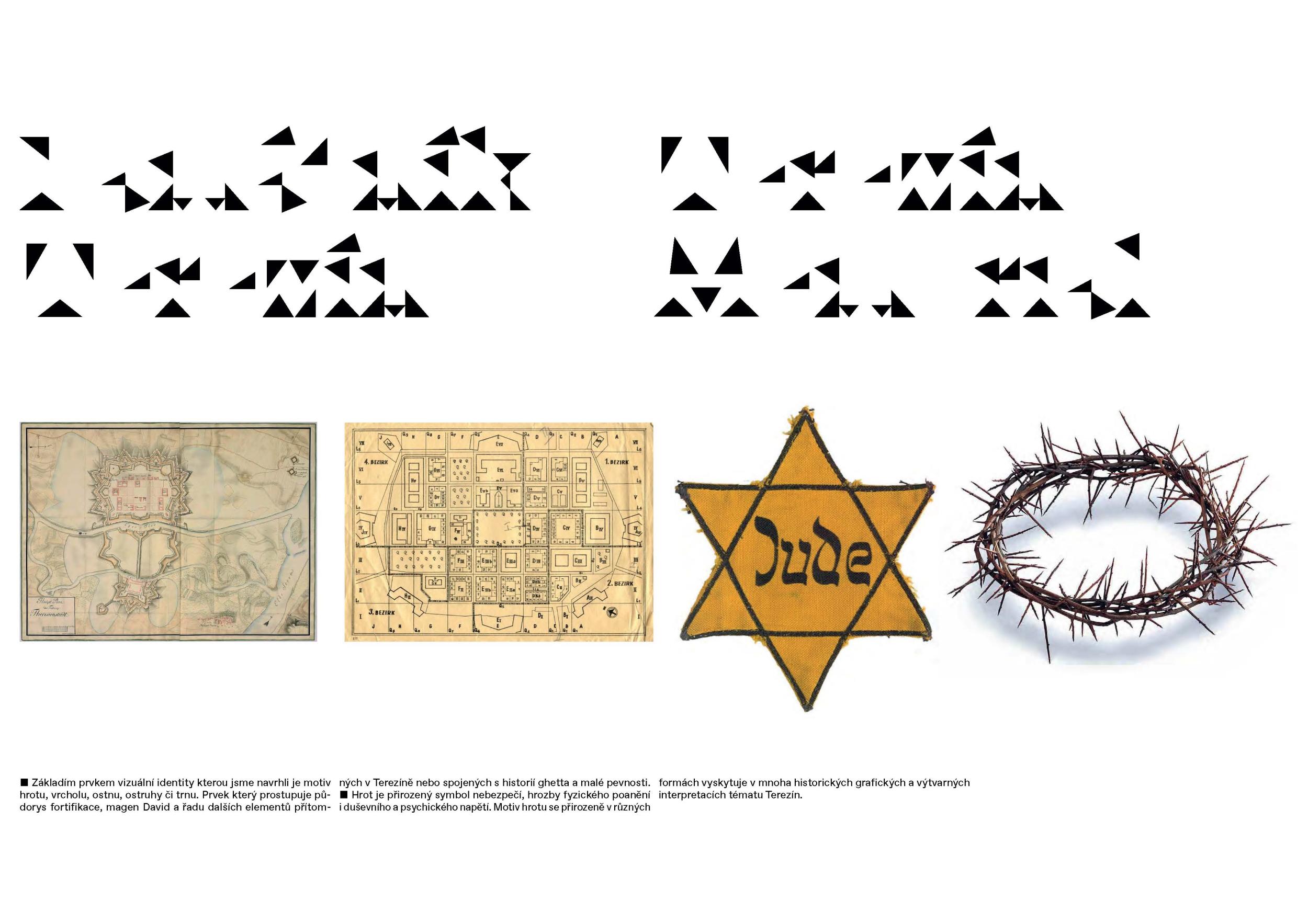
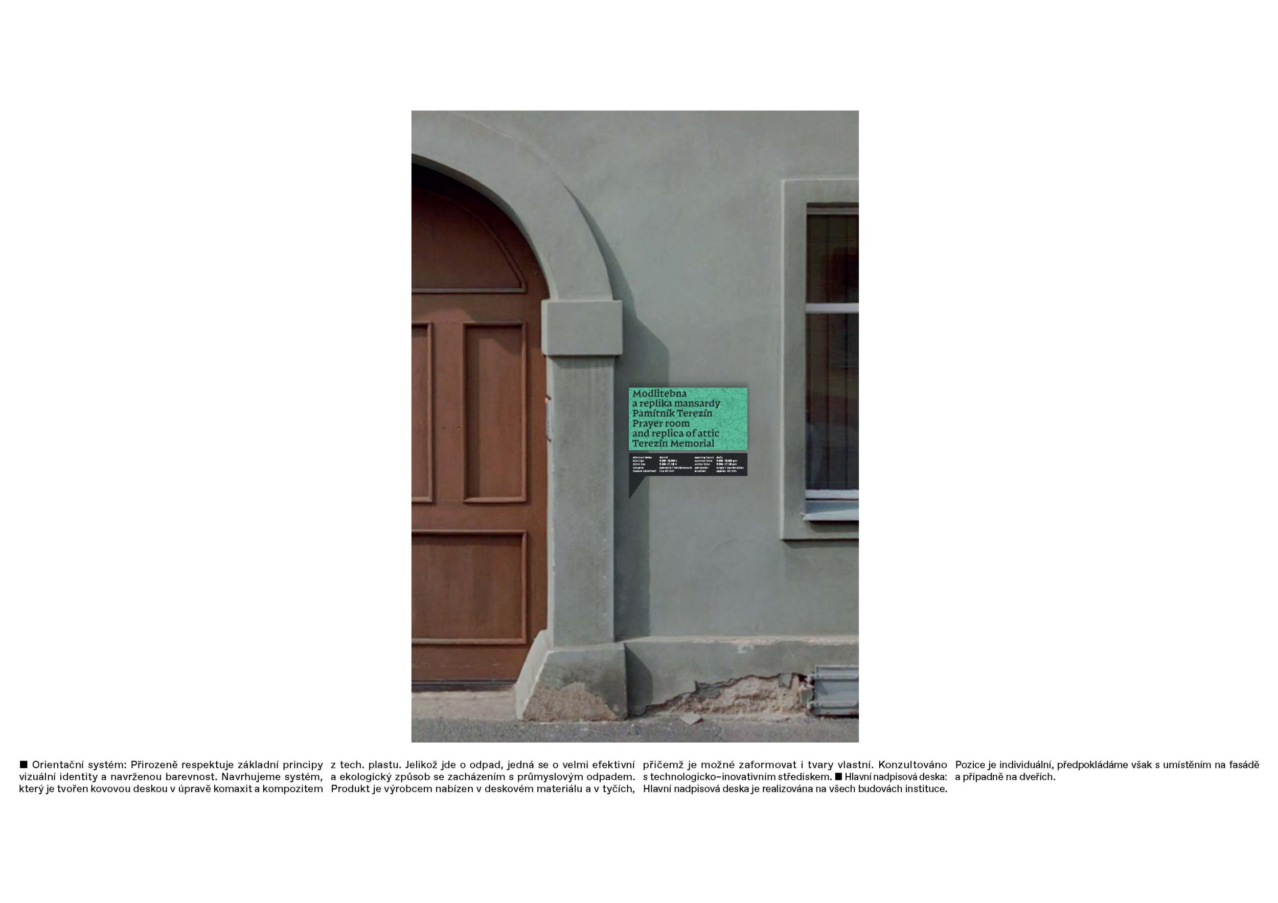
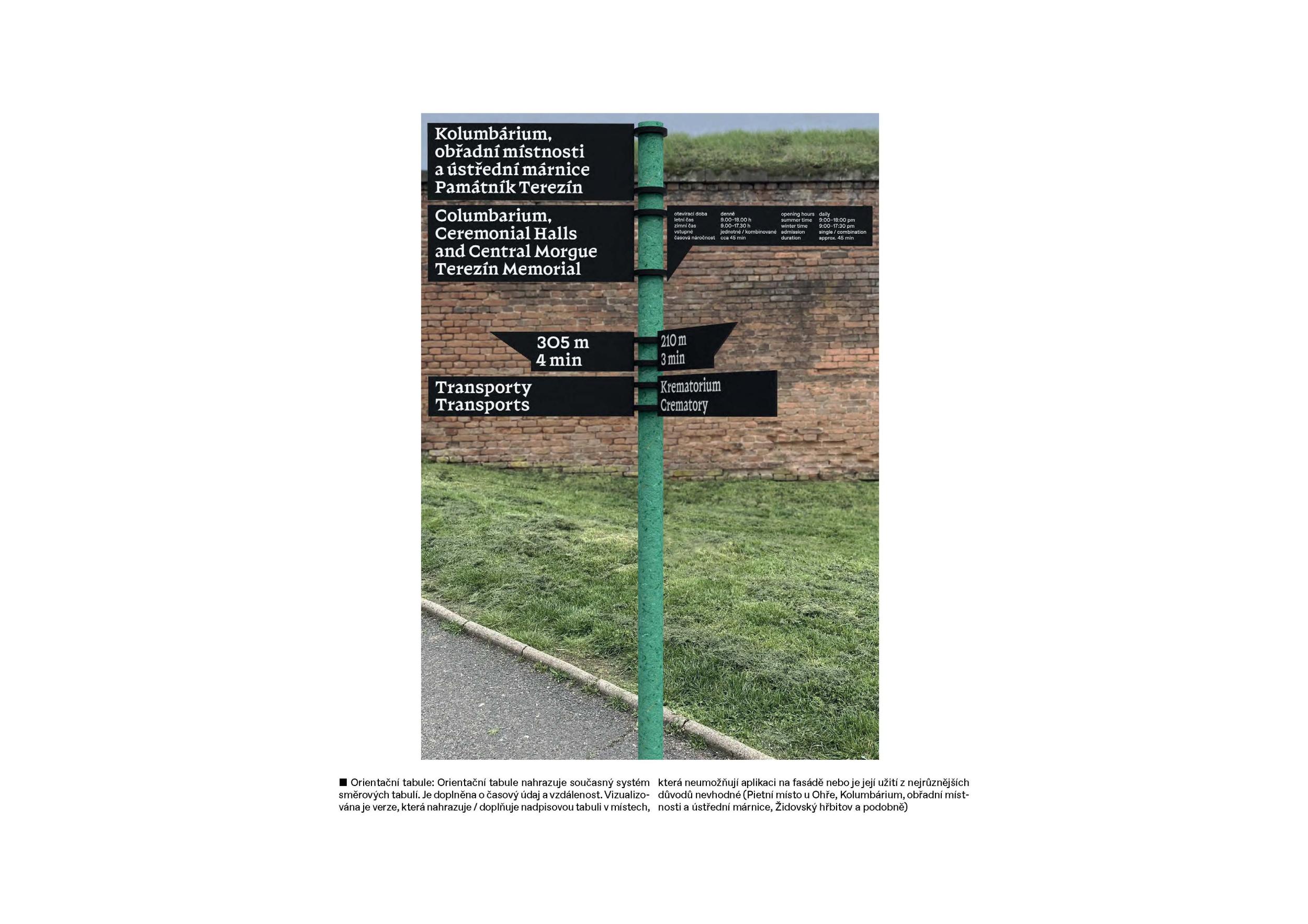
The winning design number 02 comes with a new logo (symbol) in combination with "classic" typography, set in a very sensitive editorial work with text and image content. The design rethinks the existing logo and brings a new "brand" recognizable in an international context. It is a simple but distinctive visual identity with a sensitive balance of elements. The proposal also makes some major suggestions for extending the identity to include publishing and a navigation system that substantively cites the future architectural extension of the PT. The jury also appreciates about the proposal the appeal to the tone of communication towards the public. Furthermore, we rate the individual applications in the proposal very positively as an ideological basis for further elaboration. In the case of the supplementary printed material ("ticket guide"), it would be more appropriate to use it as a separately saleable printed material. The jury sees the spatial orientation and the reprints of historical documents as very good elements. The original slogan will be developed in cooperation with the Terezín Memorial. The jury recommends the development of a new series of pictograms. The jury recommends the detailed development of a graphic manual, so that photo editing and layouts can be easily produced by a third party. The design of the website will be based on the next brief, and we recommend using a shortened "about" for the homepage, i.e. using the calendar element only as a secondary element. We also miss the integration of multilingual controls.

2nd Prize
  • Author andrej&andrej
  • Slovakia
Annotation

The design of the visual identity of the Terezín Memorial is based on a combination of two specific features characteristic of the memorial. The first is the unique architectural and visual expression of the place itself, the second is the immensely comprehensive, powerful and human legacy of the work of those who were unjustly interned there.

Jury Evaluation

In second place is proposal number 01. The main structural element of the identity is the customized font, which is formally based on the specific architecture of the Baroque fortress. It introduces a modular system that translates through the typeface into the compositional principles of the posters, the merchandise or the navigation system. The design conceptually works with the theme of bringing the events of PT into the present through a library of period materials. However, the visually expressive and formally very well managed design presents a style rather than the content that PT needs to convey. The jury evaluates very positively the design of the library of historical motifs, the system of creating poster visuals and the design of the spatial orientation, which would however be further commented upon. The jury also appreciates the design of the merchandise (scrapbooks and memorials). We lack a deeper reflection on the communication strategy of the visual style towards the general public. We do not recommend the principle of fragmentation from the author's typeface in the presented form for use in the pictogram series.

  • Author Kateřina Havelková and Tereza Boturová
  • Rájec
Annotation

Design of the visual style of the Terezín Memorial is basically based on the following points: The Terezín Memorial manages the heritage of the past, but belongs to the present Terezín Memorial as a stable, supportive institution, open to a wide range of visitors A strong identity that accompanies but does not distract from the experience Restoring identity and space to the people, who were persecuted by the Nazis at Terezín in an effort not to reduce them to victims Working with context Close cooperation with the Terezín Memorial, responding to the needs of the institution and consulting with others experts (educators, historians, psychologists and others)

Jury Evaluation

Proposal number 3 handles the topic of PT most sensitively. Based on expert consultation and distinctive insight, it puts forward the idea of the importance of individual identity. The proposal comes up with an interesting conceptual change for movement in Terezín - routes for visitors, taking into account their time possibilities and the purpose of the visit. The typographic design is bold but lacks sufficient punch and recognition.

  • Author Matuš Buranovský, Filip Kraus and Josef Tomšej
  • Prague
Annotation

The basic element of the visual identity we have designed is the motif of a spike, a point, a barb, a spur or a thorn. An element that permeates the ground plan of the fortification, the Magen David and many other elements present in Terezín or associated with the history of the ghetto and the small fortress. The spike is a natural symbol of danger, the threat of physical injury and mental and psychological tension. The spike motif naturally appears in various forms in many historical graphic and artistic interpretations of the Terezín theme.

Jury Evaluation

Design 4 introduces a very distinctive typography - the newly created typeface is based on the spike motif and set in historical references. However, the alphabet is cumbersome and has lost some of its distinctive character compared to the draft version presented in the second round. Furthermore, the application of the font is unkind to the typeface. The orientation system is unusable from the point of view of the conservation of buildings.