TGM 16 - Reconstruction of the City Hall in Přerov

1st Place
  • Author Anagram A-U and Gruppa studio
  • Team Marina Kounavi, Anne-Sereine Tremblay, Jan Kudlička
  • Rotterdam, Netherlands
Annotation

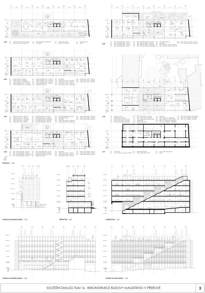
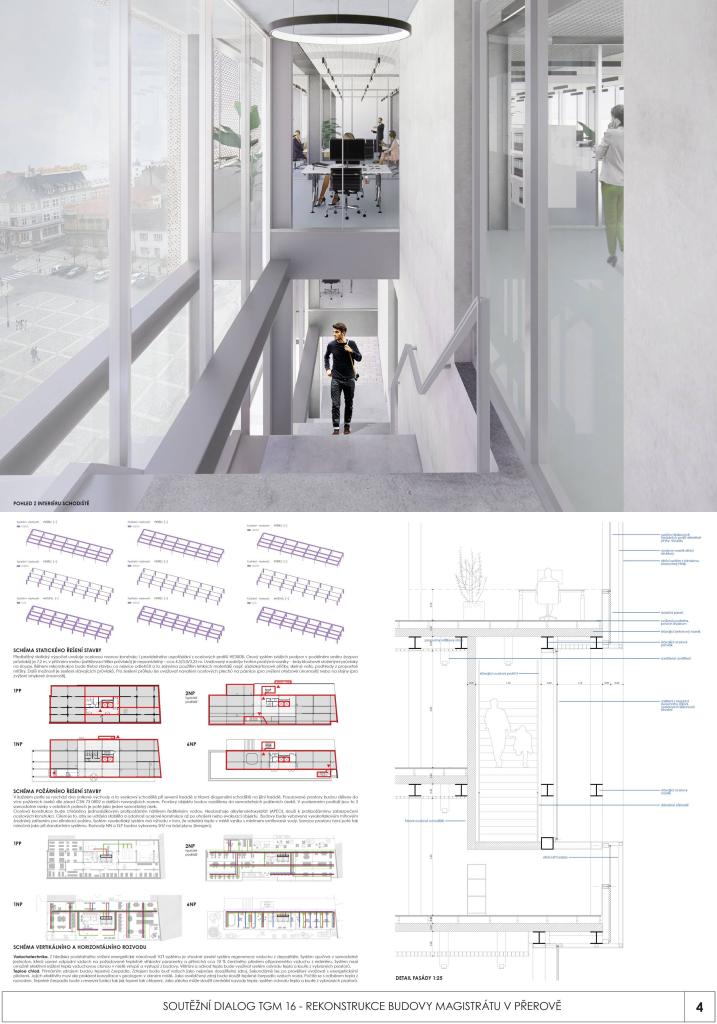
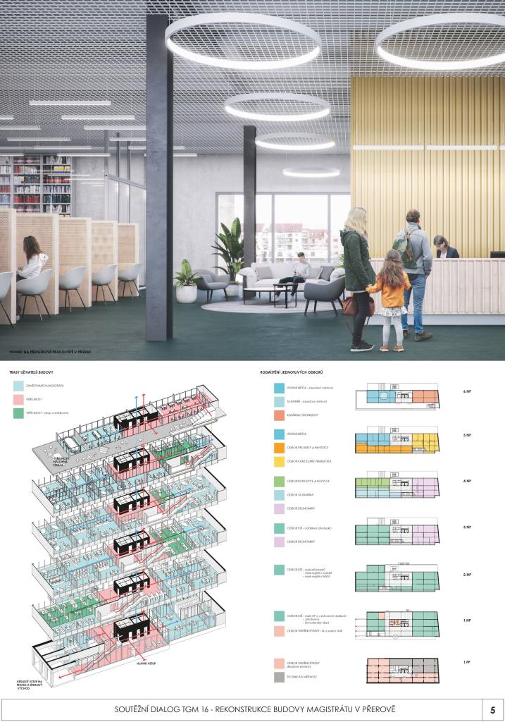
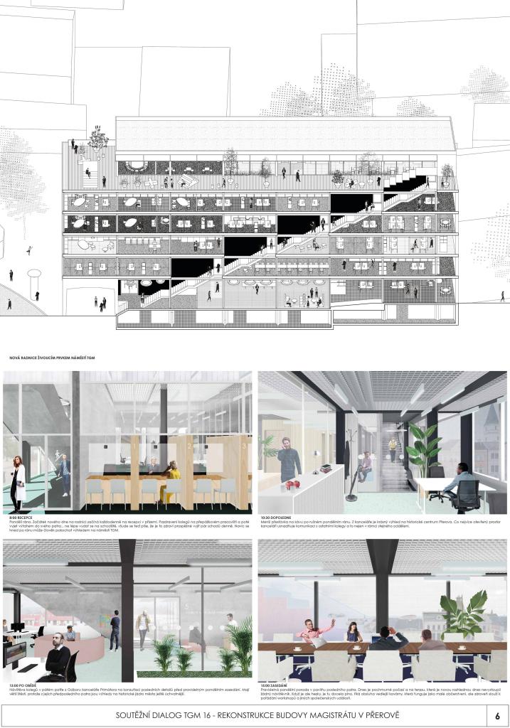
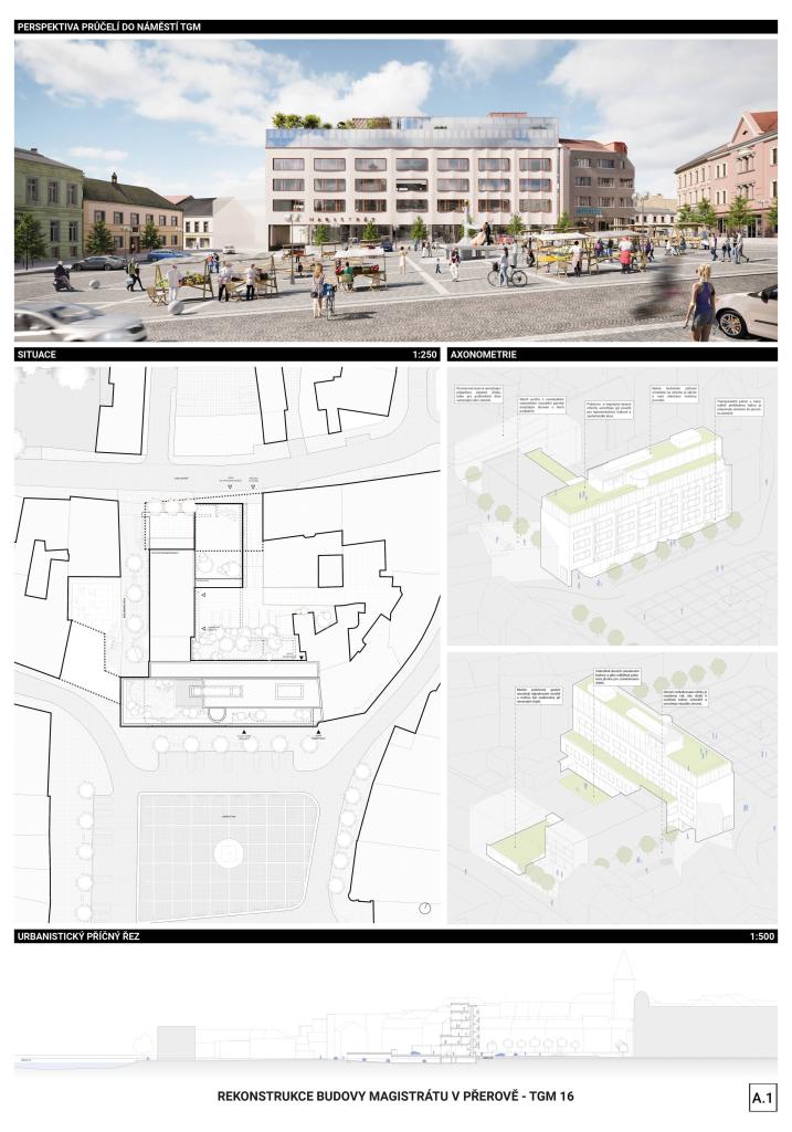
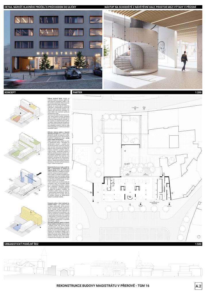
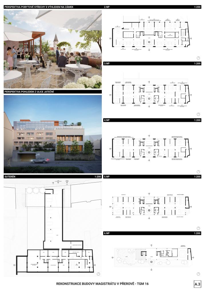
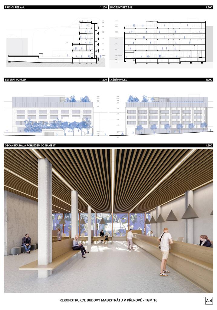
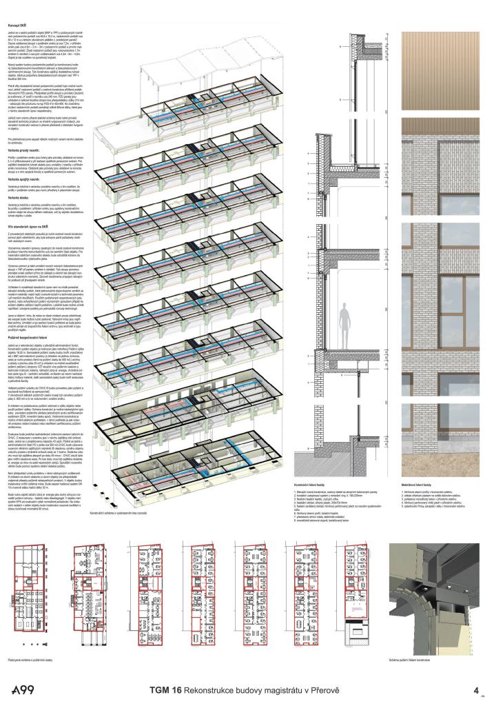
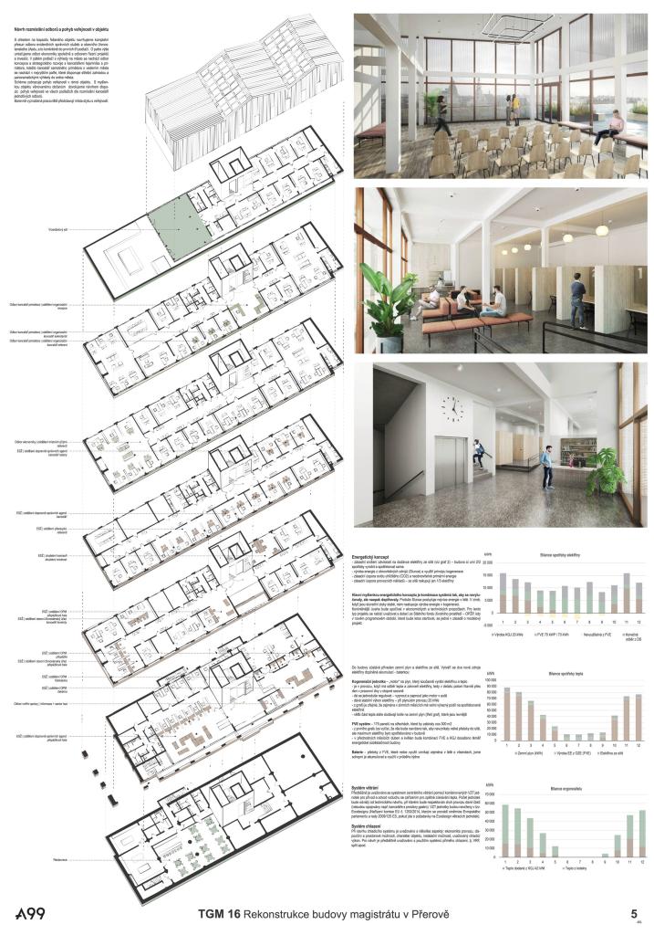
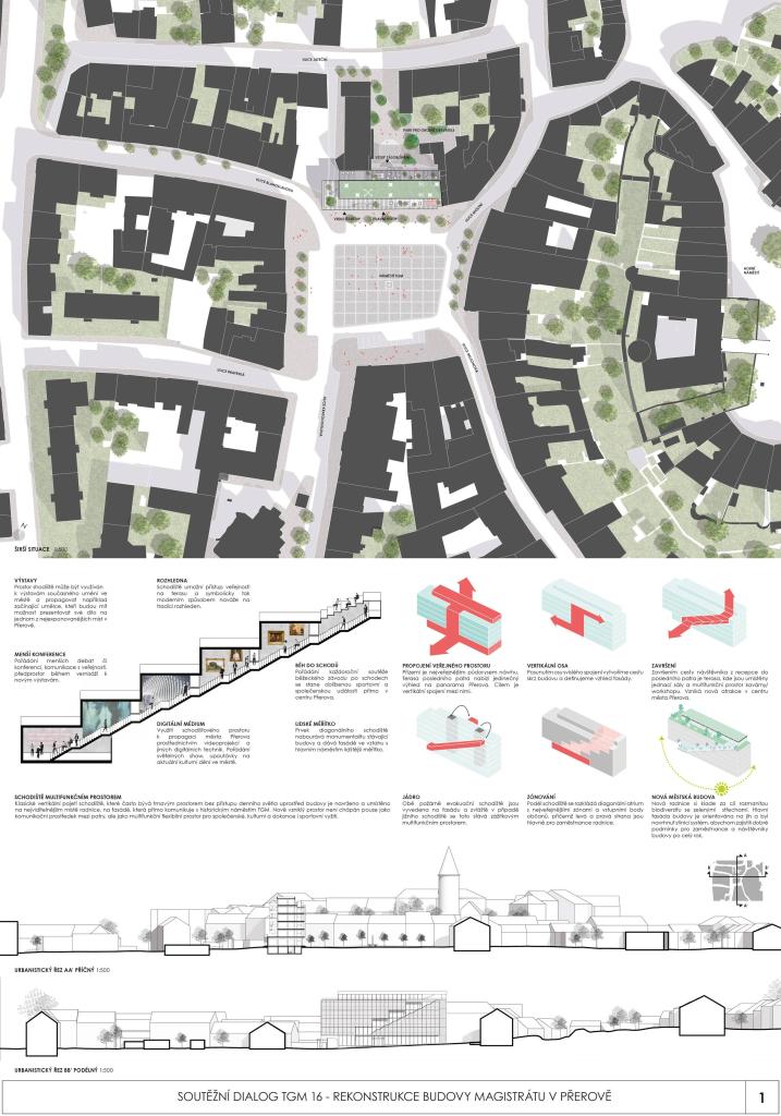
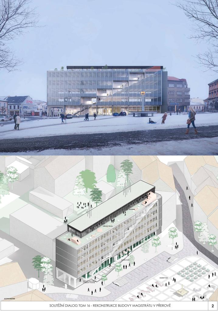
BUILDING OPEN TO THE PUBLIC. The diagonal atrium offers a completely transparent zone of the facade, which reveals the activities of the new town hall and creates a new image of the city. It offers the ground for real democracy and reconnects citizens with the city. MODERN VIEWPOINT. The staircase atrium with the inner and outer part becomes the main attraction of the building, which creates the current landmark of the city of Přerov and offers a unique view of the city skyline. The stairs end at the pavilion with a cafe. INTERACTION WITH THE PUBLIC. Central stairs and elevators define the zone of interaction with the public on the floor. Creating two office zones, private-quiet and public-interactive. Citizens can only be in public, other areas are accessible only to city hall employees. FLEXIBILITY. The design of the interior is based on the grid system of the existing building with dimensions of 7.2 x 7.2 m, which offers a flexible office environment with open and closed offices and meeting rooms.

Jury Evaluation

The proposal works with a new fundamental added value, which is the revitalization of the square. It accepts the house's original mass, but by "cutting through" the facade, it becomes closer in scale to the existing surroundings. The design acquires a new character and is placed in the context of European examples, where the town hall is part of the public space. The foyer of the communication hall is at the entrance and permeates the entire house, connects to the diagonal staircase, and allows individual departments to communicate with the public. Thus, this inner public space penetrates vertically through the house to the roof terrace, which now serves as a democratic meeting place. The transparent contemporary expression of the facade of the house is not only a formal sign, but also the concept of operation is based on the transparent functioning of the building. The design shows signs of a contemporary layout for the operation of the 21st-century office.
Previous Next
2nd Place
  • Author PLURAL
  • Team Martin Jančok, Michal Janák, Zuzana Kovaľová, Maroš Kostelanský, Denisa Lehocká (monumental art)
  • Bratislava
Annotation

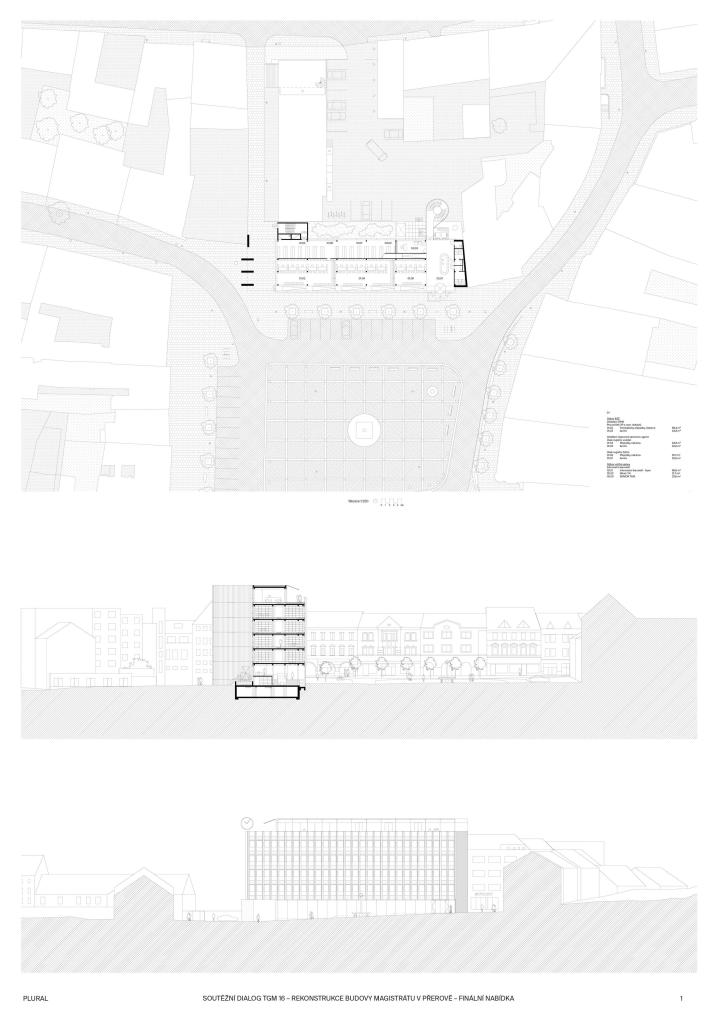
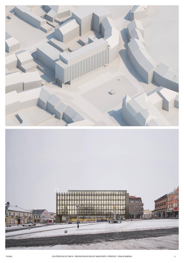
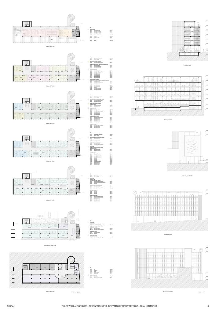
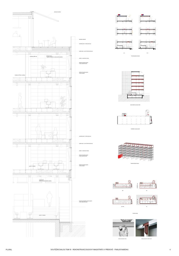
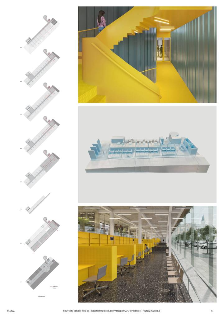
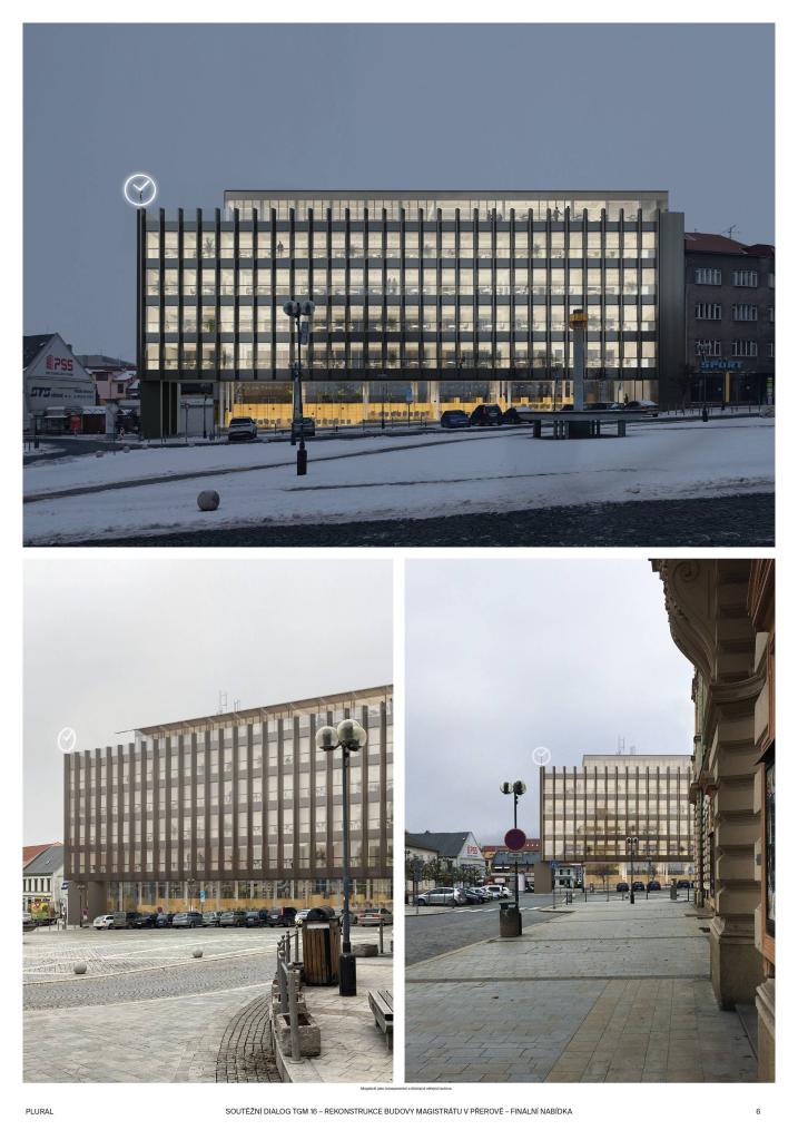
We imagine the new building of the municipality in Přerov as a representative town house, as a transparent contemporary institution that is fully available to the public. The key to this is the literal opening of the building with the help of generous glazed areas, revealing the processes often hidden behind the facade of the building. In this sense, making the roof terrace and café accessible to the public is also an act of openness to its own citizens. The ground floor, an interior public space, taking place on three interconnected levels, copies the slope of the square and acts as if it were a continuation inside the building. The design offers high comfort of the working environment, a very flexible and adaptable spatial scheme with two new communication cores, situated outside the basic volume of the building.

Jury Evaluation

The design comes with a highly cultivated solution, accepting the volume of the house and the traditional modernist concept of the office building. The design shows a high degree of understanding and respect for the character and modernity of the original building, but this does not sufficiently meet the demand for change. Strengthening the contemporary architectural layer would be beneficial. The layout is highly rational, but the potential for transformation into a contemporary 21st century office is not entirely clear. The ground floor is suitably spatially connected to the public space of the square (especially the motif of the gradual inner ramp is interesting). However, its layout does not enliven the square much.

Previous Next
3rd Place
  • Author Pietro Carlo Pellegrini
  • Lucca, Itálie
Annotation

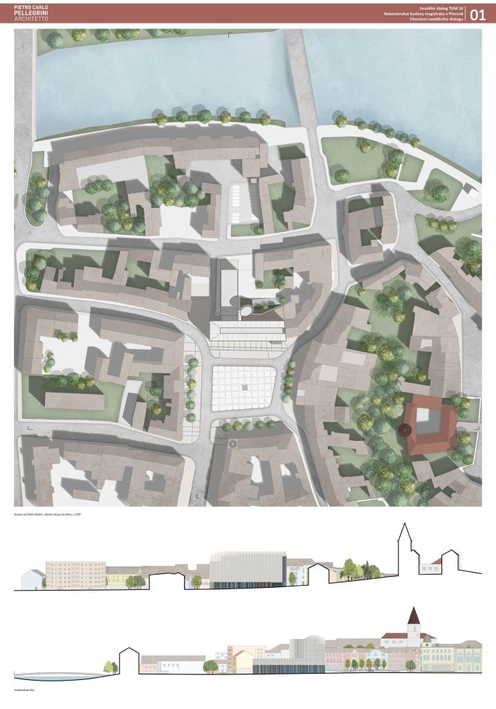
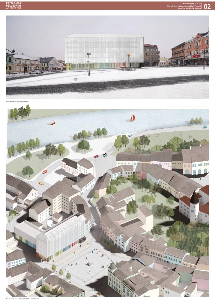
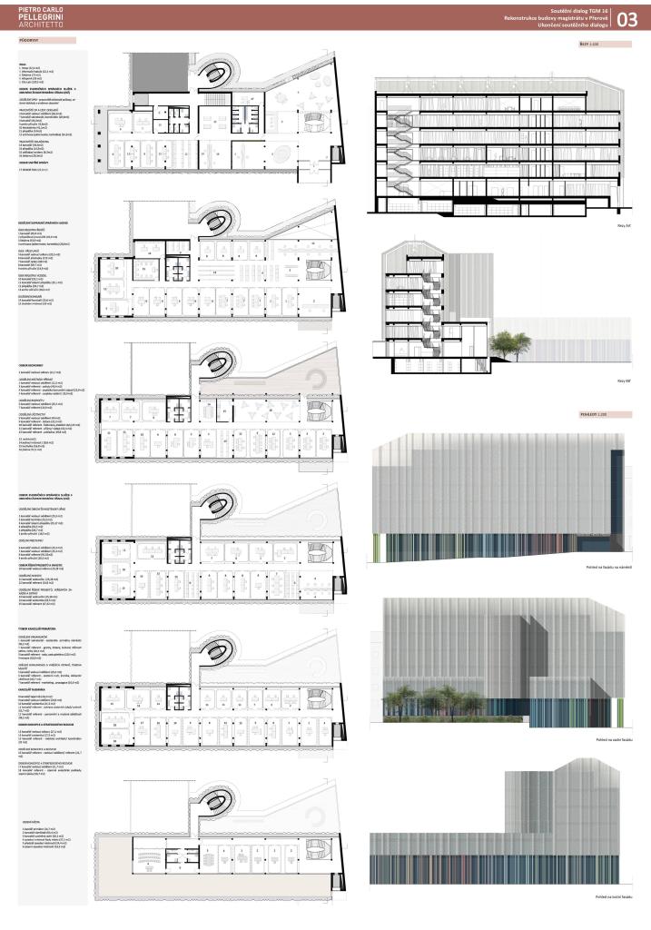
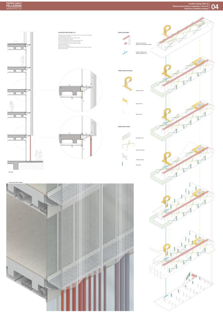
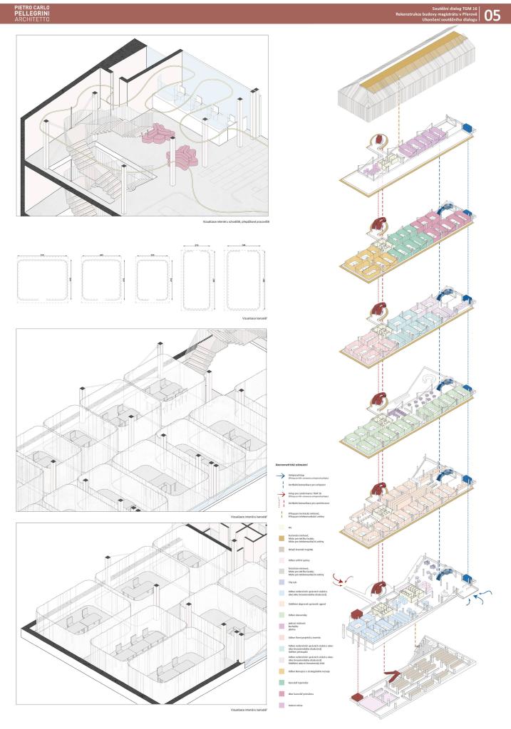
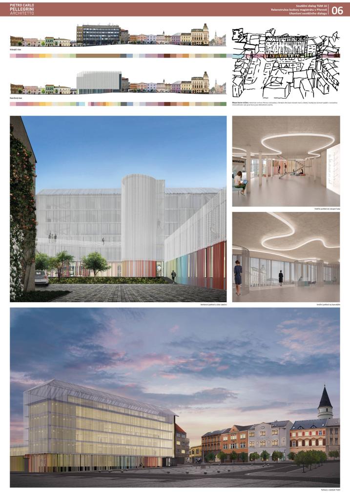
GENIUS LOCI. The project is part of T.G. Masaryk in the charming town of Přerov, deals with the architectural and urban reconstruction of the existing building. The solved object was formed by a dialogue between the forms and visions of different periods, which intertwined here and which built the city. The approach to design is a synthesis of the following cornerstones: morphological and typological characteristics of the original architecture, distribution of functions, architecture and communication. The morphological and typological characteristics are represented by a set of buildings in the historic center. T.G.M. place of intervention and especially the Castle on a nearby hill, the surrounding buildings with sloping roofs of various shapes, slopes and sizes and the diverse colors of the facades.

Jury Evaluation

The design presents an ephemeral sculptural concept, sophisticated work with color and material, the conceptual scenographic concept of the house. The outlined radical timeless vision of the internal arrangement remains in experimental form and is not sufficiently proven. The operation and organization are likely to be achievable due to the high variability of the design but remain unresolved. The identification of the house as a municipality is also problematic. Working with the roof landscape is not convincing; there are free volumes without additional function. The formal expression of the house is not connected with the internal structure of the operation.

Previous Next
4th Place
  • Author studioLIBRE
  • Team Robert Jelínek
  • Praha
Annotation

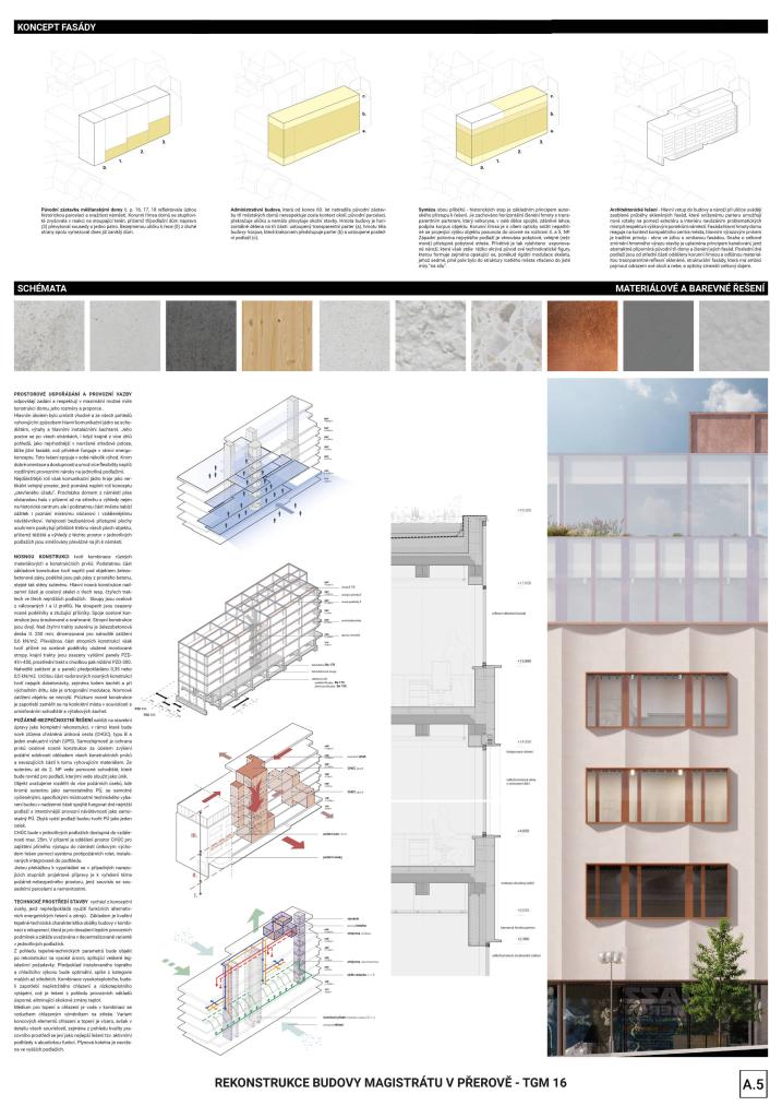
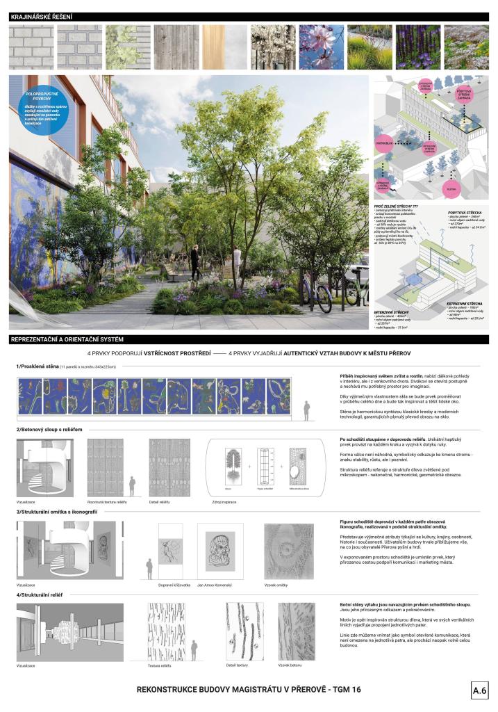
OPEN OFFICE - a clear whole, urbanistically clear, operationally varied, architecturally durable - unpretentious, yet functional and friendly. = Opportunity to remedy some specific urban contexts, which can best be activated by investment from public funds. QUALITY PUBLIC SPACE - various categories of public space that permeates the entire building from the square to the courtyard and from the ground floor to the crown of the building: public, open (accessible) vs. business, protected (safe) = parterre as the main venue. READABLE OPERATION - in the spirit of well-functioning not only municipal, but also representative services of the office, interconnected into one compact unit, where the citizen comes first, but the demands for security of all work processes and comfort of employees of the office, who are also primarily citizens, affected = common interests which cannot be mutually exclusive. REPRESENTATION OF THE CITY - building - meeting place - office = artistic elements as a whole complete identity, abstract information, leading to knowledge of the place and city for each visitor in its own way, yet contextual with the city as a historical, human, transport industrial, but also connected with nature urban total.

Jury Evaluation

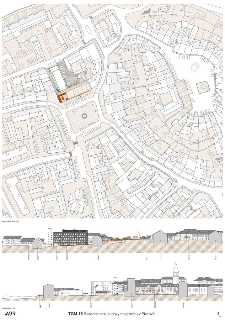
The proposal is weakened by excessive ideological and formal fragmentation of the proposal. Even highly detailed elaboration of partial parts is not enough to maintain the integrity of the design. The approach with an optical reduction of the main mass of the house is interesting, but the overall expression is not convincing, it evokes an apartment building rather than a municipal building. The layout remains confusing, with no further benefit for the 21st century office.
Previous Next
5th Place
  • Author Atelier99
  • Team Martin Jeřábek, Petr Prokš, Pavel Gregor
  • Brno
Annotation

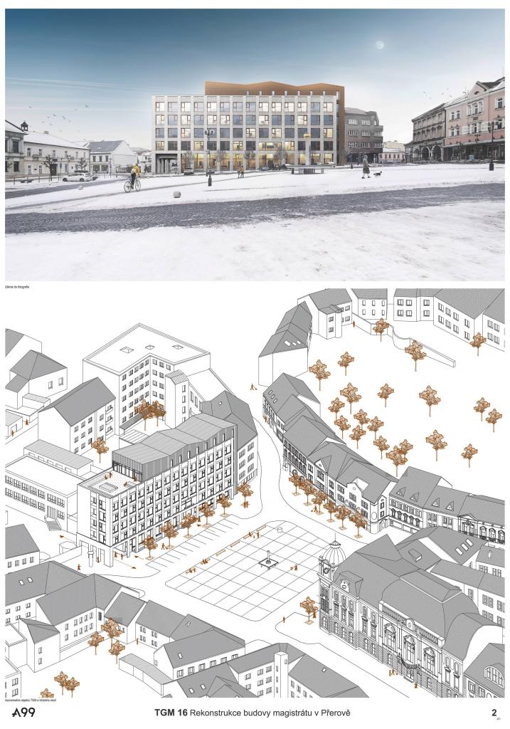
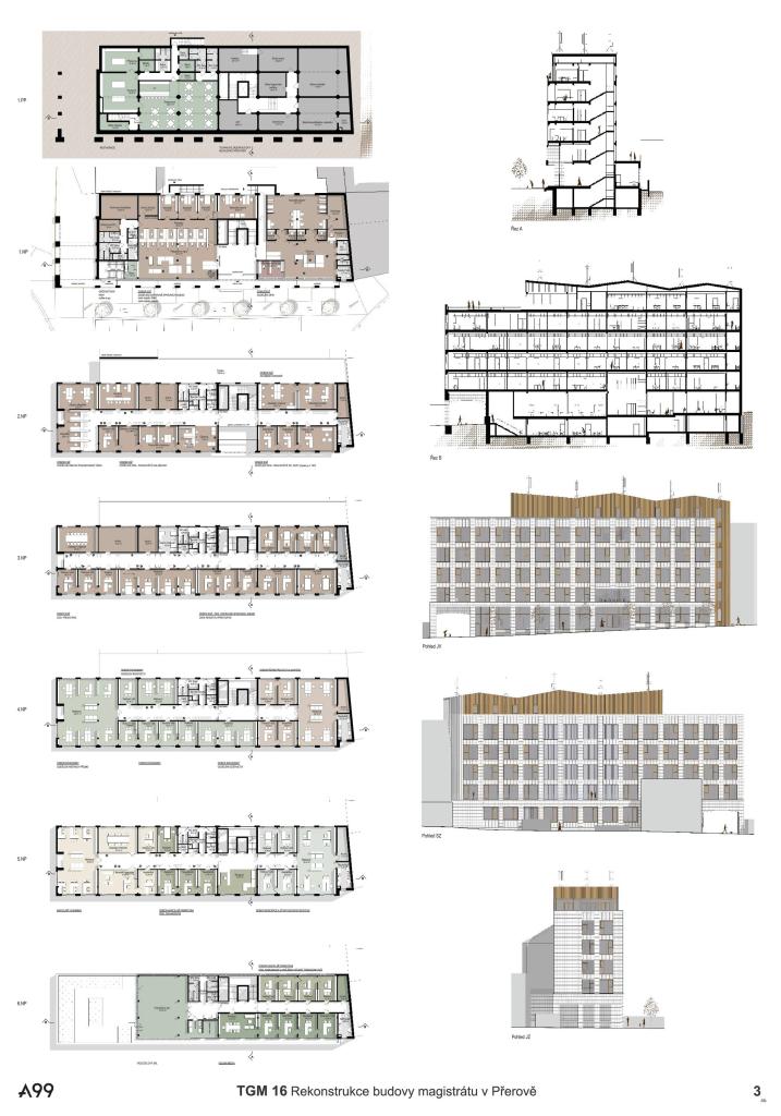
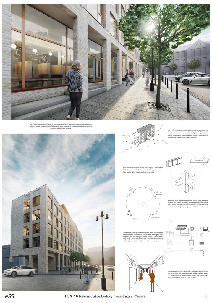
The concept of the architectural solution is based on the very structural and functional essence of the building. We maintain a dispositional three-way scheme that has been verified and functional for a long time for the purposes of administration. We design a representative facade with a dominant entrance, which the object of this function deserves. Related to this is the relocation of the communication core to the center of the layout, simplifying orientation and movement in the object. The long facade of the building, which forms one whole side of the square, is divided by pilasters. A game of shadows and lights is created, which brings detail to the facade. The regional significance of the building determines the use of quality materials. We design a brick cladding that gives large areas a smaller scale, the different orientation of the cladding supports this. The slope of the square and the slope of the roof of the superstructure give the simple volume dynamism and the building does not seem cumbersome despite its size. The light shade of the facade is traditional, clean and intelligible and in contrast with the bronze tone of the windows. Aluminum perforated cladding whispers about a sophisticated and modern technological solution inside the building.

Jury Evaluation

The decision for the material and material solution does not seem appropriate for the square. The design does not understand the context of the existing building, or the place in which the house is located, nor does it offer a new individual identity. The form of the ground floor and contact with the space of the square without the possibility of further interconnection is also problematic. The layout does not bring further potential for the contemporary office.
Previous Next